Statsmodels PACF plot confidence interval does not match PACF function
Asked Answered
S

4

5

I have a time series that appears to have a significant lag when observing the partial autocorrelation (PACF) plot, i.e. PACF value is greater than the blue confidence interval. I wanted to verify this programmatically but it doesn't seem to work.

I plotted the PACF plot with statsmodels time series api, which showed the first lag was significant. So, I used the PACF estimation to get the PACF values along with the confidence interval at each point, but the confidence intervals between the two don't match up. What's even more odd is the plot function in the source code uses the underlying estimation function so they should both match up.

Example:

import numpy as np
import matplotlib.pyplot as plt
import statsmodels.api as sm

x = np.arange(1000) 
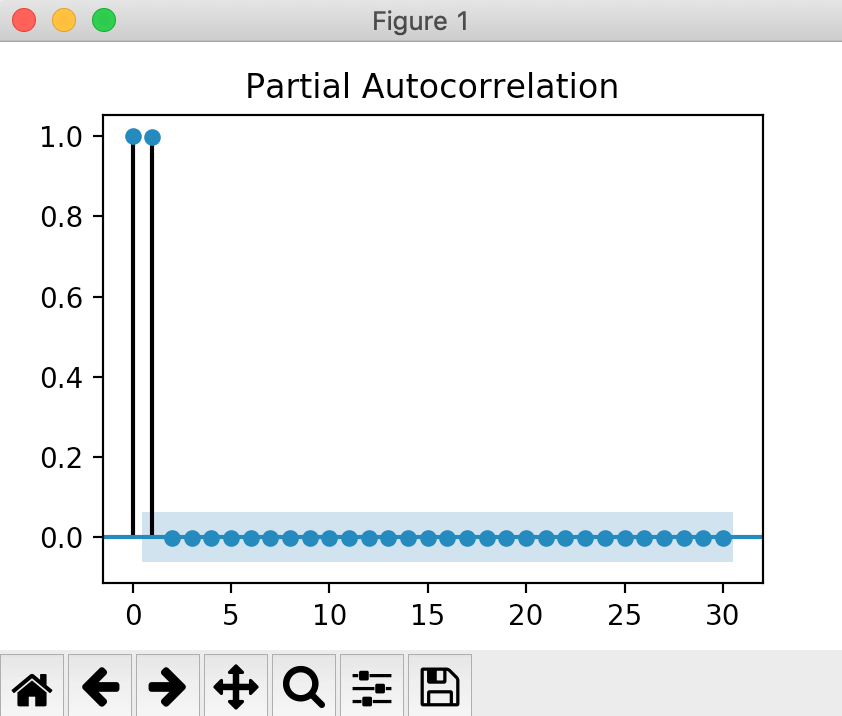
sm.graphics.tsa.plot_pacf(x)
plt.show()

enter image description here

Which shows the first lag is quite significant that is ~0.98 and the confidence interval (blue rectangle) is about (-0.06, 0.06) throughout the plot.

Alternatively, when trying to get these exact plot values (only getting first 10 lags for brevity):

sm.tsa.stattools.pacf(x, nlags=10, alpha=0.05) 

The resulting PACF values are (which match the above plot):

array([ 1.        ,  0.997998  , -0.00200201, -0.00200402, -0.00200605,
        -0.0020081 , -0.00201015, -0.00201222, -0.0020143 , -0.00201639,
        -0.00201849])

And the confidence interval (shown in blue in the above graph), seems off for the first lag:

 array([[ 1.        ,  1.        ],
        [ 0.93601849,  1.0599775 ],
        [-0.06398151,  0.0599775 ],
        [-0.06398353,  0.05997548],
        [-0.06398556,  0.05997345],
        [-0.0639876 ,  0.05997141],
        [-0.06398965,  0.05996935],
        [-0.06399172,  0.05996729],
        [-0.0639938 ,  0.05996521],
        [-0.06399589,  0.05996312],
        [-0.06399799,  0.05996101]]))

What's going on?

Api Reference:

Spotter answered 17/5, 2020 at 16:49 Comment(0)
G
8

according to the code:

  • stattools.pacf computes the confidence interval around the estimated pacf, i.e. it's centered at the actual value
  • graphics.tsa.plot_pacf takes that confidence interval and subtracts the estimated pacf, So the confidence interval is centered at zero.

I don't know or remember why it was done this way.

In the example all pacf for lags larger or equal to 2 are close to zero, so there is no visible difference between plot and the results from stattools.pacf.

Gangrel answered 22/5, 2020 at 13:42 Comment(3)
Ahh that's what is going on. So subtracting the pacf values from the given intervals should give me what the plot is showing.Spotter
@Josef, which CI is more correct to use stattools.pacf or graphics.tsa.plot_pacf from statistical point of view?Kalin
They are just shifted versions of each other, and so they rely on the same assumptions which might be appropriate or not for a given dataset. The plot with CI centered at zero makes it easier to see which lags might be statistically significant. (IIRC, the CI is computed assuming a Null process that has no serial correlation, and not under an assumption of a model that could have generated the observed acf/pacf pattern. Then CI around zero reflects that.)Gangrel
F
2

The PACF for lag 0 is always 1 (see e.g. here), and hence its confidence interval is [1,1].

This is ensured by the last line of the code snippet where the CI is calculated:

varacf = 1. / len(x)  # for all lags >=1
interval = stats.norm.ppf(1. - alpha / 2.) * np.sqrt(varacf)
confint = np.array(lzip(ret - interval, ret + interval))
confint[0] = ret[0]  # fix confidence interval for lag 0 to varpacf=0

(See also issue 1969 where this was fixed).

As the 0 lag is of no interest you usually make the PACF plot start from lag 1 (as in R's pacf function). This can be achieved by zero=False:

sm.graphics.tsa.plot_pacf(x, ax=axes[0], zero=True, title='zero=True (default)')
sm.graphics.tsa.plot_pacf(x, ax=axes[1], zero=False, title='zero=False')

enter image description here

Festschrift answered 22/5, 2020 at 10:0 Comment(5)
I don't think you understand my question. I know the first value is always 1. My point was about the confidence intervals being different starting at lag 1.Spotter
I'm afraid I don't understand your comment then: all intervals are exactly the same ( 0.0619795) as calculated in the second line in the code snippet above. The plot shows these intervals (github.com/statsmodels/statsmodels/blob/…)Festschrift
I can see you misunderstand. The whole point of my question was why does one function give confidence intervals that are different from the plotted ones. There's nothing else that confuses me.Spotter
Ah OK, so I've gotten your question wrong from the beginning (when you said "off for the first lag" I understood you meant for lag 0 and not lag 1 which I considered the second lag).Festschrift
Yeah exactly, for me lag 1 is a variable lagged 1 timestep behind. Lag 2 is 2 steps behind, etc.Spotter
C
0

if I understood initial question correctly - why the CI numbers returned by ACF/PACF function does not match CI shown on graph (made by function plot_acf)? Answer is simple - CI on graph is centered around 0, it uses the ~same numbers that you get from acf/pacf functions.

Conservationist answered 19/1, 2021 at 22:39 Comment(0)
F
0

I still do not follow the answer. From looking at my own data, I understand that the graph is centered around zero, but portrays values as-is. Isn't that just mushing two different scales into one? Shouldn't you choose 1: either raw values against raw CI (block 1), or treat value as 0 with CI centered around zero (block 2)?

Image below illustrates my point:

First block: statsmodels.tsa.stattools.acf(df, nlags=10, alpha=0.05, fft=True).

Second block: LCL-value and UCL-value have value substracted, comparison with 0.

Third block: Match the graph sm.graphics.tsa.plot_acf(df, zero=False, lags = 10, alpha=0.05) would show: adjusted LCL and UCL, but raw value.

As you can see, the "raw" way there are no significant results (eval, eval_w_0), but I get significant results from the graph (eval_adj).

enter image description here

Fermium answered 16/5, 2022 at 15:23 Comment(0)

© 2022 - 2024 — McMap. All rights reserved.