Consider the following dataset:
ig_5 <- data.frame(
  category = c("A", "B", "C", "D", "E", "F"),
  prop = c(0.1, 0.2, 0.15, 0.25, 0.05, 0.25)
) %>%
  mutate(lab.ypos = cumsum(prop) - 0.5*prop)
I created a donut chart with the following code:
ggplot(ig_5, aes(x = 2, y = prop, fill = prop)) +
  geom_bar(stat = "identity", color = "white") +
  coord_polar(theta = "y", start = 0) +
  geom_text(aes(y = lab.ypos, label = prop), color = "black", size = 5) +
  xlim(.5, 2.5)
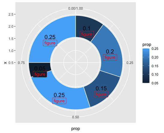
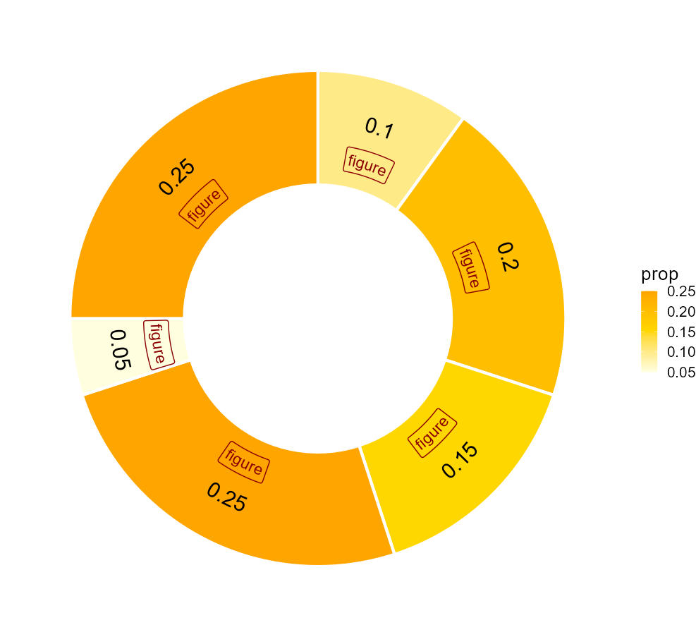
As it can be seen, the value labels are placed in the middle of each category. Now, I need to place figures rigth below each of the value labels. I can't just paste the new object to the value because the colors of the text and the figure are different. Therefore, I imagined that there should be a way to use the the coordinates of the value labels (x = 2, y= lab.ypos = cumsum(prop) - 0.5*prop) to position the figures as I need.
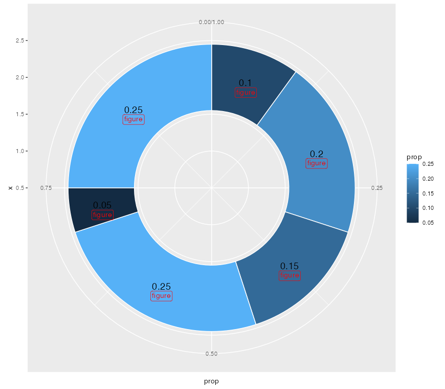
I added the new figure with geom_label and gave it a position that is proportional to the XY coordinates of the value labels. However, I haven't suceeded. This is an example of what I have tried.
ig_5 <- data.frame(
  category = c("A", "B", "C", "D", "E", "F"),
  prop = c(0.1, 0.2, 0.15, 0.25, 0.05, 0.25)) %>%
  mutate(lab.ypos = cumsum(prop) - 0.5*prop,
         lab.ypos2 = cumsum(prop) + 0.3*prop)


ggplot(ig_5, aes(x = 2, y = prop, fill = prop)) +
  geom_bar(stat = "identity", color = "white") +
  coord_polar(theta = "y", start = 0) +
  geom_text(aes(y = lab.ypos, label = prop), color = "black", size = 5) +
  geom_label(aes(y = lab.ypos,
                 x = c(1.85, 2.1, 2.2, 1.95, 1.8, 1.85),
                 label = "figure"),
             color = 'red') +
  xlim(.5, 2.5)
And the result I obtained:


