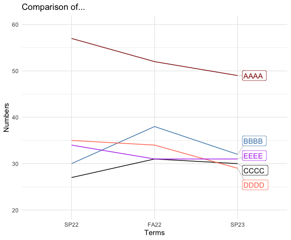
My line plot is suitable except my labels overlap too much. I realize their respective datapoints are close, but is there a way to pretty up the label spacing?
My data and code:
library(ggplot2)
library(directlabels) #geom_dl

#Original df
df <- data.frame(names=c('AAAA', 'BBBB', 'CCCC', 'DDDD', 'EEEE'),SP22=c(57, 30, 27, 35, 34),FA22=c(52, 38, 31, 34, 31),SP23=c(49, 32, 30, 29, 31))

#df to long format
longdf <- melt(df, id='names')

last.bumpup <- list("last.points","bumpup")

#lineplot
longdf %>%
ggplot() +
  geom_line(aes(x=variable, y=value, group=names, color=names)) +
  scale_y_continuous(n.breaks=6, limits=c(20, 60)) +
  scale_color_manual(values=c("darkred", "steelblue","black", "coral1",
                              "darkorchid2")) +
  geom_dl(aes(x=variable, y=value,label=names, color= names),
          method="last.bumpup", cex=0.8) +
  labs(title = "Comparison of...") +
  xlab(label = "Terms") +
  ylab(label = "Numbers") +
  #scale_colour_discrete(guide="none") +
  theme_minimal() +
  theme(legend.position = "none")
What do I need to add to/change in my code to achieve prettier label positioning? My sincere thanks in advance.


