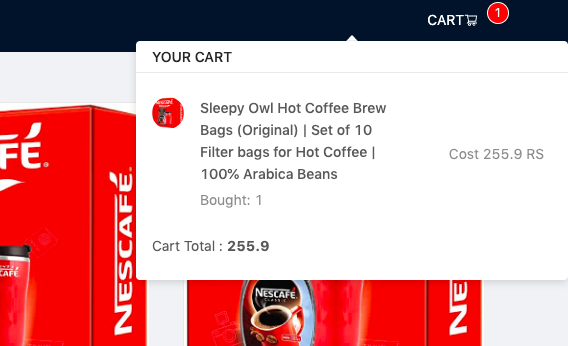
Antd popover opening in two diffrent widths depending on the order in which the actions are performed
Asked Answered
J

3

5

sorry if the title is confusing, I don't know how else to put it into words.

I am currently learning react and made this application using antd UI components. I have this feature where I can add and remove items to the cart.

i am using a popover to list the cart items once they are added to the cart. The popover opens in two different widths depending on the order in which i do actions in the application.

if i open cart before adding any thing to the cart the cart opens in narrow container without any contents in the cart. and if i add anything to cart after that. then the cart stays narrow and doesnt fit everything properly.

enter image description here

now reload the page

add items to the cart before opening the popover. now you can see the popover is wider and can fit all the contets properly.

correct

How can i solve this issue ?

reproducable example: Code Sandbox link

github: https://github.com/nijeesh4all/reactShopping

Jennijennica answered 26/2, 2020 at 10:49 Comment(2)
Fix you sandboxTorietorii
sorry? is the sandbox link not working ?Jennijennica
J
2

Thanks to u/jnforja on reddit.

<Popover      
placement="bottom"      
title="YOUR CART"      
content={listContent}      
trigger="click"      
key={this.boughtItems() > 0}>

changing the key once the items are added to the popover seems to fix the propblem.

In my opinion, what is happening should be considered a bug on the popover component. Before clicking for the first time on the cart, the popover element doesn't exist in the DOM. After user's first click, the popover DOM element will be created and positioned in the screen taking into account the current dimensions of the content. The created DOM element will be reused even when the content changes. However, when the content changes, the dimensions and positioning are not correctly recalculated (The reason why I'm not sure). So when we change from an empty list to a list with at least one item, the result is what we've seen.

One solution to fix this, is to tell React not to reuse the dom element it has created. We can do that through the key attribute. Since, from what I've seen, we can re-use the popover dom element for situations where we have 1 or more elements, I made the popover key to be the same in those situations. Thus, the expression this.boughtItems() > 0

If you want to know more about the key property, you can read this part of React's documentation.

This is self-promotion, but this article I wrote about using the key attribute to animate images on change might also help you understand how this key attribute thing works.

Jennijennica answered 27/2, 2020 at 7:14 Comment(0)
H
9

We can use overlayStyle property to give a fixed width and height as follow:

<Popover
  visible={true}
  overlayStyle={{
    width: "20vw"
  }}
  content={<div>HELLO</div>}
>
  hello
</Popover>
Halfbaked answered 23/2, 2021 at 8:17 Comment(1)
Great undocumented solution :)Eldenelder
J
2

Thanks to u/jnforja on reddit.

<Popover      
placement="bottom"      
title="YOUR CART"      
content={listContent}      
trigger="click"      
key={this.boughtItems() > 0}>

changing the key once the items are added to the popover seems to fix the propblem.

In my opinion, what is happening should be considered a bug on the popover component. Before clicking for the first time on the cart, the popover element doesn't exist in the DOM. After user's first click, the popover DOM element will be created and positioned in the screen taking into account the current dimensions of the content. The created DOM element will be reused even when the content changes. However, when the content changes, the dimensions and positioning are not correctly recalculated (The reason why I'm not sure). So when we change from an empty list to a list with at least one item, the result is what we've seen.

One solution to fix this, is to tell React not to reuse the dom element it has created. We can do that through the key attribute. Since, from what I've seen, we can re-use the popover dom element for situations where we have 1 or more elements, I made the popover key to be the same in those situations. Thus, the expression this.boughtItems() > 0

If you want to know more about the key property, you can read this part of React's documentation.

This is self-promotion, but this article I wrote about using the key attribute to animate images on change might also help you understand how this key attribute thing works.

Jennijennica answered 27/2, 2020 at 7:14 Comment(0)
G
0

You can use Property overlayClassName in the tooltip of antd. You can refer to the link below: https://ant.design/components/tooltip/#API

<Popover
   overlayClassName="wrapper-notify"
   placement="bottomRight"
   title={<span>Thông báo</span>}
   content={}
   trigger="click"
>

.ant-popover.wrapper-notify {
  position: fixed;
  width: 300px;
}
Gump answered 3/5, 2022 at 14:25 Comment(0)

© 2022 - 2025 — McMap. All rights reserved.