How to set input full width on mobile devices in tailwind?
Asked Answered
D

3

5

I have a input element. It takes 50% of available parent width. Property w-6/12.

How to set width full for mobile devices?

Code is:

<div class="mt-4 width">
   <div class="mt-1 w-6/12 sm:w-full">
      <select
         type="email"
         autocomplete="email"
         class="block w-full bg-gray input-color-gray input-color-gray font-roboto-100 rounded-md sm:text-sm p-3 bg-gray pr-4"
         >
         <option>Make</option>
      </select>
   </div>
</div>

I have tried:

sm:w-full

Dharana answered 23/3, 2022 at 19:17 Comment(0)
T
10

The solution to your problem is to swap w-6/12 and sm:w-full. They should instead be w-full sm:w-6/12.


Here's why:

The tailwind documentation specifically recommends against targeting against smaller screens by using the sm prefix. Tailwind is "mobile first" which means your default (un-prefixed) styles should be your mobile styles, and you should provide overrides to address the extra space at higher resolutions.

Here's a screenshot from the mobile-first section of the tailwind documentation:

Don't use sm to target mobile devices

The takeaway from this is that tailwind breakpoints operate as >= operators. When you prefix sm, it means "anything at 640px or more". Here's the table of tailwind size breakpoints:

tailwindcss responsive design breakpoints

Tasteless answered 23/3, 2022 at 19:26 Comment(0)
H
1

Try to change the order of the classes, Example:

 <div class="mt-4 width">
    <div class="mt-1 w-full md:w-6/12">
       <select
          type="email"
          autocomplete="email"
          class="block w-full bg-gray input-color-gray input-color-gray font-roboto-100 rounded-md sm:text-sm p-3 bg-gray pr-4"
          >
          <option>Make</option>
       </select>
    </div>
 </div>

This way you can customize the width according to your requirements and include other breakpoints to the class: sm, md, lg, xl

Hackworth answered 23/3, 2022 at 19:27 Comment(0)
T
0

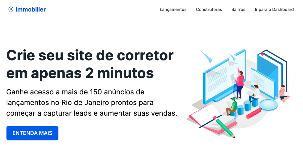
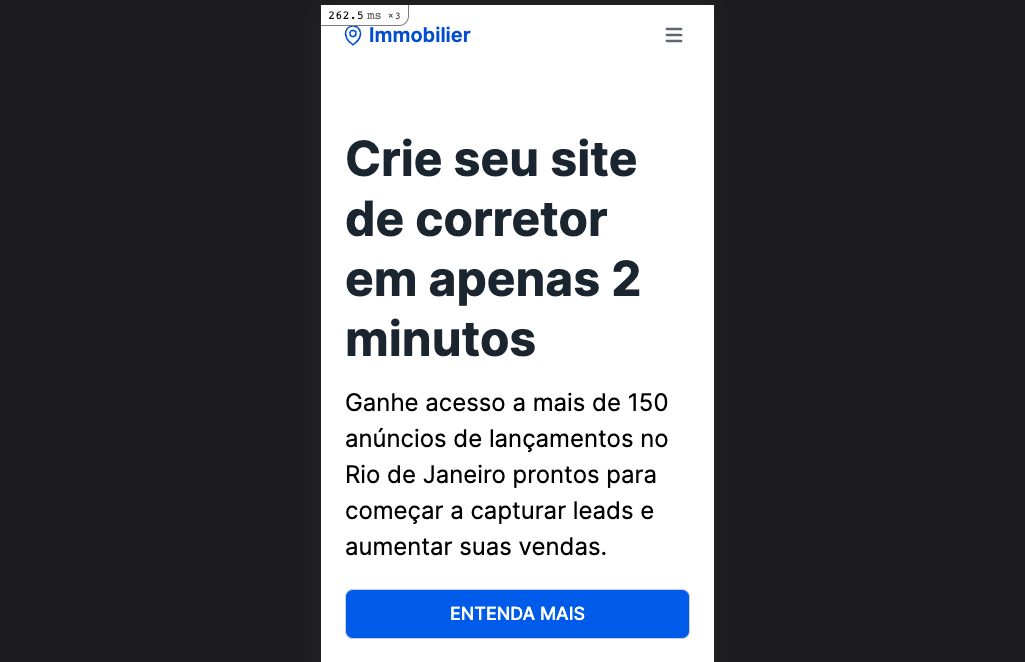
What you want is to make it full on mobile devices, so you can use w-full. But also adjust it back to the regular size on larger screens, in which case you can rely on w-fit. So the final result would be to use both at once: w-full md:w-fit

To illustrate, I've used it for the responsive blue button below.

And the code:

<div class="pt-12 pb-24">
  <div class="px-3 mx-auto flex flex-wrap flex-col md:flex-row items-center">
    <!--Left Col-->
    <div class="flex flex-col w-full md:w-3/5 justify-center items-start">
      <h1 class="my-4 text-5xl font-bold leading-tight">Crie seu site de corretor em apenas 2 minutos</h1>
      <p class="leading-normal text-2xl mb-6">
        Ganhe acesso a mais de 150 anúncios de lançamentos no Rio de Janeiro prontos para começar a capturar leads e
        aumentar suas vendas.
      </p>
      <!--Responsive Blue Button-->
      <a href="/premium" class="btn-primary btn-lg w-full md:w-fit">Entenda mais</a>
    </div>
    <!--Right Col-->
    <div class="w-full md:w-2/5 py-6 text-center">
      <img class="w-full" src="https://www.tailwindtoolbox.com/templates/hero.png" />
    </div>
  </div>
</div>

Desktop

enter image description here

Mobile

enter image description here

Hope that's useful info.

Tuber answered 14/11, 2022 at 20:47 Comment(0)

© 2022 - 2024 — McMap. All rights reserved.