Tailwind CSS height screen in mobile browser
Asked Answered
C

3

5

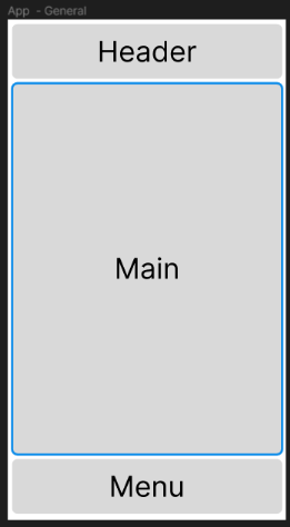
I have an app that is full-screen

<div class="h-screen flex flex-col">
    <div>
        Header
    </div>
    <div class="flex-1 overflow-y-auto">
        Main
    </div>
    <div>
        Footer
    </div>
</div>

This works normally.

works expected in full-screen mode

In the phone browser, the bottom menu goes out of the page. However it works in full-screen mode.

works unsuccessfully with mobile browser dynamic header

I could not solve it. Can anyone guide me?

Cantilena answered 3/11, 2023 at 19:12 Comment(1)
Since 2023, dynamic values (h-dvh, h-lvh, h-svh) have become part of the default template. See: Reference and PR #11317.Hortensiahorter
A
8

tldr: change h-screen to h-dvh

Update

@rozsazoltan pointed out that we don't need to use an arbitrary value (h-[100dvh]) anymore because in Tailwind v3.4.0 they added svh, lvh, and dvh values to the default height/min-height/max-height theme.

I was scrolling through YouTube and Kevin Powell happened to release a video about these units just a day after my original answer. He does a good job at explaining these dynamic units and some of the resons why you'd want to use one over the other. I'd suggest giving it a watch.

Original:

This is beacuse of the way mobile browsers handle the vh unit. You can read more about it in this Stack Overflow answer to a similar issue.

While the answer I shared suggests using Javascript to set the height, there is a relatively new css unit called dvh. It works like vh, but it takes into account the url bar that shows/hides on mobile browsers when you scroll. It's current support is promising.

Simply changing the h-screen to h-[100dvh] should solve your issue.

This is also a good answer to reference when if you want to learn more about dvh and the other dynamic units.

Ailurophile answered 15/11, 2023 at 20:35 Comment(2)
Since 2023, dynamic values (h-dvh, h-lvh, h-svh) have become part of the default template. See: Reference and PR #11317.Hortensiahorter
I had no idea they added those, thanks for sharing!Ailurophile
H
2

As @Rico mentioned, instead of using h-screen (height: 100vh), you can use h-[100dvh] (height: 100dvh). Tailwind CSS injected this into the default template in PR #11317, so you can now refer to the h-dvh (similarly height: 100dvh) class.

Hortensiahorter answered 26/9 at 8:49 Comment(0)
C
1

bro you just need to use h-[100dvh] for full screen size

Chaumont answered 15/11, 2023 at 20:56 Comment(1)
You answered the same as the accepted answer, only shorter and without explanation.Hortensiahorter

© 2022 - 2024 — McMap. All rights reserved.