custom color for provinces in specific country using raster package in R
Asked Answered
P

1

0

I am trying to label(green, red, blue) each province in a specific country as follows:

library(raster)
library(rgeos)
library(ggplot2)
library(dplyr)

iran <- getData("GADM", country = "Iran", level = 1)
map <- fortify(iran)
map$id <- as.integer(map$id)
dat <- data.frame(id = 1:(length(iran@data$NAME_1)),
                  state = iran@data$NAME_1,
                  pr = c(530, -42, 1673, 75, 206, 544, 1490, 118, 75,
                         40, 105, 191, 111, 810, 609, 425, 418, 550, 40, 425, -54, -50,
                         16, 18, 133,425, -30, 241,63, 191,100))
dat <- dat %>% mutate(color_province = case_when(pr <= 50 ~ 'green',
                                                 pr > 150 ~ 'red',
                                                 TRUE ~ 'yellow'))

I want to set custom color to each province (using 'dat' data frame) as follows:

> dat
   id                       state   pr color_province
1   1                      Alborz  530            red
2   2                     Ardebil  -42          green
3   3                     Bushehr 1673            red
4   4 Chahar Mahall and Bakhtiari   75         yellow
5   5             East Azarbaijan  206            red
6   6                     Esfahan  544            red
7   7                        Fars 1490            red
8   8                       Gilan  118         yellow
9   9                    Golestan   75         yellow
10 10                     Hamadan   40          green
11 11                   Hormozgan  105         yellow
12 12                        Ilam  191            red
13 13                      Kerman  111         yellow
14 14                  Kermanshah  810            red
15 15                   Khuzestan  609            red
16 16  Kohgiluyeh and Buyer Ahmad  425            red
17 17                   Kordestan  418            red
18 18                    Lorestan  550            red
19 19                     Markazi   40          green
20 20                  Mazandaran  425            red
21 21              North Khorasan  -54          green
22 22                      Qazvin  -50          green
23 23                         Qom   16          green
24 24             Razavi Khorasan   18          green
25 25                      Semnan  133         yellow
26 26      Sistan and Baluchestan  425            red
27 27              South Khorasan  -30          green
28 28                      Tehran  241            red
29 29             West Azarbaijan   63         yellow
30 30                        Yazd  191            red
31 31                      Zanjan  100         yellow

For example 'Ardebil' province is green and 'Zanjan' province is yellow. I used 'Fill' argument to set custom color and here is my try:

map_df <- inner_join(map, dat, by = "id")
centers <- data.frame(gCentroid(iran, byid = TRUE))
centers$state <- dat$state
ggplot() +  
geom_map(data = map_df, map = map_df,
         aes(map_id = id, group = group, 
             x = long, y = lat,
             fill = as.factor(color_province))) +
geom_text(data = centers, aes(label = state, x = x, y = y), size = 3) +
coord_map() +
labs(x = "", y = "", title = "Iran Province") +
scale_fill_manual(values = list(yellow = 'yellow', red = 'red', green = 'green'))

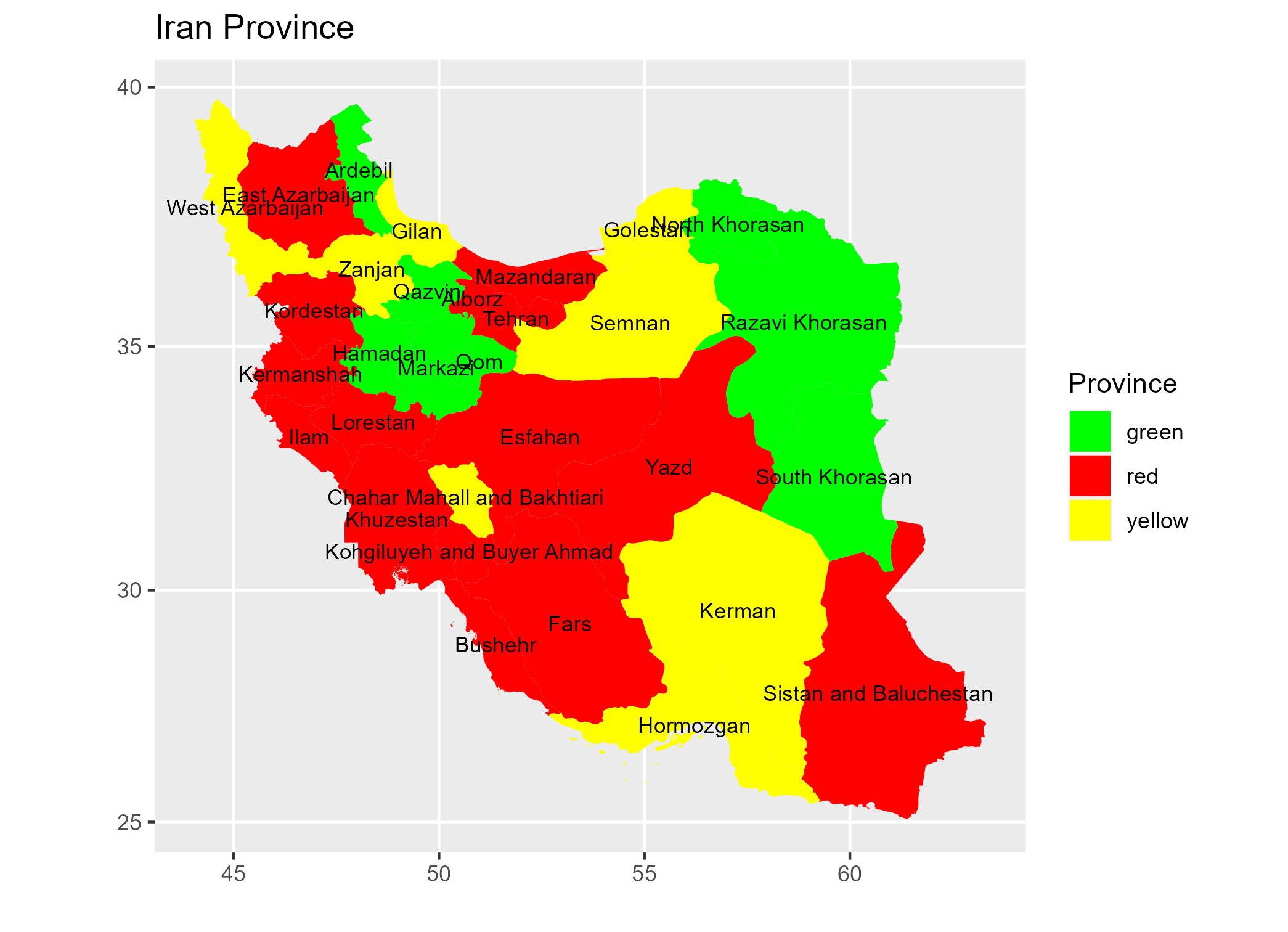
enter image description here

But it does not work. According to the 'dat' data frame 'Ardebil' is 'green' but it is red on map. Is there a better way to do this?

Pascal answered 15/11, 2021 at 6:33 Comment(3)
Your code looks fine. But I suspect there is an issue with your data, e.g. when I do map_df <- filter(map_df, id == 2) to filter the map for Ardebil (id = 2) I got a map showing me Hamadan instead. But I wasn't able to figure out what's the issue.Subgenus
One possible story is that id information is not identical between map and dat. You may want to check that part.Apartment
@Apartment Could you see #69986914 ?Pascal
A
1

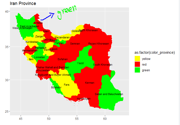
Since you asked me, I had a quick look of your code. Your assumption for id was basically wrong. When you used fortify(), you probably thought id was assigned in a normal sequence (e.g., 1 to n). But this was not the case. Just run unique(mymap$id). You will see what I mean. So what was the solution? When you create dat, you need rownames(iran@data). Once this is done, you should be fine. See the final graphic.

library(raster)
library(rgeos)
library(ggplot2)
library(dplyr)

iran <- getData("GADM", country = "Iran", level = 1)
mymap <- fortify(iran) # This is the hidden cause
mymap$id <- as.integer(mymap$id)

dat <- data.frame(id = rownames(iran@data), # This is what you needed.
                  state = iran@data$NAME_1,
                  pr = c(530,-42,1673,75,206,544,1490,118,75,
                         40,105,191,111,810, 609,425,418,550, 40, 425, -54,-50,
                         16, 18, 133,425, -30, 241,63, 191,100)) %>% 
       mutate(color_province = case_when(pr <= 50 ~ 'green',
                                         pr > 150 ~ 'red',
                                         TRUE ~ 'yellow'))

mydf <- inner_join(mymap, dat, by = "id")
centers <- data.frame(gCentroid(iran, byid = TRUE))
centers$state <- dat$state

ggplot() +
geom_map(data = mydf,
         map = mydf,
         aes(map_id = id, group = group,
             x = long, y = lat,
             fill = as.factor(color_province))) +
geom_text(data = centers,
          aes(label = state, x = x, y = y), size = 3) +
coord_map() +
labs(x = "", y = "", title = "Iran Province") +
scale_fill_manual(values = c("green", "red", "yellow"),
                  name = "Province") 

enter image description here

Apartment answered 16/11, 2021 at 13:21 Comment(0)

© 2022 - 2024 — McMap. All rights reserved.