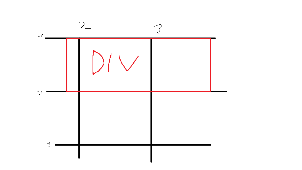
It's possible to "offset" a div in a css grid as in the image ?
How to offset a div in a css grid
provide margin left, eg: margin-left:20px; –
Matamoros
Why not just set appropriate column sizes, rather than trying to offset the elements to occupy more/less/different grid areas? –
Averett
is it about display:grid? did you set any columns and any span values to children ...? Do you have an example of your HTML & CSS showing your issue ? Please clarify your question. There is no offset in CSS grid, only spanning through columns and/or rows –
Whooper
Yes i have a code on wich i'm working but It could be off-topic because i have a problem setting an Image and a paragraph in this div –
Recency
Consider negative margin:
.container {
  display: grid;
  grid-template-columns: repeat(3, 1fr);
  grid-template-rows: repeat(3, 1fr);
  width: 500px;
  height: 200px;
  border: 1px solid;
}

.box {
  grid-column: 2/3;
  margin-left: -20px;
  margin-right: -80px;
  background: red;
}
.box-alt {
  grid-column: 2/3;
  grid-row:2;
  background: blue;
}
<div class="container">
<div class="box"></div>
<div class="box-alt"></div>
</div> I believe the trick here is to set a template of 6 or 9 columns and play withe spanning . regular spanning 2 or 3 cols and the one looking offset spanning an extra col or stating at col 4 instead 3 ... ;) –
Whooper
@G-Cyr true but I saw it differently ... I thought he will first define the element inside the grid using row/column and then we want to add some offsets to it :) –
Milreis
<div class="container">
    <div class="area1"></div>
    <div class="area2"></div>
</div>
.container{
    display: grid;
    grid-template: 1fr / repeat(3, 1fr);
    grid-template-areas: "area1 offset area2";
}
.area{
    width: 100%;
    height: 40px;
}
.area1{
    background-color: red;
}
.area2{
    background-color: yellow;
}
If you are using Mozilla's guide in this link, you can use empty div like this as offset div:
<div class="container">
   <div class="row">

       <!-- Empty/Offset Div Here -->
       <div class="col-xl-2"> </div>

       <div class="col-xl-8">
          <!-- Content Here -->
       </div>
   </div>
</div>
doesn't this assume using bootstrap which isn't mentioned in the original post? –
Seanseana
It doesn’t use Bootstrap, on the contrary, it replaces it with grid system. –
Photokinesis
.col-xl-8 is defined where? –
Seanseana I followed getbootstrap.com/docs/4.0/layout/grid/#grid-options for grid options value. In Mozilla’s post, it defines custom column classes, like
@media (min-width: 1200px) { .col-lg-12 { grid-column: span 12 } Then I defined col-xl-* class since it is upto you to define your custom classes. –
Photokinesis I see - their guide also provides CSS which you may want to include. –
Seanseana
© 2022 - 2024 — McMap. All rights reserved.
