How do I set dot sizes and colors for a plotly express scatter_geo?
Asked Answered
E

2

5

I have an example data set (pd.read_clipboard(sep='\s\s+') to read into pandas):

    reference   Latitude    Longitude   year    subreg  dot_size
date                        
1984-08-05  1985-12     24.033333   59.916667   1984    62  80
1984-08-02  1985-11     22.316667   91.716667   1984    62  80
1984-07-30  1985-10     6.266667    3.183333    1984    62  80
1984-05-12  1985-9  1.816667    3.200000    1984    93  80
1983-04-10  1985-8  6.983333    -58.033333  1983    93  80
1983-03-02  1985-7  4.133333    6.950000    1983    57  80
1981-04-10  1985-1  13.500000   42.716667   1981    22  80
1980-02-13  1985-5  16.541667   111.241667  1980    51  80

Which I plotted on scatter_geo using Plotly express

subreg = df['subreg']
px.scatter_geo(df, lat=df['Latitude'], lon=df['Longitude'], color='subreg', height=600)

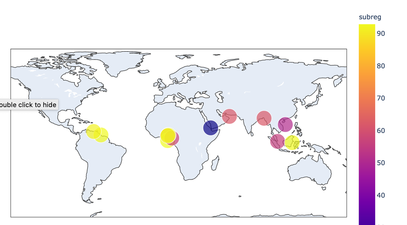
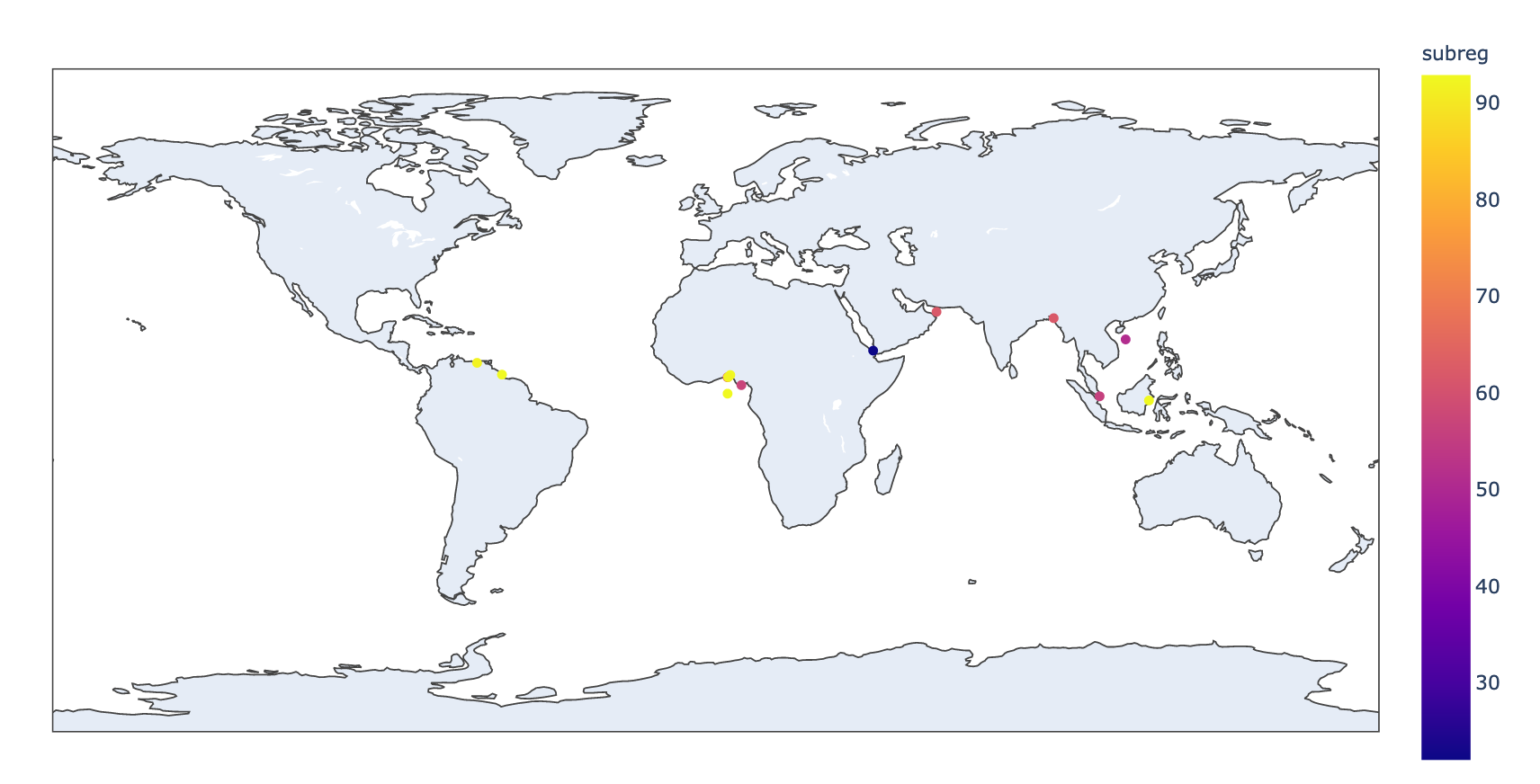
But I found the dots too small to read effectively, particularly the four yellow dots on a white portion of the map.

enter image description here

I've tried a number of hacks to change the size such as df['dot_size'] = 80 which had some success in that they were larger but I seem to only have the option of no dots (dotsize = 0) tiny dot (size not passed as parameter) or huge dot (dotsize >=1), with no other options available.

enter image description here

The Plotly Express scatter_geo documentation indicates this as possible:

size (str or int or Series or array-like) – Either a name of a column in data_frame, or a pandas Series or array_like object. Values from this column or array_like are used to assign mark sizes.

What am I missing about controlling the size of the dots? Also, how do I effectively set the colors?

Easting answered 14/9, 2020 at 2:27 Comment(0)
B
7

An alternative to switching to go.Scattergeo() is to modify fig after generating it from px.scatter_geo(). This worked for me:

import pandas as pd
import plotly.express as px

df = pd.DataFrame(dict(lat=[24, 22], lon=[60, 92], subreg=[62, 93]))
fig = px.scatter_geo(df, lat="lat", lon="lon", color="subreg")
fig.update_traces(marker=dict(size=50))
fig.show()

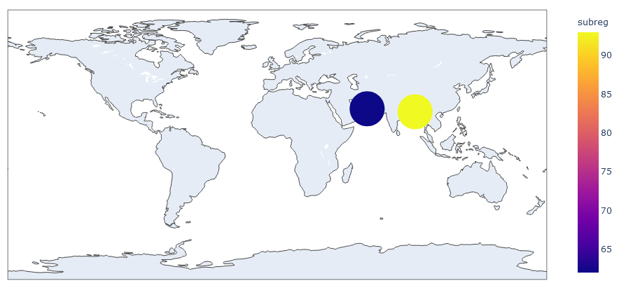
It looks like this:

enter image description here

Bogoch answered 8/3, 2021 at 15:57 Comment(1)
Very nice answer. Worked for px.scatter as well.Bucky
V
5

As far as I know, the color and size parameters in px.scatter_geo only will take the name of a column, and then uses that data to set the sizes or colors. So if you pass in 'subreq' to color or size, it will make the color and size dependent on that column from the dataframe.

I would suggest you use plotly.graph_objects if you want more control. You can do something like

import plotly.graph_objects as go

fig = go.Figure(go.Scattergeo(
    lat=df['Latitude'],
    lon=df['Longitude'],
    marker=dict(color=list(range(6)),
                colorscale='viridis',
                size=50)
))
fig.show()

This way you can set the size/color as a constant (e.g. set size=50), or set it as a list, one for each point. Plotly interprets color as a range, and the actual colors are determined by a colorscale, see here. Hope that helped

Viveca answered 14/9, 2020 at 2:57 Comment(0)

© 2022 - 2024 — McMap. All rights reserved.