Bar charts connected by lines / How to connect two graphs arranged with grid.arrange in R / ggplot2
Asked Answered
L

2

5

At Facebook research, I found these beautiful bar charts which are connected by lines to indicate rank changes: Facebook's solution
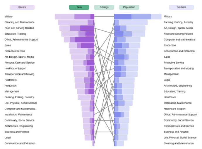
https://research.fb.com/do-jobs-run-in-families/

I would like to create them using ggplot2. The bar-chart-part was easy:

library(ggplot2)
library(ggpubr)
state1 <- data.frame(state=c(rep("ALABAMA",3), rep("CALIFORNIA",3)), 
                 value=c(61,94,27,10,30,77), 
                 type=rep(c("state","local","fed"),2),
                 cumSum=c(rep(182,3), rep(117,3)))
state2 <- data.frame(state=c(rep("ALABAMA",3), rep("CALIFORNIA",3)), 
                 value=c(10,30,7,61,94,27), 
                 type=rep(c("state","local","fed"),2),
                 cumSum=c(rep(117,3), rep(182,3)))
fill <- c("#40b8d0", "#b2d183", "#F9756D")

p1 <- ggplot(data = state1) +
  geom_bar(aes(x = reorder(state, value), y = value, fill = type), stat="identity") +
  theme_bw() + 
  scale_fill_manual(values=fill) + 
  labs(x="", y="Total budget in 1M$") +
  theme(legend.position="none", 
        legend.direction="horizontal", 
        legend.title = element_blank(),
        axis.line = element_line(size=1, colour = "black"),
        panel.grid.major = element_blank(), 
        panel.grid.minor = element_blank(),
        panel.border = element_blank(), panel.background = element_blank()) +
  coord_flip() 

p2 <- ggplot(data = state2) +
  geom_bar(aes(x = reorder(state, value), y = value, fill = type), stat="identity") +
  theme_bw() + 
  scale_fill_manual(values=fill) + labs(x="", y="Total budget in 1M$") +
  theme(legend.position="none", 
        legend.direction="horizontal", 
        legend.title = element_blank(),
        axis.line = element_line(size=1, colour = "black"),
        panel.grid.major = element_blank(), 
        panel.grid.minor = element_blank(),
        panel.border = element_blank(), 
        panel.background = element_blank()) +
  scale_x_discrete(position = "top") + 
  scale_y_reverse() +
  coord_flip()

p3 <- ggarrange(p1, p2, common.legend = TRUE, legend = "bottom")

But I couldn't come up with a solution to the line-part. When adding lines e.g. to the left side by

p3 + geom_segment(aes(x = rep(1:2, each=3), xend = rep(1:10, each=3), 
                   y = cumSum[order(cumSum)], yend=cumSum[order(cumSum)]+10), size = 1.2)

The problem is that the lines will not be able to cross over to the right side. It looks like this: My version so far

Basically, I would like to connect the 'California' bar on the left with the Caifornia bar on the right.

To do that, I think, I have to get access to the superordinate level of the graph somehow. I've looked into viewports and was able to overlay the two bar charts with a chart made out of geom_segment but then I couldn't figure out the right layout for the lines:

subplot <- ggplot(data = state1) + 
  geom_segment(aes(x = rep(1:2, each=3), xend = rep(1:2, each=3), 
                   y = cumSum[order(cumSum)], yend =cumSum[order(cumSum)]+10), 
               size = 1.2)

vp <- viewport(width = 1, height = 1, x = 1, y = unit(0.7, "lines"), 
               just ="right", "bottom"))
print(p3)
print(subplot, vp = vp)

Help or pointers are greatly appreciated.

Liebman answered 17/10, 2018 at 22:24 Comment(4)
alluvial may be a helpful package for plotting the lines (the remaining challenge would be figuring out how to plot the bar chart over the alluvial plot)Cleisthenes
Cool question! Consider also uploading your plot to attract more attention.Familiar
If you can calculate the relative x/y center location of the bar charts you could use something along the lines of grid.lines(x = unit(c(.475, .525), "npc"), y = unit(c(.7, .4), "npc")), but that seems incredibly hacky...Familiar
Can you elaborate on how you expect the lines to be joined? cumSum isn't defined in your code.Tightwad
S
8

This is a really interesting problem. I approximated it using the patchwork library, which lets you add ggplots together and gives you an easy way to control their layout—I much prefer it to doing anything grid.arrange-based, and for some things it works better than cowplot.

I expanded on the dataset just to get some more values in the two data frames.

library(tidyverse)
library(patchwork)

set.seed(1017)

state1 <- data_frame(
  state = rep(state.name[1:5], each = 3),
  value = floor(runif(15, 1, 100)),
  type = rep(c("state", "local", "fed"), times = 5)
)

state2 <- data_frame(
  state = rep(state.name[1:5], each = 3),
  value = floor(runif(15, 1, 100)),
  type = rep(c("state", "local", "fed"), times = 5)
)

Then I made a data frame that assigns ranks to each state based on other values in their original data frame (state1 or state2).

ranks <- bind_rows(
  state1 %>% mutate(position = 1),
  state2 %>% mutate(position = 2)
)  %>%
  group_by(position, state) %>%
  summarise(state_total = sum(value)) %>%
  mutate(rank = dense_rank(state_total)) %>%
  ungroup()

I made a quick theme to keep things very minimal and drop axis marks:

theme_min <- function(...) theme_minimal(...) +
  theme(panel.grid = element_blank(), legend.position = "none", axis.title = element_blank())

The bump chart (the middle one) is based on the ranks data frame, and has no labels. Using factors instead of numeric variables for position and rank gave me a little more control over spacing, and lets the ranks line up with discrete 1 through 5 values in a way that will match the state names in the bar charts.

p_ranks <- ggplot(ranks, aes(x = as.factor(position), y = as.factor(rank), group = state)) +
  geom_path() +
  scale_x_discrete(breaks = NULL, expand = expand_scale(add = 0.1)) +
  scale_y_discrete(breaks = NULL) +
  theme_min()
p_ranks

For the left bar chart, I sort the states by value and turn the values negative to point to the left, then give it the same minimal theme:

p_left <- state1 %>%
  mutate(state = as.factor(state) %>% fct_reorder(value, sum)) %>%
  arrange(state) %>%
  mutate(value = value * -1) %>%
  ggplot(aes(x = state, y = value, fill = type)) +
    geom_col(position = "stack") +
    coord_flip() +
    scale_y_continuous(breaks = NULL) +
    theme_min() +
    scale_fill_brewer()
p_left

The right bar chart is pretty much the same, except the values stay positive and I moved the x-axis to the top (becomes right when I flip the coordinates):

p_right <- state2 %>%
  mutate(state = as.factor(state) %>% fct_reorder(value, sum)) %>%
  arrange(state) %>%
  ggplot(aes(x = state, y = value, fill = type)) +
    geom_col(position = "stack") +
    coord_flip() +
    scale_x_discrete(position = "top") +
    scale_y_continuous(breaks = NULL) +
    theme_min() +
    scale_fill_brewer()

Then because I've loaded patchwork, I can add the plots together and specify the layout.

p_left + p_ranks + p_right +
  plot_layout(nrow = 1)

You may want to adjust spacing and margins some more, such as with the expand_scale call with the bump chart. I haven't tried this with axis marks along the y-axes (i.e. bottoms after flipping), but I have a feeling things might get thrown out of whack if you don't add a dummy axis to the ranks. Plenty still to mess around with, but it's a cool visualization project you posed!

Shied answered 18/10, 2018 at 2:48 Comment(0)
T
5

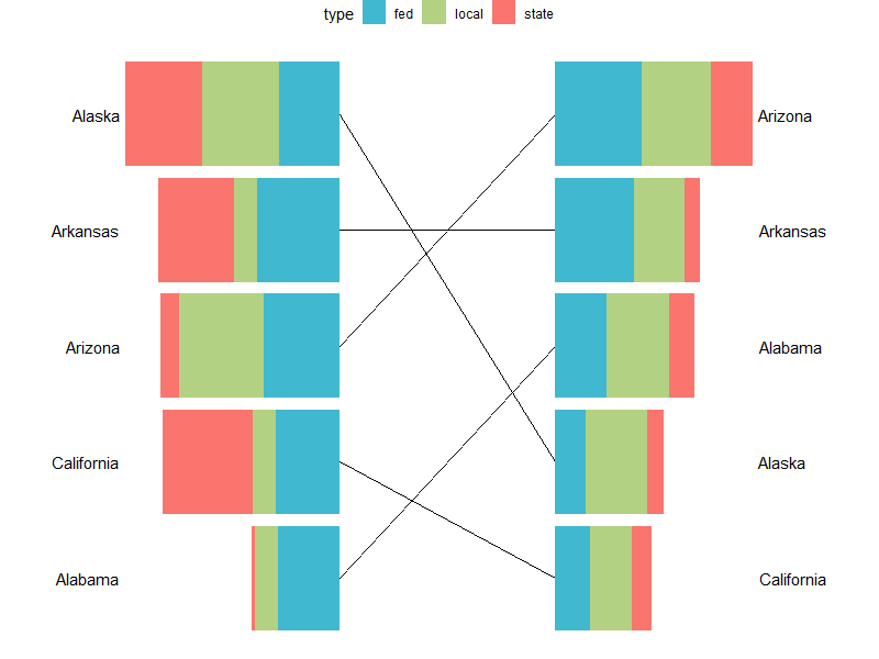
Here's a pure ggplot2 solution, which combines the underlying data frames into one & plots everything in a single plot:

Data manipulation:

library(dplyr)    
bar.width <- 0.9

# combine the two data sources
df <- rbind(state1 %>% mutate(source = "state1"),
            state2 %>% mutate(source = "state2")) %>%

  # calculate each state's rank within each data source
  group_by(source, state) %>%
  mutate(state.sum = sum(value)) %>%
  ungroup() %>%
  group_by(source) %>%
  mutate(source.rank = as.integer(factor(state.sum))) %>%
  ungroup() %>%

  # calculate the dimensions for each bar
  group_by(source, state) %>%
  arrange(type) %>% 
  mutate(xmin = lag(cumsum(value), default = 0),
         xmax = cumsum(value),
         ymin = source.rank - bar.width / 2,
         ymax = source.rank + bar.width / 2) %>% 
  ungroup() %>%

  # shift each data source's coordinates away from point of origin,
  # in order to create space for plotting lines
  mutate(x = ifelse(source == "state1", -max(xmax) / 2, max(xmax) / 2)) %>%
  mutate(xmin = ifelse(source == "state1", x - xmin, x + xmin),
         xmax = ifelse(source == "state1", x - xmax, x + xmax)) %>%

  # calculate label position for each data source
  group_by(source) %>%
  mutate(label.x = max(abs(xmax))) %>%
  ungroup() %>%
  mutate(label.x = ifelse(source == "state1", -label.x, label.x),
         hjust = ifelse(source == "state1", 1.1, -0.1))

Plot:

ggplot(df, 
       aes(x = x, y = source.rank,
           xmin = xmin, xmax = xmax, 
           ymin = ymin, ymax = ymax,
           fill = type)) +
  geom_rect() +
  geom_line(aes(group = state)) +
  geom_text(aes(x = label.x, label = state, hjust = hjust),
            check_overlap = TRUE) +

  # allow some space for the labels; this may be changed
  # depending on plot dimensions
  scale_x_continuous(expand = c(0.2, 0)) +
  scale_fill_manual(values = fill) +

  theme_void() +
  theme(legend.position = "top")

plot

Data source (same as @camille's):

set.seed(1017)

state1 <- data_frame(
  state = rep(state.name[1:5], each = 3),
  value = floor(runif(15, 1, 100)),
  type = rep(c("state", "local", "fed"), times = 5)
)

state2 <- data_frame(
  state = rep(state.name[1:5], each = 3),
  value = floor(runif(15, 1, 100)),
  type = rep(c("state", "local", "fed"), times = 5)
)
Tightwad answered 18/10, 2018 at 10:44 Comment(0)

© 2022 - 2024 — McMap. All rights reserved.