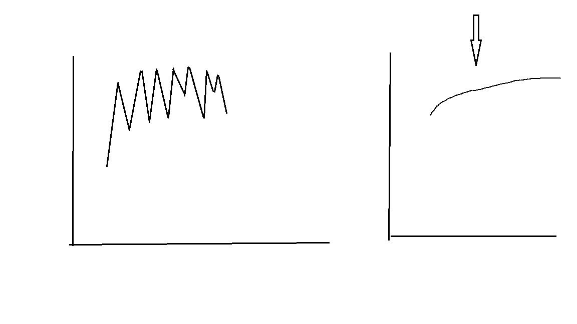
Right now i have a large data set with temperature going up and down all the time. I want to smoothen my data and plot the best fit line with all the temperature,
Here is the data:
weather.data
    date        mtemp
1   2008-01-01  12.9
2   2008-01-02  12.9
3   2008-01-03  14.5
4   2008-01-04  15.7
5   2008-01-05  17.0
6   2008-01-06  17.8
7   2008-01-07  20.2
8   2008-01-08  20.8
9   2008-01-09  21.4
10  2008-01-10  20.8
11  2008-01-11  21.4
12  2008-01-12  22.0
and so on............... til 2009 Dec 31
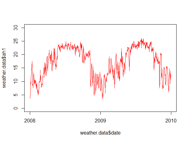
My current graph looks like this and my data fit a regression like either the running average or loess:
However, when I tried to fit it with the running average, it became like this:

Here is my code.
plot(weather.data$date,weather.data$mtemp,ylim=c(0,30),type='l',col="orange")
par(new=TRUE)
Could anyone give me a hand?


