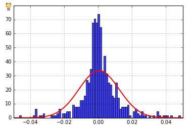
I have data (pd Series) that looks like (daily stock returns, n = 555):
S = perf_manual.returns
S = S[~((S-S.mean()).abs()>3*S.std())]

2014-03-31 20:00:00    0.000000
2014-04-01 20:00:00    0.000000
2014-04-03 20:00:00   -0.001950
2014-04-04 20:00:00   -0.000538
2014-04-07 20:00:00    0.000764
2014-04-08 20:00:00    0.000803
2014-04-09 20:00:00    0.001961
2014-04-10 20:00:00    0.040530
2014-04-11 20:00:00   -0.032319
2014-04-14 20:00:00   -0.008512
2014-04-15 20:00:00   -0.034109
...
I'd like to generate a probability distribution plot from this. Using:
print stats.normaltest(S)

n, bins, patches = plt.hist(S, 100, normed=1, facecolor='blue', alpha=0.75)
print np.sum(n * np.diff(bins))

(mu, sigma) = stats.norm.fit(S)
print mu, sigma
y = mlab.normpdf(bins, mu, sigma)
plt.grid(True)
l = plt.plot(bins, y, 'r', linewidth=2)

plt.xlim(-0.05,0.05)
plt.show()
I get the following:
NormaltestResult(statistic=66.587382579416982, pvalue=3.473230376732532e-15)
1.0
0.000495624926242 0.0118790391467
I have the impression the y-axis is a count, but I'd like to have probabilities instead. How do I do that? I've tried a whole lot of StackOverflow answers and can't figure this out.


seaborn? Several built-in compound plots that might include what you're looking for (once you figure out the data meaning). – Iselaisenberg