Spacer not working with Form inside a VStack
Asked Answered
S

5

5

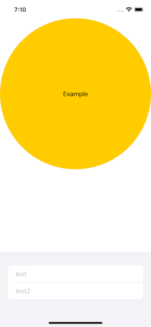
I'm trying to get a circle on top with the form content down below, right above my TabBar. I can somewhat force this by using .frame() but I'm not a big fan of that. It seems like there should be a simpler way in order to align it to the bottom.

My understanding is that Spacer() should push the form towards the bottom and leave the circle at the top, but this doesn't seem to be the case.

var body: some View {
    VStack {
        Circle().foregroundColor(.yellow).overlay(VStack {
            Text("Example")
        }).foregroundColor(.primary)
        
        Spacer()
        
        Form {
            TextField("test", text: $a)
            TextField("test2", text: $b)
        }
    }
}

Symbolist answered 18/8, 2021 at 16:46 Comment(1)
SwiftUI cannot not guess which size of circle you want, so consume all available space. You have to specify size you need or limit space to consume.Maidie
G
12

All scrollviews (which Form is built on) and shapes (which Circle is) are greedy in layout priority. They don't have inner limitations, so if there's available space they are going take it.

Spacer is greedy too, but it has lower priority than other greedy views.

That's why in your case, Form and Circle are splitting available space 50% to 50%.

You need to restrict both their heights to make it work.

VStack {
    Circle().foregroundColor(.yellow).overlay(VStack {
        Text("Example")
    }).foregroundColor(.primary)
    .frame(height: UIScreen.main.bounds.width)
    
    Spacer()
    
    Form {
        TextField("test", text: $a)
        TextField("test2", text: $b)
    }.frame(height: 150)
}

Grosbeak answered 18/8, 2021 at 17:20 Comment(3)
Instead of .frame(height: UIScreen.main.bounds.width) an aspectRatio should workGosse
That is working great, the only thing I'm confused on is how you can specify fixed values for height and width yet it will remain with the same overall place on the screen for multiple devices? Does iOS use that value as relative to the screen it's displaying on?Symbolist
@JoeScotto It may look kind of the same, but it's actually isn't. Spacer height will be different depending on a device, but we don't need to be pixel perfect here(it's just impossible), we only need to have same proportions and layout logics so app will looks the same to user. Also some particular items, like TextField, will have same height on all devices, which makes it easier to layoutGrosbeak
C
2

Set max width for spacer

        Spacer()
            .frame(maxWidth: .infinity)
        }
Crack answered 6/11, 2023 at 10:34 Comment(0)
B
1

A way to solve this, which will look good on all devices since there are no fixed sizes, is to use SwiftUI-Introspect.

You can achieve this by getting the Form's contentHeight from the underlying UITableView.

Example:

struct ContentView: View {
    @State private var a = ""
    @State private var b = ""

    @State private var contentHeight: CGFloat?

    var body: some View {
        VStack {
            Circle()
                .foregroundColor(.yellow)
                .overlay(
                    VStack {
                        Text("Example")
                    }
                )
                .foregroundColor(.primary)
                .aspectRatio(1, contentMode: .fit)

            Spacer()

            Form {
                TextField("test", text: $a)

                TextField("test2", text: $b)
            }
            .introspectTableView { tableView in
                contentHeight = tableView.contentSize.height
            }
            .frame(height: contentHeight)
        }
    }
}

Result:

Result

Banded answered 18/8, 2021 at 18:10 Comment(0)
T
1

You can simply use:

Spacer()
    .layoutPriority(1)
Tartarous answered 27/9, 2023 at 12:59 Comment(0)
V
0

Forms, like Lists, expand to take all available space in the parent view. If you switch your simulator to Light Mode, you will see a light gray area behind your TextFields. That is your form.

What then happens is the Spacer() gets compressed to nothing. The easiest way to fix this is to put a .frame(height: ???) on the Spacer() will cause the spacer to take up that amount of space and push your Form down. One caveat is that it also pushes your circle up and shrinks it as well. I don't know if this will be an issue for you as this is a simple minimal, reproducible example, but if needed, you could set a .frame() on the upper view.

        VStack {
            Circle().foregroundColor(.yellow).overlay(VStack {
                Text("Example")
            }).foregroundColor(.primary)
            .frame(width: 300)
            
            Spacer()
                .frame(height: 100)
            
            Form {
                TextField("test", text: $a)
                TextField("test2", text: $b)
            }
        }
Vaudeville answered 18/8, 2021 at 17:20 Comment(0)

© 2022 - 2024 — McMap. All rights reserved.