lower bound to kernel density estimation with seaborn for matplotlib in python
Asked Answered
F

3

5

I have a collection of measured tree diameters and am trying to plot a histogram with a kernel density estimation superimposed on top in python. The seaborn module lets me do this quite simply but I can find no way of specifying that the kde should be zero for negative numbers (since trees can't have negative tree diameters).

what I've got at present is this:

seaborn.distplot(C77_diam, rug=True, hist=True, kde=True)

I've looked at seaborn.kdeplot which is the function that distplot calls but can't find anything useful. Does anyone know if this can be done with seaborn, and if not if it can be done with matplotlib more generally?

I only started using seaborn because i couldn't figure out how to overlay a kde pyplot.plot() with a pyplot.hist().

Furrier answered 16/2, 2014 at 10:18 Comment(1)
The closest are the clip and cut options for kdeplot which allow you to exclude outliers but, that's not really what I want.Furrier
D
15

There's no way to force the density estimate to zero with that function, but you can always set the axis limits such that the left side of the plot starts at 0.

seaborn.distplot(C77_diam, rug=True, hist=True, kde=True).set(xlim=(0, max_diam))
Distressful answered 16/2, 2014 at 18:1 Comment(1)
I thought that might be the case. Thanks for the xlim idea, it's not quite what I wanted, but it'll do.Furrier
A
2

This is an old thread, but it came up first in my google search for a similar question. In case anyone else lands here like I did: In the years since this question was answered seaborn has added the cut and clip parameters. Setting the cut parameter to 0 truncates the kernel estimations at 0:

seaborn.distplot(C77_diam, rug=True, hist=True, kde=True, cut=0)
Accuse answered 13/11, 2023 at 19:54 Comment(0)
P
1

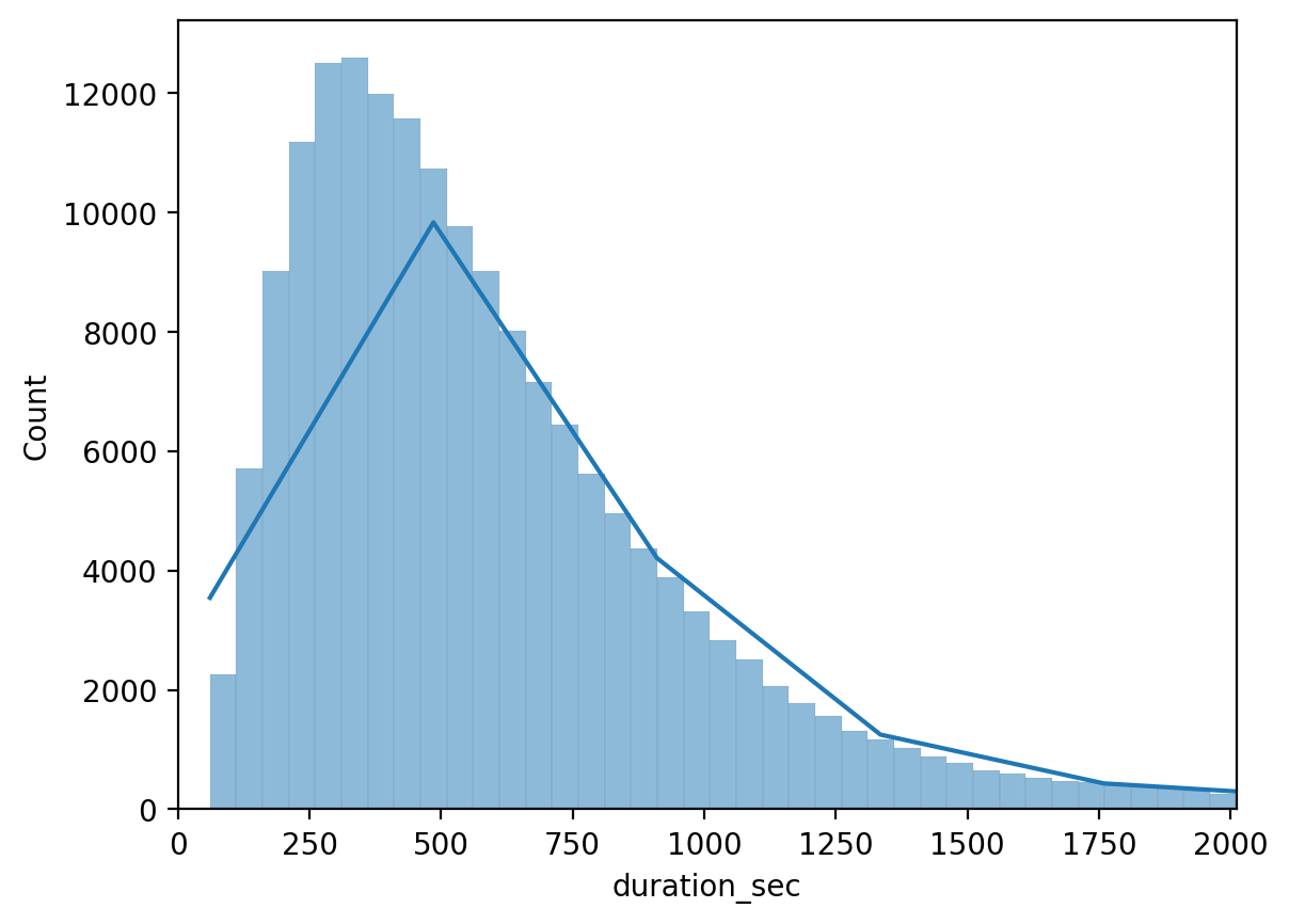
If there is an outlier, using .set(xlim=(0, max_diam)) may make the distribution line have pointy edges like in this image:enter image description here

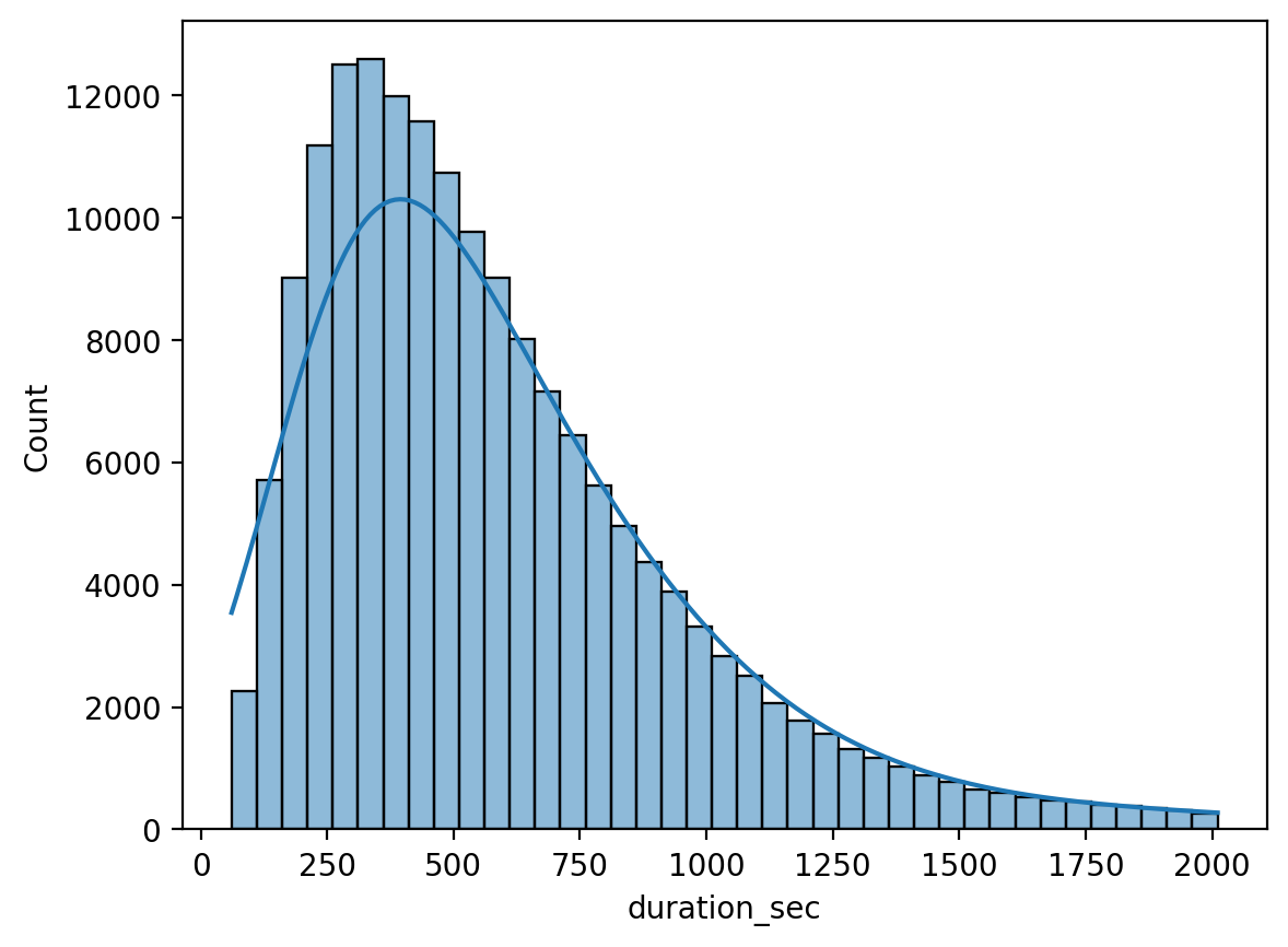
I found a different answer here that uses kde=True, kde_kws=dict(clip=(bins.min(), bins.max())) to limit the calculations to just what is specified in the bins. It generates a smoother distribution line like this:enter image description here

Example usage: sns.histplot(df, x='duration_sec',bins=bins,kde=True, kde_kws=dict(clip=(bins.min(), bins.max())));

Pilfer answered 15/9 at 11:5 Comment(0)

© 2022 - 2024 — McMap. All rights reserved.