facebook customer chat messenger positioning
Asked Answered
Y

9

5

So i've installed the facebook customer chat messenger plugin on my website and it works fine, but i need to align it to the left of the website and if possible also change the size of the button (it's huge).

my code is:

<script>(function(d, s, id) {
              var js, fjs = d.getElementsByTagName(s)[0];
              if (d.getElementById(id)) return;
              js = d.createElement(s); js.id = id;
              js.src = 'https://connect.facebook.net/pt_PT/sdk/xfbml.customerchat.js';
              fjs.parentNode.insertBefore(js, fjs);
            }(document, 'script', 'facebook-jssdk'));</script>

<div class="fmessengerBtn">
<script>
    window.fbAsyncInit = function() {
        FB.init({
            xfbml: true,
            version : "v3.2"
        });
    };
    </script>
    <div id="fb-root"></div>
    <div class="fb-customerchat" 
        attribution=setup_tool 
        page_id="372545293082246" 
        theme_color="#0b9bb8" 
        greeting_dialog_display="fade" 
        greeting_dialog_delay="60" 
        ref="home" 
        logged_in_greeting="Fale conosco" 
        logged_out_greeting="Fale conosco">
    </div>
    </div>

i've tried just using CSS to align the container div but then the chat window will stay on the right side of the website... Is there some sort of attribute or option to set the thing to go to the left side instead? Surely this is something lots of other people have needed to do

also, the greeting_dialog_delay option doesn't seem to be working

Yoko answered 6/2, 2019 at 15:46 Comment(2)
There aren’t any other styling options than what is listed in the documentation - you’d have to try and manipulate it via your own stylesheet somehow (for as much as that is possible, most of that is inside an iframe.) It is probably more important to Facebook that users can easily and quickly recognize this component everywhere, than to give you detailed options to customize it.Disabled
@Disabled left or right alignment doesn't seem like a "detailed option to customise it" i mean surely not all websites have an empty spot for the messenger in the bottom right corner, some people like to have a "scroll to top" button down there or whatever. i think this is one of those options that should be available by default with any plugin like thisYoko
E
11

The following CSS seems to work for now (since the classes may change) :

/* ***************
 * FB on left side 
 ******************/

/* This is for the circle position */
.fb_dialog.fb_dialog_advanced {
    left: 18pt;
}

/* The following are for the chat box, on display and on hide */
iframe.fb_customer_chat_bounce_in_v2 {
    left: 9pt;
}
iframe.fb_customer_chat_bounce_out_v2 {
    left: 9pt;
}
Elissa answered 20/3, 2019 at 12:18 Comment(0)
D
5

I tweaked the code a bit in case you want to keep the widget on the bottom right but just move it over to the left some (e.g., it is blocking another element)

.fb_dialog.fb_dialog_advanced {
    right: 18pt;
  margin-right: 50px;
}
iframe.fb_customer_chat_bounce_in_v2 {
    right: 9pt;
   margin-right: 50px;
}
iframe.fb_customer_chat_bounce_out_v2 {
    right: 9pt;
   margin-right: 50px;
}
Dickenson answered 30/5, 2019 at 16:40 Comment(0)
P
3

To add to @Cubakos' answer to get the bounce in and bounce out animation:

@keyframes fb_bounce_in_v2 {
    0% {
        opacity: 0;
        transform: scale(0, 0);
        transform-origin: bottom left;
    }

    50% {
        transform: scale(1.03, 1.03);
        transform-origin: bottom left;
    }

    100% {
        opacity: 1;
        transform: scale(1, 1);
        transform-origin: bottom left;
    }
}

@keyframes fb_bounce_out_v2 {
    0% {
        opacity: 1;
        transform: scale(1, 1);
        transform-origin: bottom left;
    }

    100% {
        opacity: 0;
        transform: scale(0, 0);
        transform-origin: bottom left;
    }
}
Poitiers answered 9/1, 2020 at 5:31 Comment(1)
I think this answer is outdated...☹️Balkh
G
2

Try Below Code

.fb_dialog {
position: -webkit-sticky !important;
position: fixed !important;
bottom: 95px !important;
right: 30px !important;
}
Griffith answered 4/12, 2019 at 11:1 Comment(0)
P
2

Combining @Cubakos & @Kuttoosan answers + made an adjust for positing the chat bubble as the posted methods here no longer work for me.

/* The following is for the chat bubble */
.fb_dialog_content>iframe {
  left: 18pt;
}

/* The following are for the chat box, on display and on hide */
iframe.fb_customer_chat_bounce_in_v2 {
  left: 9pt;
}

iframe.fb_customer_chat_bounce_out_v2 {
  left: 9pt;
}

/* The following are for the bounce in/out animations */
@keyframes fb_bounce_in_v2 {
  0% {
    opacity: 0;
    transform: scale(0, 0);
    transform-origin: bottom left;
  }

  50% {
    transform: scale(1.03, 1.03);
    transform-origin: bottom left;
  }

  100% {
    opacity: 1;
    transform: scale(1, 1);
    transform-origin: bottom left;
  }
}

@keyframes fb_bounce_out_v2 {
  0% {
    opacity: 1;
    transform: scale(1, 1);
    transform-origin: bottom left;
  }

  100% {
    opacity: 0;
    transform: scale(0, 0);
    transform-origin: bottom left;
  }
}
Prevalent answered 22/8, 2020 at 3:12 Comment(0)
C
2

After a while, I realize that we couldn't customize this plugin by CSS because

"it isn’t possible to style the elements contained within an iframe as you would with normal HTML elements on your site due to HTML limitations" https://wordpress.org/support/topic/resize-messenger-icon/

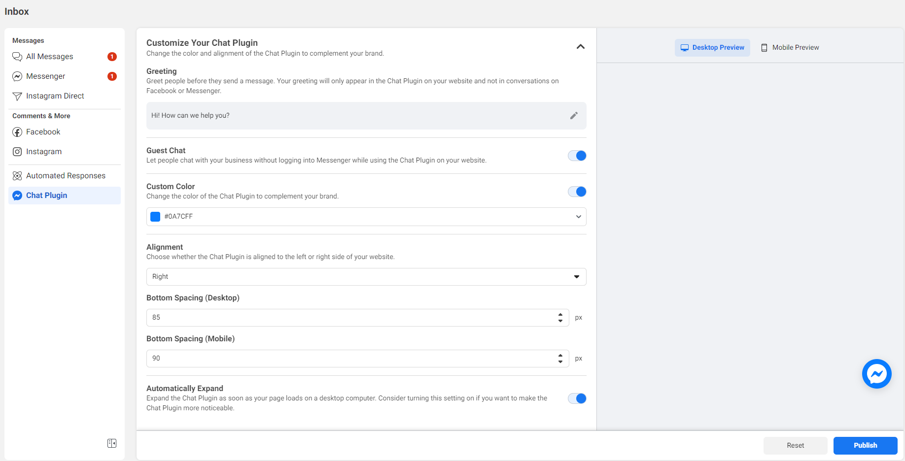
You can customize your chat plugin from Facebook Business Page only 3 things:

  • Alignment
  • Color
  • Bottom Spacing (For mobile and desktop)

enter image description here

In the right page, there are preview pages for you to know how your customization will be like.

After customizing, don't forget to click on the button PUBLISH to save your changes.

It's a pain that you cannot resize the logo or styling it more easily, I hope that Facebook in the future can give us more power to do what we want with this.

Carbonous answered 28/4, 2021 at 14:21 Comment(2)
I agree we do not have the flexibility to style the elements within the iframe. But we are still able to style the positioning of the iframe. Helpful for X axis positioning of the iframe since the fb settings only enables the position direction.Faddist
@BowieChang Yes it's a good pointCarbonous
I
2

Was Simple as below.

.fb_dialog.fb_dialog_advanced iframe {
    right: auto !important;
    left: 2rem;
    bottom: 2rem !important;
}
Impersonality answered 1/9, 2021 at 4:26 Comment(1)
Note that you have to target the iframe inside it.Impersonality
L
1

The Proper way to modify the chat plugin is this scr

Here's how I edited it properly. Get ready for a fun navigation run! (learn from our wasted 4h)

  1. Switch or login as your facebook professional account
  2. Go to your facebook page
  3. Click "Manage"
  4. On the left menu, under "Your Tools" click "Messaging Settings" (Now it takes you to a new dashboard)
  5. On the left menu click inbox again (even though you are already on it)
  6. Click top gear icon.
  7. Under "Inbox Modes", click "View all settings"
  8. Select Chat plugin on the left
  9. Scroll down and voila... now you can edit the chat positioning
Lindly answered 28/11, 2022 at 23:51 Comment(0)
C
0

For server-side rendering, if you are using Next.js, you can use its built-in server-side rendering capabilities to ensure that the chat box and its associated CSS styles are fully loaded and rendered before the page is served to the user

<Head>
    <style>{`
    @media screen and (max-width: 767px) {
  .fb_dialog_content > iframe {
    bottom: 144px !important;
    margin-right: -3px !important;
  }

  iframe.fb_customer_chat_bounce_in_v2 {
    bottom: 144px !important;
  }
  
  iframe.fb_customer_chat_bounce_out_v2 {
    bottom: 144px !important;
  }
}`}</style>
  </Head>
Chilblain answered 3/4, 2023 at 8:11 Comment(0)

© 2022 - 2024 — McMap. All rights reserved.