I'm tyring to make a graph in which different link categories have different colors, I use this as input (sample):
  source target  cat weight
  <fctr> <fctr>     <chr>  <dbl>
1  human  water       1     30
2  human  water       2     49
3  human  water       3     2
4  human  water       4    14
5  human  water       5    19
Then I transform this data into nodes, links and link.colors and plot it, this will give:

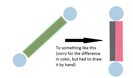
As you can see in this network, the links are plotted on top of each other. Therefore, it's impossible to see the differences. So I want to plot the links next to each other instead of on top of each other.
I can't provide the whole dataset, but a simple example will but sufficient I suppose:
library(networkD3)

link <- read.table(text = '  source target value
                        1      0      1    30
                        2      0      1    49', header = T)

nodes <- read.table(text = '   name group size
                              1 human     1   10
                              2 water     1   10', header = T)

link.colors <- c('#e6194b','#3cb44b')

network <- forceNetwork(Links = link, Nodes = nodes,
                        Source = "source", Target = "target",
                        Value = "value", NodeID = "name",
                        Group = "group", opacity = 0.6,
                        zoom = TRUE, charge = -60,
                        fontSize = 15, linkColour = link.colors)

# plot in R
network

# zooming doesn't work in Rstudio for me so I write it to a file instead of plotting it
# and then open it in my browser
saveNetwork(network, file = 'network_example.html', selfcontained = FALSE)
This code will produce the left network, whereas I want to have something like the right one

not sure if this is R or more JS, therefore I tagged it as both

saveNetwork()workaround,... – Surveying