Position fixed on Chrome mobile causing issues when scrolling
Asked Answered
C

1

6

I've been researching this issue for the past hour and saw similar questions but I'm not sure they are the same exact problem. Probably related, somehow, but none of the answers helped me fixed my issue.

Take the following code:

<html>
    <head>
        <meta name="viewport" content="width=device-width, initial-scale=1">
        <style>
            html, body {
                height: 100%;
                margin: 0;
            }

            main {
                background-color: orange;
                height: 1500px;
                margin: 50px;
            }

            footer {
                background-color: green;
                position: fixed;
                height: 50px;
                left: 100px;
                right: 100px;
                bottom: 100px;
            }
        </style>
    </head>
    <body>
        <main></main>
        <footer></footer>
    </body>
</html>

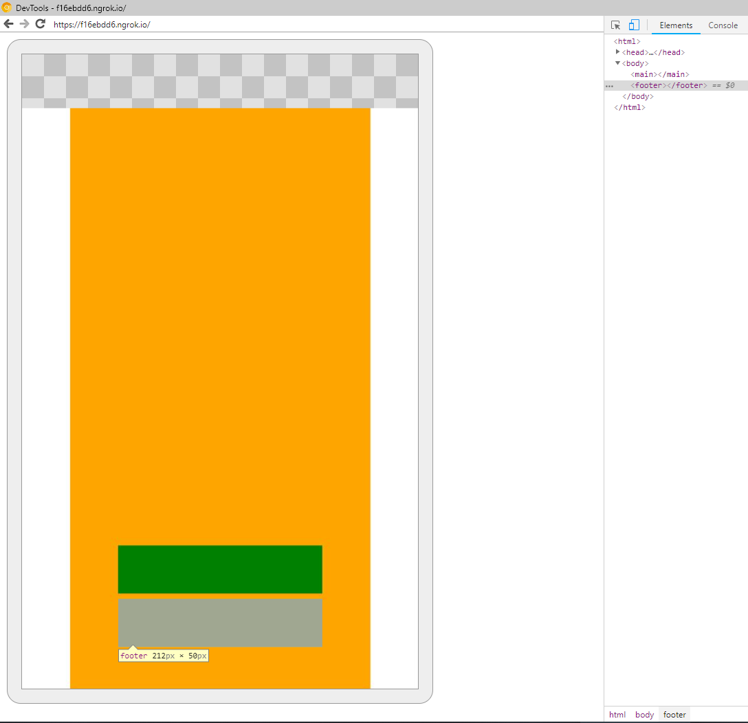
This hard to debug because I can't seem to reproduce the problem consistently. I keep scrolling up and down - making the address bar on Chrome for Android show and hide - eventually, something like this will happen:

enter image description here

For some reason, the footer is being drawn in the correct place (as specified by the CSS), but Chrome dev tools detect the element in a different position (not always like the screenshot shows).

Why is this a problem?

Assume I have clickable elements inside footer, the clickable area for those elements will be in the "blue" area detected by Chrome dev tools and not where the footer is actually being drawn (the green area), as it should because that's what the user is seeing.

Thoughts?

Cale answered 18/6, 2018 at 16:52 Comment(10)
I recommend including a 'viewport meta tag' in head to properly scale pages to mobile devices. I would then remove the 1500px height value and set it to 'min-height: 100%;'Mellen
@Mellen The tag is there already, and the 1500px is to simulate content.Cale
I also have this issue, you can find my SO post here #50938606 and I've also reported it as a bug to Chromium here bugs.chromium.org/p/chromium/issues/… perhaps chime in on the bug report to help get it noticed. This is definitely a browser bug and it only seems to occur on Android.Phosphorescent
@james.brndwgn Will do, have you found any kind of workaround?Cale
@RicardoAmaral sadly no. Because it's caused by the browser address bar hiding/showing and only affects fixed positioned elements I don't think there is any possible workaround - bar switching to position: absolute if that's an option OR locking down the viewport so that the address bar never hides.Phosphorescent
The only reliable workaround is to prevent Chrome from hiding the address bare. It can be implemented as described in the following StackOverflow article: #18061808Abandon
@james.brndwgn Check my answer below (posted on the Chromium issue too) and see if the workaround works for you too :)Cale
@RicardoAmaral Interesting and good effort. Unpractical for myself though as I have a lot more fixed elements across the site than just a bottom nav. I'm also using Vue so directly manipulating the DOM isn't a good idea, though I could do it the Vue way. At this point, as it's quite a breaking bug (on their flagship OS & browser), I'm hoping Google will address it quickly.Phosphorescent
@james.brndwgn Unless it becomes a performance bottleneck, you can just create a directive and apply it to all fixed elements. Not that unpractical. When Google fixes the issue, you just remove the directive. Remembering that Google can fix the bug, but some people may not have automatic updates on their browser.Cale
looks like this should be fixed with the latest chrome release - v68 bugs.chromium.org/p/chromium/issues/detail?id=848122Giovannagiovanni
C
0

EDIT: I'm leaving the code below here but I found out it's not working as I expected it. It did work during my initial testing but our QA found out that it didn't actually solve the issue we were having. Right now, there's no workaround that I'm aware and we need to wait for the Chromium team to fix the issue on their end.

NON-WORKING SOLUTION

I might just have found a workaround for this Chromium bug.

I'm testing this on a Pixel 2 running the latest Chrome, not sure how nice it will work for lower end devices. It's a bit ugly but it seems to work for me.

What I did was replace the offending element with itself (forcing a browser re-layout) on the touchend event. This is perfect because the problem only exists on mobile and touchend does not exist on desktop versions.

const body = document.getElementsByTagName('body');
const button = document.getElementsByTagName('button');
const footer = document.getElementsByTagName('footer');

function randomColor() {
  button[0].style.backgroundColor =
    `hsla(${Math.random() * 360}, 100%, 50%, 1)`;
}

window.addEventListener('touchend', function() {
  body[0].replaceChild(footer[0], footer[0]);
}, false);
* {
  box-sizing: border-box;
}

html,
body {
  height: 100%;
  margin: 0;
}

main {
  background-color: orange;
  height: 3000px;
  margin: 10px;
}

footer {
  border: 2px solid green;
  background-color: greenyellow;
  display: flex;
  justify-content: center;
  align-items: center;
  position: fixed;
  left: 0;
  bottom: 0;
  width: 100%;
  height: 100px;
}

button {
  border: 2px solid black;
  background-color: white;
  cursor: pointer;
  width: 50%;
  height: 70%;
}
<main></main>
<footer>
  <button onclick="randomColor()">CLICK ME!</button>
</footer>
Cale answered 21/6, 2018 at 14:33 Comment(0)

© 2022 - 2024 — McMap. All rights reserved.