matplotlib: assign color to a radius
Asked Answered
R

1

6

I have a 3D plot of a disk. Now I would like to plot the surface in color depending on values which are stored in an array. E.g. the radius of the disk is 300mm. The array could like:

arr = np.array([[ 114.28, 14],
                [ 128.57, 16],
                [ 142.85,19],
                [ 157.13,20],
                [ 171.41,21],
                [ 185.69,22],
                [ 199.97,24],
                [ 214.25,27],
                [ 228.53,29],
                [ 242.81,30],
                [ 257.09,31],
                [ 271.37,34],
                [ 288.65,35],
                [ 299.93,36],
                [ 300,38]])

It means for radius = 114.28 I have the value 14. I would like to plot a circle at radius 114.28 in a color (e.g. blue). Second radius is 128.57. For the radius 128.57 the value 16 is assigned. That means I would like to plot a circle in another color e.g. orange on the surface of the plot and so on.

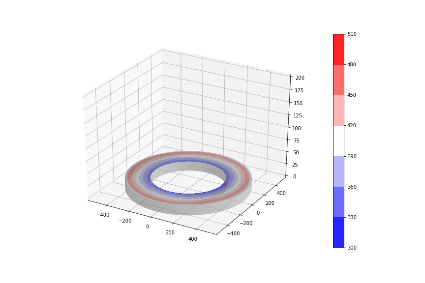
I tried to solve this problem with contourplot (thanks to bazingaa). It looks exactly as I want it to. Unfortunately I just realized that this is not really the solution to my problem. Maybe I should explain what I'm trying to achieve. I want to show how certain parameters, such as speed, are distributed along the disc. In this case the contourplot would also correct, as the speed increases towards the outside. But it can also happen that parameters have to be visualized which do not always increase towards the outside continuously. I tried this scenario and simply made a value in the middle of the array smaller than the value before it (I changed the value 27 to 14 from arr) and nothing happens in the contourplot except that the legend changes. Maybe contourplot is not the right approach after all? Maybe I have to draw individual circles and assign colors to them and interpolate between the circles to fill the gaps.

contourplot

import numpy as np
import matplotlib as mlp
import matplotlib.pyplot as plt
import mpl_toolkits.mplot3d.axes3d as axes3d

ri = 100
ra = 300
h=20

# input xy coordinates
xy = np.array([[ri,0],[ra,0],[ra,h],[ri,h],[ri,0]])
# radial component is x values of input
r = xy[:,0]
# angular component is one revolution of 30 steps
phi = np.linspace(0, 2*np.pi, 2000)
# create grid
R,Phi = np.meshgrid(r,phi)
# transform to cartesian coordinates
X = R*np.cos(Phi)
Y = R*np.sin(Phi)
# Z values are y values, repeated 30 times
Z = np.tile(xy[:,1],len(Y)).reshape(Y.shape)


fig = plt.figure()
ax = fig.add_subplot(1, 1, 1, projection='3d')

ax.set_zlim(0,200)
ax.plot_surface(X, Y, Z, alpha=0.5, color='lightgrey', rstride=1, cstride=1)

plt.contourf(X, Y, np.sqrt(X ** 2 + Y ** 2), zdir='z', offset=20, 
             cmap=plt.cm.rainbow)
cbar = plt.colorbar() 
arr = np.array([[ 114.28, 14],
                [ 128.57, 16],
                [ 142.85,19],
                [ 157.13,20],
                [ 171.41,21],
                [ 185.69,22],
                [ 199.97,24],
                [ 214.25,27],
                [ 228.53,29],
                [ 242.81,30],
                [ 257.09,31],
                [ 271.37,34],
                [ 288.65,35],
                [ 299.93,36],
                [ 300,38]])
cbar.ax.set_yticklabels(arr[:,1])

plt.show()

I hope someone can help, it is very important to me. Best regards !

Reinhart answered 4/8, 2018 at 10:9 Comment(2)
You example code is no good. At least provide the code which generates the 3D disk you showed. Neither am I able to reproduce your contour plot. Copy the code above, run it and see what error you getFusspot
You're absolutely right. I adapted the code, now it should work. Sorry for thisReinhart
F
1

Here is one solution. I just added the following lines after your first code whose last line is ax.plot_surface(X, Y, Z, alpha=0.5, color='lightgrey', rstride=1, cstride=1). I didn't use plt.show() yet. P.S.: I increased the density of phi by using phi = np.linspace(0, 2*np.pi, 2000) as initially you had just 20 data points. This is to plot relatively smoother circles.

plt.contourf(X, Y, np.sqrt(X ** 2 + Y ** 2), zdir='z', offset=20, 
             cmap=plt.cm.bwr)
plt.colorbar()
plt.show()

I have chosen z=20 as the height for the contour plot. You can modify it as per your choice.

Following is the resulting plot. Hope it helps you. Viel spass.

enter image description here

Fusspot answered 4/8, 2018 at 21:33 Comment(6)
Thank you for the answer. I guess it is a very good beginning. But there are still a few things I would love to have: is there a possibility to fill the gaps between the circles like in a contourplot ? Is is somehow possible to implement a legend which tells you which color represents which value (also like in a contour plot) ? best regards from germany !Reinhart
A style like in this picture would be perfect: hydrocul.github.io/wiki/numpy/ndarray-create-special.html. Unfortunately it is in chinese so I don't understand how he did it.Reinhart
Bazingaa this is almost what I need... I should look exactely how it look like except of the legend. The legend should show the values which are in the array [see above]. It was should show 15, 19, 20, 22 .....It means at a radius of 300 there is the velocity of 15. At radius of 350 is a velocity of 19 and so on... Hope there is a possibiliy with contourplot because I really like how it looks. Best regards and viel spass to you as well !Reinhart
Well, you can do the following before showing the plot: cbar = plt.colorbar() arr = np.array([[50, 15], [100, 19], [200, 20], [300, 22]]) and cbar.ax.set_yticklabels(arr[:,1]). Since I don't know what is the functional relationship between radius and levels, I don;t know how to fill the complete color bar range with the levels.Fusspot
And again it is almost what I was looking for (we are getting closer) :) The functional relationship between radius and level is velocity. And the array shows this relationship. I tried to insert a array with more values and I got the color bar range filled but unfortunately only to a certain point (to 27) but I have more values (it goes until 38) so it should show the maximum 38. I edited my question, there you can see my new array and a picture of the result I get. Best regards and thank you so much, you helped me really a lot !Reinhart
I edited my question, maybe now it's more understandable what I am looking for^^.Reinhart

© 2022 - 2024 — McMap. All rights reserved.