Is there a way to 'float the labels' on the woocommerce checkout? (like Shopify)
Asked Answered
H

4

6

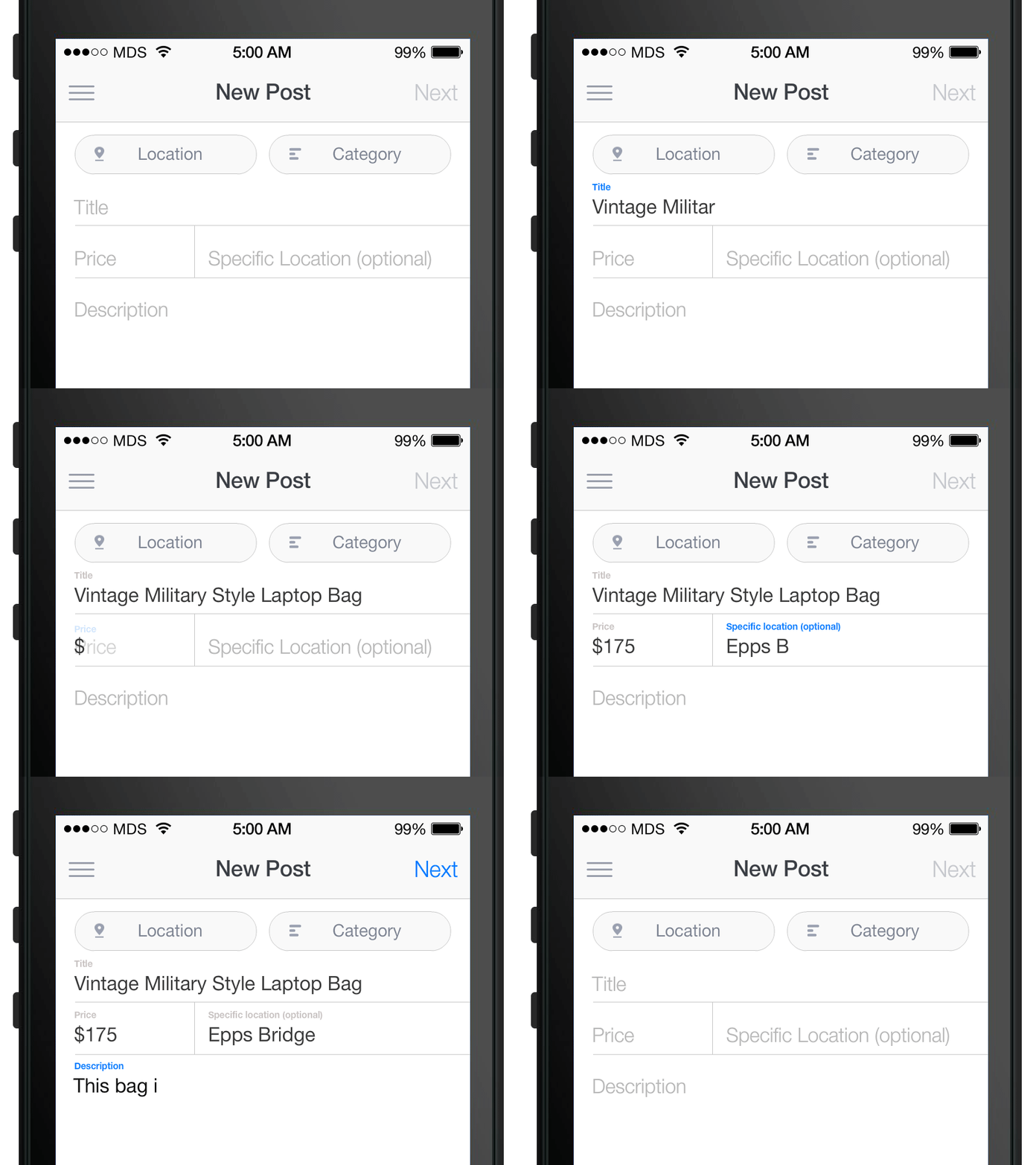
I'm attempting to replicate the experience from the Shopify checkout in my WooCommerce checkout page by animating the labels when the user focuses on a certain input, just like this:

Floating labels - Image from Matt D. Smith

I've tried using input:focus ~ label, but it won't work because the default WooCommerce input is inside a span (.woocommerce-input-wrapper) like this:

<!-- The basic markup for each input -->
<p class="form-row form-row-first validate-required" id="billing_first_name_field" data-priority="10">
    <label for="billing_first_name" class="">Nombre&nbsp;<abbr class="required" title="obligatorio">*</abbr></label>
    <span class="woocommerce-input-wrapper">
        <input type="text" class="input-text " name="billing_first_name" id="billing_first_name" placeholder="" value="" autocomplete="given-name">
    </span>
</p>

<!-- CSS -->
<style>
.woocommerce-billing-fields__field-wrapper .form-row{
    position: relative;
}
.woocommerce-billing-fields__field-wrapper .form-row label{
    position: absolute;
    top: 11px;
    left: 11px;
    padding: 0;
    color: #808080;
    transition: .35s;
}
.woocommerce-billing-fields__field-wrapper .form-row input:focus ~ label{
    top: -8px;
    font-size: 12px;
    font-weight: 500;
}
</style>

Thanks!

Hogback answered 25/1, 2019 at 6:44 Comment(5)
will you please share screenshot, what actually you expected?Lonely
Is Shopify not using HTML, CSS and JS for that? Will you please shtare the fragments that document how Shopify does it on the site you refer to?Giaour
Yes I refer to this effectHogback
Oh, I meant more sharing fragements of these with your question in programming context. So far I have problems to extract from the question in terms of the many programming questions that can be related to the scenario where you're actually stuck and which prevents you to do the translation work on your own.Giaour
I'm looking for the same. From what I read, the issue is also that the label needs to be after the input, so WooCommerce is kind of preventing this to work it seems.Henni
T
1

As already mentioned: There is no standardized way to change the input-label position on text input.

Off-topic: The design pattern in your screenshot comes from Googles material design (at least that's where it's commonly used and seen today). You can find more about that pattern here: https://material.io/components/text-fields

Solution with JS and CSS

You need some CSS and JS code to implement that design pattern. There are four different states you need to cover:

  1. When a field receives the text-focus: Move the label up.
  2. When a field loses focus and has no content: Move the label down.
  3. When a field loses focus and has content: Leave the label up.
  4. When a field has a value on page load: Move the label up.

Here's a short demo - the important part is the JS code which adds CSS classes to the field container on focus, blur and input.

jQuery('.form-row :input').each(function() {
  var $input = jQuery(this);
  var $row   = $input.closest('.form-row');
  
  // Is the field filled on page load?
  if ($input.val()) {
    $row.addClass('-filled');
  }
  
  // Enter or leave the "focus" state.
  $input.on('focus', function() {
    $row.addClass('-focus');
  });
  $input.on('blur', function() {
    $row.removeClass('-focus');
  });

  // When the fields input value changes, add or remove the "-filled" state
  $input.on('input', function() {
    if ($input.val()) {
      $row.addClass('-filled');
    } else {
      $row.removeClass('-filled');
    }
  });
})
.form-row {
  position: relative;
  padding-top: 20px; /* top padding adds space for the label */
  margin: 10px 0;
}

.form-row label {
  position: absolute;
  top: 20px; /* initially, the label is down */
  left: 0;
  color: #aaa;
  transition: all 0.3s;
}

/* Give both the label and input field the same padding/box-size */
.form-row input, 
.form-row label {
  font-size: 16px;
  line-height: 22px;
  padding: 8px 12px;
  margin: 0;
}

/* When the field is focused or filled, move the label up */
.form-row.-focus label,
.form-row.-filled label {
  color: #6200ee;
  font-size: 12px;
  top: 0;
  padding: 0;
  line-height: 20px; /* Set the line height to the top-padding */
}
<script src="https://cdnjs.cloudflare.com/ajax/libs/jquery/3.3.1/jquery.min.js"></script>

<div class="woocommerce-billing-fields__field-wrapper">

<p class="form-row">
    <label for="field1">
        Field 1&nbsp;<abbr class="required">*</abbr>
    </label>
    <span class="woocommerce-input-wrapper">
        <input type="text" id="field1">
    </span>
</p>

<p class="form-row">
    <label for="field2">
        FIeld 2&nbsp;<abbr class="required">*</abbr>
    </label>
    <span class="woocommerce-input-wrapper">
        <input type="text" id="field2" value="Initial Value">
    </span>
</p>

</div>

Pure CSS

TL;DR; this is not possible in WooCommerce out-of-the-box.

Note: A pure CSS solution is also possible when your comes after the field and could look like the below sample. It works by using the input fields "placeholder" as the initial caption. The CSS selector :not(:placeholder-shown) matches every text field that has a value. The CSS selector :focus handles the input fields focus state.

However, this is just a sample and is not possible in WooCommerce without writing custom cart and checkout templates to produce the correct HTML elements.

.form-row {
  position: relative;
  padding-top: 20px;
  margin: 10px 0;
}

.form-row label {
  position: absolute;
  color: #6200ee;
  font-size: 12px;
  top: 0;
  left: 0;
  padding: 0;
  line-height: 20px;
  opacity: 0;
  transition: all 0.3s;
}

.form-row input {
  font-size: 16px;
  line-height: 22px;
  padding: 8px 12px;
  margin: 0;
}

/* Here's the logic: */

.form-row input:focus::placeholder {
  opacity: 0;
}

.form-row input:focus + label,
.form-row input:not(:placeholder-shown) + label {
  opacity: 1;
}
 <p class="form-row">
    <input type="text" id="field1" placeholder="My Field">
    <label for="field1">
        My Field
    </label>
</p>
Throughway answered 15/10, 2021 at 11:15 Comment(0)
L
0

I hope you find these codes useful

my css:

label {}

.woocommerce form .form-row label {
    position: absolute;
    left: 10px;
    top: 15px;
}

.woocommerce form .form-row {
    position: relative;
}

label.floatlabel {
    top: -30px !important;
}

mu jQuery :

jQuery('.woocommerce form .form-row input').click(function(){

var label = jQuery("label[for='" + jQuery(this).attr('id') + "']");

if(jQuery('floatlabel').length ){

jQuery('label.floatlabel').removeClass('floatlabel');

}

jQuery(label).addClass('floatlabel');

})
Labelle answered 22/6, 2021 at 8:47 Comment(0)
W
0

The major issue with woocommerce checkout inputs is that labels are before inputs. For floating labels to work you need to place the labels after the inputs then it is all easy. (You can use any css method here: https://css-tricks.com/float-labels-css/).

I have tried finding a way to revert these elements in html but without success. I also tried using flexbox in css along with column-reverse but the animation didn't seem to work.

Basically the answer we are searching for is to the question: How to place labels after inputs in woocommerce checkout?

@Morteza Barati's answer could be good but it doesn't work properly. If inputs are autofilled then the label sits on top of them + once label moves up in case field is erased it won't come back down.

Walk answered 15/10, 2021 at 10:39 Comment(0)
S
0

Got here looking for a way to implement floating labels as well, and figured an updated 2024 answer might help others as well.

The :has selector being supported pretty much anywhere (https://caniuse.com/css-has) opens up new possibilities.

For this method to work, all the fields will need to have placeholders. This is so that we can use :placeholder-shown to detect whether an input has been filled or not. For that, we can use a very slightly adapted snippet from BusinessBloomer (https://www.businessbloomer.com/woocommerce-move-labels-inside-checkout-fields/)

All we need to do is remove the second line in the foreach statement, to avoid setting the labels to an empty string. So the final snippet would be:

add_filter( 'woocommerce_checkout_fields', 'bbloomer_labels_inside_checkout_fields', 9999 );
   
function bbloomer_labels_inside_checkout_fields( $fields ) {
   foreach ( $fields as $section => $section_fields ) {
      foreach ( $section_fields as $section_field => $section_field_settings ) {
         $fields[$section][$section_field]['placeholder'] = $fields[$section][$section_field]['label'];
      }
   }
   return $fields;
}

With that snippet, all our fields should have placeholders, equal to the content of their label.

Now for the CSS:

First we set the .form-row to position relative, so that our labels don't end up flying around on the page:

.form-row {
  position: relative;
  margin-bottom: 25px;
}

You might also wanna give them a margin-bottom, at least on mobile so the floating labels don't go into the field above.

/* Hide our placeholders by setting its opacity to 0 */
.form-row input::placeholder {
  opacity: 0;
}

/* Absolutely position our labels, give them some color and a transition */
.form-row label {
  position: absolute;
  top: 50%;
  left: 15px;
  transform: translateY(-50%);
  transition: .25s all ease-out;
  color: #333;
  font-size: 16px;
}

/* Apply styles when the input is in focus or the placeholder isn't shown aka. the input has been filled */
.form-row:has(input:focus) label,
.form-row:has(input:not(:placeholder-shown)) label {
  top: 8px;
  left: 0;
  transform: translateY(-155%);
  color: firebrick;
  font-size: 13px;
}

Keep in mind that the positioning values will also depend on whatever other styles you have applied to your form, you'll likely have to adapt a bit but in the end it should look something like this: Woocommerce Checkout floating labels

In my case, the shop only sells to a single country so the Country/Region Label should be unaffected by all that. In order to exclude it, I just had to slightly adapt my selectors using :not to:

.form-row label:not([for="billing_country"]) {
  ...
}

.form-row:has(input:focus) label:not([for="billing_country"]),
.form-row:has(input:not(:placeholder-shown)) label:not([for="billing_country"]) {
  ...
}

Hope it helps someone :)
Seligman answered 12/5 at 6:23 Comment(0)

© 2022 - 2024 — McMap. All rights reserved.