Plotly: How to create a line plot of a time series variable that has a multiple-color label?
Asked Answered
A

3

6

I have datframe as df which has a column that I am passing under y as 'parameter' as shown below and it to be plotted against variable 'time'. This variable has 2 labels under the column 'labels' which is passed under the color.

import plotly.express as px
fig= px.line(data_frame= df,  x='time', y='parameter', color='labels')

Please find the images I have attached for the graph. Both images are of the same variable, but 2nd image is zoomed version of the first one to get better idea.

As you can see, I am plotting one variable against time and expecting separate colors for 2 labels, plotly is giving 2 separate lines in graph in color blue and red which looks quite messy and wrong. What changes should I make to have one continuous graph in 2 separate colors?

More explanation: I do not want the blue line running through red graph (please refer the attached images) and vice versa as I am plotting only one graph. I want graph as shown 3rd image. Thank you in advance.

enter image description here

enter image description here enter image description here

Arcade answered 1/10, 2020 at 15:47 Comment(2)
Please provide a data sample.Bresee
See my answer at https://mcmap.net/q/1916159/-plotly-do-not-connect-gaps-in-plotly-express-line-graph.Hoem
B
1

Second suggestion

(Please read my first suggestion further down for a a few assumptions and conditions)

I've managed to build an approach that pretty much should cover all you're asking for here. The only detail that provides a real challenge is how gaps between traces are visualized sinc my second suggestion builds on adding a unique trace for each single label. You may suspect that this would potentially fill the legend with a bunch of duplicate names, but that is taken care of by grouping trace names by the associated label. I've also set up a dictionary where you can specify colors for each label. This is the result:

Plot 2.1 - Color defined by label

enter image description here

Notice the grey line? That's the result of the "connectivity" problem I described earlier. You can chose to hide or show that line by setting the opacity parameter (last number) in color='rgba(200,200,200,0.2)'. You'll find a complete code snippet to reproduce this figure below. There's a lot going on there to tweak this whole thing togeteher, so don't hesitate to ask about the details if anything is unclear.

Complete code:

# imports
import plotly.express as px
import plotly.graph_objects as go
import pandas as pd
import numpy as np
import random

# settings
observations = 100
np.random.seed(5)
value = np.random.uniform(low=-1, high=1, size=observations).tolist()
time = [t for t in pd.date_range('2020', freq='D', periods=observations)]#.format()]

df=pd.DataFrame({'time': time, 
                 'value':value})
df['value']=df['value'].cumsum()
df1 = df.copy()
df1=df1.set_index('time')

# custom function to build labels as conditions of parameter values
def classify(e):
    if e > 0.75: return 'high'
    if e > 0.25: return 'medium'
    if e >= 0: return 'low'
    
# custom function to set mode = line or marker, given data length
def modes(df):
    if len(df) > 1: return 'lines'
    else: return  'markers'
    
# dictionary to specify marker or line color
# this will depend on your real world labels !!!
cols = {'high': 'green',
         'medium': 'blue',
         'low': 'red'}

df['label1'] = [(elem-df['value'].min())/(df['value'].max()-df['value'].min()) for elem in df['value']]
df['label'] = [classify(elem) for elem in df['label1']]
df = df.drop('label1', 1)

df['group'] = df['label'].ne(df['label'].shift()).cumsum()
df = df.groupby('group')
dfs = []
for name, data in df:
    dfs.append(data)

fig = go.Figure()
# one line to connect them all
fig=go.Figure((go.Scatter(x=df1.index, y=df1['value'],
                          name = 'all data',
                          line=dict(color='rgba(200,200,200,0.7)'))))

showed = []
for frame in dfs:

    if frame['label'].iloc[0] not in showed:
        
        fig.add_trace(go.Scatter(x=frame['time'], y = frame['value'],
                                 mode = modes(frame),
                                 marker_color = cols[frame['label'].iloc[0]],
                                 legendgroup=frame['label'].iloc[0],
                                 name=frame['label'].iloc[0]))
        showed.append(frame['label'].iloc[0])
    else:
        fig.add_trace(go.Scatter(x=frame['time'], y = frame['value'],
                                 mode = modes(frame),
                                  marker_color = cols[frame['label'].iloc[0]],
                                 legendgroup=frame['label'].iloc[0],
                                 name=frame['label'].iloc[0],
                                 showlegend=False
                                ))
fig.update_layout(template='plotly_dark')
fig.update_xaxes(showgrid=False)
fig.update_layout(uirevision='constant')
fig.show()

First suggestion

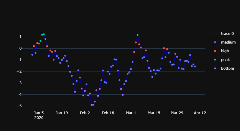
How you should do this would depend highly on the structure of your dataset. By the sound of your question, I can only guess that it looks something like this:

         time     param   label
0  2020-01-01 -0.556014  medium
1  2020-01-02  0.185451    high
2  2020-01-03 -0.401111  medium
3  2020-01-04  0.436111    high
4  2020-01-05  0.412933    high
5  2020-01-06  0.636421    peak
6  2020-01-07  1.168237    peak
7  2020-01-08  1.205073    peak
8  2020-01-09  0.798674    peak
9  2020-01-10  0.174116    high

If so, then yon can quickly run into a problem of a weird connectivity between your datapoints if you'd like to display param with a line trace with different colors. The first thing that comes to mind is to combine a line of one color, with markers of multiple colors like this:

enter image description here

This will give you a nice interactivity where you can switch all elements on and off, perhaps to study only the parts of your data where label=='peak:

enter image description here

Let me know how this works out for you and we can talk some more details. You'll find a data sample and all details here:

Complete code:

# imports
import plotly.express as px
import plotly.graph_objects as go
import pandas as pd
import numpy as np
import random

# settings
observations = 100
np.random.seed(5); cols = list('a')
param = np.random.uniform(low=-1, high=1, size=observations).tolist()
time = [t for t in pd.date_range('2020', freq='D', periods=observations).format()]

df=pd.DataFrame({'time': time, 
                 'param':param})
df['param']=df['param'].cumsum()

def classify(e):
    if e > 0.9: return 'peak'
    if e > 0.75: return 'high'
    if e > 0.25: return 'medium'
    if e > 0.9: return 'low'
    if e >= 0: return 'bottom'

df['label1'] = [(elem-df['param'].min())/(df['param'].max()-df['param'].min()) for elem in df['param']]
df['label'] = [classify(elem) for elem in df['label1']]
df = df.drop('label1', 1)

fig=go.Figure((go.Scatter(x=df['time'], y=df['param'],
                         mode='lines',
                         line=dict(color='rgba(0,0,200,0.7)'))))
fig.add_traces(px.scatter(df, x='time', y='param', color='label').data)
fig.update_layout(template='plotly_dark')
fig.update_xaxes(showgrid=False)
fig.show()
         
Bresee answered 1/10, 2020 at 21:46 Comment(0)
F
1

If I understand correctly, you are trying to plot a single time series of data with having two different color labels. Plotting multiple lines in the same graph would cause some overlap because it shares the time axis.

Why not use a scatter plot (without connecting the dots)? Depending on the density of data, that would visually look similar to connected lines/curves.

You could also try plotting blue and red lines with some vertical shifts to reduce overlap.

Ferrule answered 1/10, 2020 at 17:6 Comment(1)
Yes, thats the perfect explanation of what I want. Actually, I already tried with the scatter plot but as the data density is quite high, it looks messy but after zooming in it gives correct visualization as I had wanted in first place. This partially solved my question but I am still trying find a way to make it better in representation.Arcade
B
1

Second suggestion

(Please read my first suggestion further down for a a few assumptions and conditions)

I've managed to build an approach that pretty much should cover all you're asking for here. The only detail that provides a real challenge is how gaps between traces are visualized sinc my second suggestion builds on adding a unique trace for each single label. You may suspect that this would potentially fill the legend with a bunch of duplicate names, but that is taken care of by grouping trace names by the associated label. I've also set up a dictionary where you can specify colors for each label. This is the result:

Plot 2.1 - Color defined by label

enter image description here

Notice the grey line? That's the result of the "connectivity" problem I described earlier. You can chose to hide or show that line by setting the opacity parameter (last number) in color='rgba(200,200,200,0.2)'. You'll find a complete code snippet to reproduce this figure below. There's a lot going on there to tweak this whole thing togeteher, so don't hesitate to ask about the details if anything is unclear.

Complete code:

# imports
import plotly.express as px
import plotly.graph_objects as go
import pandas as pd
import numpy as np
import random

# settings
observations = 100
np.random.seed(5)
value = np.random.uniform(low=-1, high=1, size=observations).tolist()
time = [t for t in pd.date_range('2020', freq='D', periods=observations)]#.format()]

df=pd.DataFrame({'time': time, 
                 'value':value})
df['value']=df['value'].cumsum()
df1 = df.copy()
df1=df1.set_index('time')

# custom function to build labels as conditions of parameter values
def classify(e):
    if e > 0.75: return 'high'
    if e > 0.25: return 'medium'
    if e >= 0: return 'low'
    
# custom function to set mode = line or marker, given data length
def modes(df):
    if len(df) > 1: return 'lines'
    else: return  'markers'
    
# dictionary to specify marker or line color
# this will depend on your real world labels !!!
cols = {'high': 'green',
         'medium': 'blue',
         'low': 'red'}

df['label1'] = [(elem-df['value'].min())/(df['value'].max()-df['value'].min()) for elem in df['value']]
df['label'] = [classify(elem) for elem in df['label1']]
df = df.drop('label1', 1)

df['group'] = df['label'].ne(df['label'].shift()).cumsum()
df = df.groupby('group')
dfs = []
for name, data in df:
    dfs.append(data)

fig = go.Figure()
# one line to connect them all
fig=go.Figure((go.Scatter(x=df1.index, y=df1['value'],
                          name = 'all data',
                          line=dict(color='rgba(200,200,200,0.7)'))))

showed = []
for frame in dfs:

    if frame['label'].iloc[0] not in showed:
        
        fig.add_trace(go.Scatter(x=frame['time'], y = frame['value'],
                                 mode = modes(frame),
                                 marker_color = cols[frame['label'].iloc[0]],
                                 legendgroup=frame['label'].iloc[0],
                                 name=frame['label'].iloc[0]))
        showed.append(frame['label'].iloc[0])
    else:
        fig.add_trace(go.Scatter(x=frame['time'], y = frame['value'],
                                 mode = modes(frame),
                                  marker_color = cols[frame['label'].iloc[0]],
                                 legendgroup=frame['label'].iloc[0],
                                 name=frame['label'].iloc[0],
                                 showlegend=False
                                ))
fig.update_layout(template='plotly_dark')
fig.update_xaxes(showgrid=False)
fig.update_layout(uirevision='constant')
fig.show()

First suggestion

How you should do this would depend highly on the structure of your dataset. By the sound of your question, I can only guess that it looks something like this:

         time     param   label
0  2020-01-01 -0.556014  medium
1  2020-01-02  0.185451    high
2  2020-01-03 -0.401111  medium
3  2020-01-04  0.436111    high
4  2020-01-05  0.412933    high
5  2020-01-06  0.636421    peak
6  2020-01-07  1.168237    peak
7  2020-01-08  1.205073    peak
8  2020-01-09  0.798674    peak
9  2020-01-10  0.174116    high

If so, then yon can quickly run into a problem of a weird connectivity between your datapoints if you'd like to display param with a line trace with different colors. The first thing that comes to mind is to combine a line of one color, with markers of multiple colors like this:

enter image description here

This will give you a nice interactivity where you can switch all elements on and off, perhaps to study only the parts of your data where label=='peak:

enter image description here

Let me know how this works out for you and we can talk some more details. You'll find a data sample and all details here:

Complete code:

# imports
import plotly.express as px
import plotly.graph_objects as go
import pandas as pd
import numpy as np
import random

# settings
observations = 100
np.random.seed(5); cols = list('a')
param = np.random.uniform(low=-1, high=1, size=observations).tolist()
time = [t for t in pd.date_range('2020', freq='D', periods=observations).format()]

df=pd.DataFrame({'time': time, 
                 'param':param})
df['param']=df['param'].cumsum()

def classify(e):
    if e > 0.9: return 'peak'
    if e > 0.75: return 'high'
    if e > 0.25: return 'medium'
    if e > 0.9: return 'low'
    if e >= 0: return 'bottom'

df['label1'] = [(elem-df['param'].min())/(df['param'].max()-df['param'].min()) for elem in df['param']]
df['label'] = [classify(elem) for elem in df['label1']]
df = df.drop('label1', 1)

fig=go.Figure((go.Scatter(x=df['time'], y=df['param'],
                         mode='lines',
                         line=dict(color='rgba(0,0,200,0.7)'))))
fig.add_traces(px.scatter(df, x='time', y='param', color='label').data)
fig.update_layout(template='plotly_dark')
fig.update_xaxes(showgrid=False)
fig.show()
         
Bresee answered 1/10, 2020 at 21:46 Comment(0)
L
0

Here's my approach. It's possibly more straightforward than the existing answer.

  • Apply the group function provided below to assign a shared id to consecutive rows with a shared label value.
  • Group rows by id, and plot them as individual traces.
  • Adjust the visibility of the trace legend entries to ensure only one legend entry per label.
def group(df, column):
    """
    Groups contiguous non-NA values in a DataFrame column and assigns a distinct
    group identifier to each group.
    """
    is_none = df[column].isna()
    unique_values = df[column].where(~is_none, other=float('inf'))
    changes = unique_values != unique_values.shift()
    return changes.cumsum() - 1

df["trace_id"] = group(df, "labels")

fig = go.Figure()

colorway = px.colors.qualitative.Plotly
added_legend = set()  # track which states have been added to the legend

for trace_id, data in df.groupby("trace_id"):
    label = data["labels"].iloc[0]
    show_legend = label not in added_legend
    added_legend.add(state)
    
    fig.add_trace(go.Scatter(x=data.index, y=data["value"], mode='lines', 
                             name=f'{label}',
                             legendgroup=f'{label}', 
                             showlegend=show_legend,
                             line=dict(color=colorway[state % len(colorway)])))

fig.show()

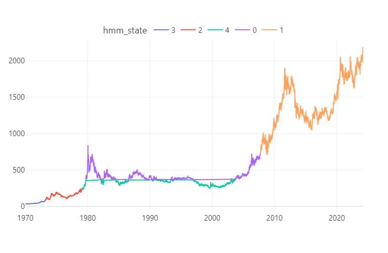
Before (using px.line())

2

After

enter image description here

Laboy answered 27/3 at 16:24 Comment(0)

© 2022 - 2024 — McMap. All rights reserved.