In Amazon Quicksight, I have a dataset with a bunch of data items which are imported into SPICE from JSON in S3. For simplicity, assume that data items look like this:
{url: "/us/page1.html", errors: 6, Responsetime: "2021-03-21T10:00:01"}
There are many data items for the same URL, run on different test dates (the Responsetime).
I can create a graph, a "visual", of total errors over time for all urls by making a line chart with value sum(errors) and X dimension of Responsetime, and that works fine.
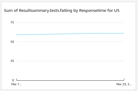
I can create the same visual showing total errors over time but only for URLs matching /us/ by creating a custom filter for url matching contains /us/ and applying this filter to the visual, and this also works fine and looks like this:
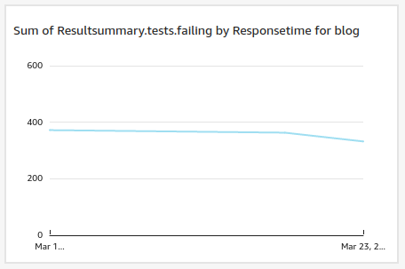
I can create the same visual showing total errors over time but only for URLs matching /blog/ by creating a custom filter for contains /blog/ identically to the above but with a diferent filter, and this also works fine and looks like this:
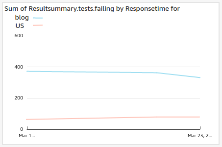
What I want to do is display those last two graphs as two lines on the same graph. So I have one linechart with two values on it, where one value is field errors filtered by url contains /us/, and the second value is field errors filtered by url contains /blog/. That is, something like this:
How do I do this?
I know how to plot two different values on the same linechart, but not how to plot the same value but filtered in two different ways.


