How to preserve axis aspect ratio with tight_layout
Asked Answered
P

1

6

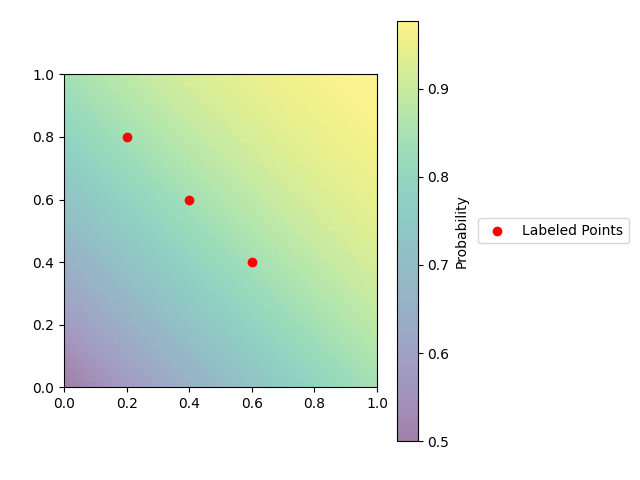
I have a plot with both a colorbar and a legend. I want to place the legend outside of the plot to the right of the colorbar. To accomplish this, I use bbox_to_anchor argument, but this causes the legend to get cut off:

import matplotlib.pyplot as plt
import numpy as np
from scipy.stats import norm

_, ax = plt.subplots()

extent = np.r_[0, 1, 0, 1]
space = np.linspace(0, 1)
probs = np.array([[norm.cdf(x + y) for x in space] for y in space])
colormap = ax.imshow(probs, aspect="auto", origin="lower", extent=extent, alpha=0.5)
colorbar = plt.colorbar(colormap, ax=ax)
colorbar.set_label(f"Probability")
ax.scatter(
    [0.2, 0.4, 0.6], [0.8, 0.6, 0.4], color="r", label="Labeled Points",
)
plt.legend(loc="center left", bbox_to_anchor=(1.3, 0.5))
plt.title
plt.show()

Plot with legend cut off

Plot with legend cut off

To fix the legend, I insert a call to plt.tight_layout() before plt.show(), but this causes the aspect ratio to get distorted:

Plot with distorted aspect ratio

Plot with distorted aspect ratio

How can I show the entire legend and preserve the aspect ratio of the axes?

Puke answered 30/8, 2021 at 22:11 Comment(2)
In this case, do you want to make the figure wider or the axes smaller?Cornflakes
(you could also move the legend to the top of the figure)Cornflakes
A
2

You can manage the ratio between axis height and width with matplotlib.axes.Axes.set_aspect. Since you want them to be equal:

ax.set_aspect(1)

Then you can use matplotlib.pyplot.tight_layout to fit the legend within the figure.
If you want to adjust margins too, you can use matplotlib.pyplot.subplots_adjust.

Complete Code

import matplotlib.pyplot as plt
import numpy as np
from scipy.stats import norm

_, ax = plt.subplots()

extent = np.r_[0, 1, 0, 1]
space = np.linspace(0, 1)
probs = np.array([[norm.cdf(x + y) for x in space] for y in space])
colormap = ax.imshow(probs, aspect="auto", origin="lower", extent=extent, alpha=0.5)
colorbar = plt.colorbar(colormap, ax=ax)
colorbar.set_label(f"Probability")
ax.scatter([0.2, 0.4, 0.6], [0.8, 0.6, 0.4], color="r", label="Labeled Points",)
plt.legend(loc="center left", bbox_to_anchor=(1.3, 0.5))

ax.set_aspect(1)
plt.tight_layout()
plt.subplots_adjust(left = 0.1)

plt.show()

enter image description here

Aldous answered 31/8, 2021 at 9:41 Comment(2)
This works, but it introduces another problem: Now the colorbar is taller than the axes.Puke
Try to pass bottom = 0.2 and top = 0.8 parameters to subplots_adjust: plt.subplots_adjust(left = 0.1, bottom = 0.2, top = 0.8). You may need to adjust those parameters to optimize the resultAldous

© 2022 - 2024 — McMap. All rights reserved.