How do I achieve a multi-series line chart in Crystal Reports?
Asked Answered
W

2

6

This relates to my How do I achieve a pivot report in Crystal Reports for Visual Studio? The data is the same, but they want a line chart as well.

So, my data is {datetime}, {car-id}. The X -axis of the chart must show the hour of {datetime}, the Y axis the number of cars that entered the park at that hour, and I must have seven data series, lines, one for each day of the week. So, e.g. the x/y point on the green line shows that on Wednesday, at hour x, y cars entered the car park.

Common sense tells me that I can kludge this by transforming the data source so that each day has its own column in a table, a table like this:

DateTime WeekDay CarCount

Yet the Crystal line chart doesn't seem to support more than one column, so there must be a different and better way of doing this. The weekday is part of {datetime} after all.

How can I achieve this chart? I am a rank amateur at charting, and Crystal's idiosyncrasies really aggravate my lack of skills and experience in this area.

Willowwillowy answered 30/7, 2013 at 17:21 Comment(0)
U
3

It's not obvious how to get multiple series to show up properly.

First, create a formula that will extract the day of week from the datetime: dayofweek({datetime}) and then create another that will extract just the hour: hour({datetime}).

From there, insert a chart from scratch and make the following settings in the Chart Expert

  1. Select "Line" under the Type tab
  2. Under the Data tab, select "On change of" and select your {@HourOfDay} formula first. This will create each hour as a point on the X-axis.
  3. In that same spot, also insert the {@DayofWeek} formula. This will create a new line for each day of the week. This is, in my opinion, the non-obvious part.
  4. Finally, to pick your Y-axis values, select {car-id} where it says "Show value(s)". It should default to the count summary of that field.

(Note: in the screenshot below, you would just replace {Customer.Customer_Name} with {car-id}

How to set up the Chart Expert

Unbalance answered 2/8, 2013 at 17:33 Comment(0)
V
0

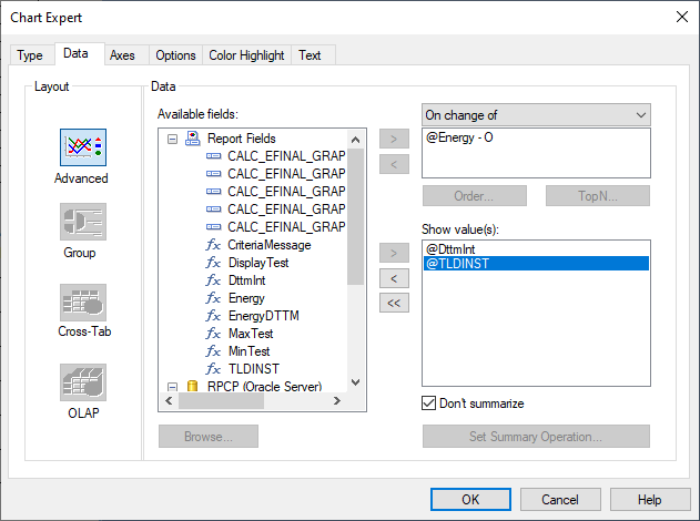
I had this issue for 5 years and finally solved it. I have a XY chart with multiple series.

  1. Everything needs to be in a formula.
  2. The graph should be in the report header section of a subreport. The sub report generates the X Y data like this: Series X Y Ser1 2020 1 Ser1 2021 2 Ser2 2020 0 Ser2 2021 1

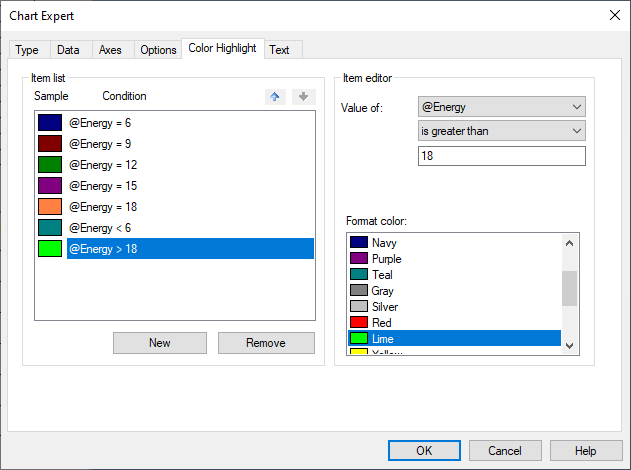
For me I have as series "Energy" ie 6, 9, 12 etc.
Then I have a date/time and a measurement.

On change of (Energy formula) Show Values #1 DateTime (convert this to int ie 2000.9 for 9/2000) - dont summerize #2 Measurement (number) - dont' summerize

Then you can do the color highlighter to capture your series (6 is red etc). The legend won't work - can't figure out that yet.

enter image description here

enter image description here

Vinylidene answered 14/4, 2022 at 23:48 Comment(1)
Just an update 2 years later. I eventually went with multiple graphs right on top of each other. Very tricky to do. Graph 1 has the legend but no data (to make the legend, create the series and put the data outside the bounds of the graph (ie -1,-1). Graph 2 has the x axis and first series - everything else is transparent Graph 3 has second series - everything else is transparent You will need to force the color of each graph to the legend, Crystal always uses the same colors. So the first series is always blue, etc.Vinylidene

© 2022 - 2024 — McMap. All rights reserved.