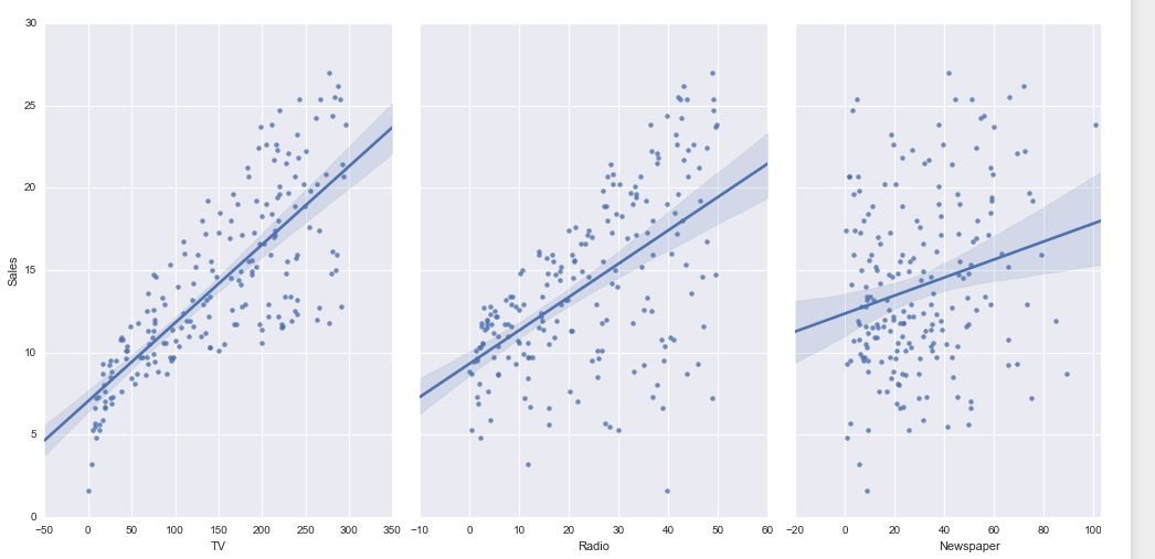
I want the similar visualization as shown below using Bokeh. As I am new to Bokeh , I might be wondering is there any code that is as concise as the below one using Seaborn ?
My main focus is how to write code for same visualization in Bokeh
dataset
data = pd.read_csv('http://www-bcf.usc.edu/~gareth/ISL/Advertising.csv',index_col = 0)
Plotting the dataset
import seaborn as sns

sns.pairplot(data, x_vars = ['TV', 'Radio','Newspaper'], y_vars = ['Sales'],
             size =7, aspect =.7, kind = 'reg')
Also the code in Seaborn doesn't require to enter the best fitted line . It automatically generates the best fitted line in the graph with a shadow of confidence interval . Is this kind of plotting possible in Bokeh ?

