Create a table with values from ecdf graph
Asked Answered
R

2

1

I am trying to create a table using values from an ecdf plot. I've recreated an example below.

#Data
data(mtcars)

#Sort by mpg
mtcars <- mtcars[order(mtcars$mpg),]

#Make arbitrary ranking variable based on mpg
mtcars <- mtcars %>% mutate(Rank = dense_rank(mpg))

#Make variable for percent picked
mtcars <- mutate(mtcars, Percent_Picked = Rank/max(mtcars$Rank))

#Make cyl categorical
mtcars$cyl<-cut(mtcars$cyl, c(3,5,7,9), right=FALSE, labels=c(4,6,8))

#Make the graph
ggplot(mtcars, aes(Percent_Picked, color = cyl)) + 
  stat_ecdf(size=1) + 
  scale_x_continuous(labels = scales::percent) +
  scale_y_continuous(labels = scales::percent)

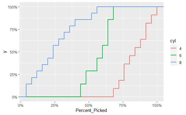
Which creates this plot ggplot ecdf graph

I want to create a table for the value of each of the cylinder types when the overall Percent_Picked is at 25%, 50%, and 75%. So something that shows that 4-cylander is at 0%, 6 is around 28%, and 8 is around 85%.

Calculating quantiles by group doesn't give me what I want (it shows the percent of all cylinders picked when 25%, 50%, and 75% of the particular cylinder type was picked). (For example, the suggestions by tbradley1013 on their blog only help with quantiles for each particular cylinder, not the overall cdf for each cylinder at given quantiles for Percent_Picked.)

Any leads would be appreciated!

Roubaix answered 4/2, 2020 at 17:2 Comment(1)
And, I should also say, if parts of the code above look sketchy, let me know what I should do differently!Roubaix
R
0

A much shorter answer that I can't believe I didn't see earlier. Essentially I just divide the number of rows equal to or less than .25, .5, and .75 by the total number of rows, for each cyl.

cyl.table<-mtcars %>%
  group_by(cyl) %>%
    summarise("25% Picked" = sum(Percent_Picked<=0.25)/(sum(Percent_Picked<=1)),
              "50% Picked" = sum(Percent_Picked<=0.5)/(sum(Percent_Picked<=1)),
              "75% Picked" = sum(Percent_Picked<=0.75)/(sum(Percent_Picked<=1)))
cyl.table
Roubaix answered 14/4, 2020 at 15:11 Comment(0)
F
2

So looking around I found this question. Yours extends this a little by asking for group specific ecdf values, so we can use the do function in dplyr (here's an example] to do so. There's some slight differences in the values when comparing between this table and the values in your ggplot and I'm not exactly sure why that is. It could be just that the mtcars data set is somewhat small, so if you run this on a larger data set, I'd expect it to be closer to the actual values.


#Sort by mpg
mtcars <- mtcars[order(mtcars$mpg),]

#Make arbitrary ranking variable based on mpg
mtcars <- mtcars %>% mutate(Rank = dense_rank(mpg))

#Make variable for percent picked
mtcars <- mutate(mtcars, Percent_Picked = Rank/max(mtcars$Rank))

#Make cyl categorical
mtcars$cyl<-cut(mtcars$cyl, c(3,5,7,9), right=FALSE, labels=c(4,6,8))

#Make the graph
ggplot(mtcars, aes(Percent_Picked, color = cyl)) + 
  stat_ecdf(size=1) + 
  scale_x_continuous(labels = scales::percent) +
  scale_y_continuous(labels = scales::percent)


create_ecdf_vals <- function(vec){
  df <- data.frame(
    x = unique(vec),
    y = ecdf(vec)(unique(vec))*length(vec)
  ) %>%
    mutate(y = scale(y, center = min(y), scale = diff(range(y)))) %>%
    union_all(data.frame(x=c(0,1),
                         y=c(0,1))) # adding in max/mins
  return(df)
}

mt.ecdf <- mtcars %>%
  group_by(cyl) %>%
  do(create_ecdf_vals(.$Percent_Picked))


mt.ecdf %>%
  summarise(q25 = y[which.max(x[x<=0.25])],
            q50 = y[which.max(x[x<=0.5])],
            q75 = y[which.max(x[x<=0.75])])

ggplot(mt.ecdf,aes(x,y,color = cyl)) +
  geom_step()

~EDIT~
After some digging around in the ggplot2 docs, we can actually explicitly pull out the data from the plot using the layer_data function.

my.plt <- ggplot(mtcars, aes(Percent_Picked, color = cyl)) + 
  stat_ecdf(size=1) + 
  scale_x_continuous(labels = scales::percent) +
  scale_y_continuous(labels = scales::percent)

plt.data <- layer_data(my.plt) # magic happens here

# and here's the table you want
plt.data %>%
  group_by(group) %>%
  summarise(q25 = y[which.max(x[x<=0.25])],
            q50 = y[which.max(x[x<=0.5])],
            q75 = y[which.max(x[x<=0.75])])
Fondle answered 5/2, 2020 at 13:22 Comment(4)
Thanks for your help on this! I think the issue with the slight differences in the ecdf graphs is that the one using the function you created doesn't start counting/accumulating until after the first instance for each cyl. So for example, when the first 4-cylander car is chosen, the y variable does not increase - it only starts to increase after the next 4-cylander car is chosen. I couldn't figure out where that was happening in the code - do you know?Roubaix
Just found a better answer - let me revise what I've given you hereFondle
The update works like a charm. I had no idea layer_data existed, thank you!Roubaix
As an update, I had to update a bit of the summarize function to q25 = y[x<=0.25][which.max(x[x<=0.25])] - see #60728718 for more detailsRoubaix
R
0

A much shorter answer that I can't believe I didn't see earlier. Essentially I just divide the number of rows equal to or less than .25, .5, and .75 by the total number of rows, for each cyl.

cyl.table<-mtcars %>%
  group_by(cyl) %>%
    summarise("25% Picked" = sum(Percent_Picked<=0.25)/(sum(Percent_Picked<=1)),
              "50% Picked" = sum(Percent_Picked<=0.5)/(sum(Percent_Picked<=1)),
              "75% Picked" = sum(Percent_Picked<=0.75)/(sum(Percent_Picked<=1)))
cyl.table
Roubaix answered 14/4, 2020 at 15:11 Comment(0)

© 2022 - 2024 — McMap. All rights reserved.