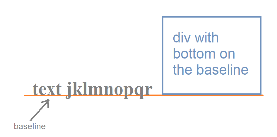
I would like to vertically align a child element in a flex box (or text box) so that its bottom coincides with the baseline of its siblings.
This happens by default for images:
<img> has no baseline, so when images are used in an inline formatting context with vertical-align: baseline, the bottom of the image will be placed on the text baseline.
Can I achieve the same effect with a <div> instead of an <img>?
Later edit: I'm attaching a snippet. I want the bottom border of the last child to coincide with the bottom border of the image (the baseline of the rest of the children). I don't want everything aligned to the bottom.
.parent {
    display: flex;
    align-items: baseline;
}

.child2 {
    font-family: monospace;
    font-size: 200%;
}

img {
    border-bottom: 1px solid red;
}

.child-bottom {
    padding: 5px;
    background-color: #fdd;
    border-bottom: 1px solid red;
}
<div class="parent">
<span>These</span>
<span class="child2">are</span>
<span>baseline</span>
<img src="https://cdn.sstatic.net/Img/ico-binoculars.svg?v=d4dbaac4eec9">
<span>aligned.</span>
<div class="child-bottom">This child's bottom border should be on the baseline of the parent.</div>
</div>Later edit 2. A picture is a thousand words. Hope it helps clarify what kind of alignment I need. Notice how letters j, p, and q extend below the baseline. 
