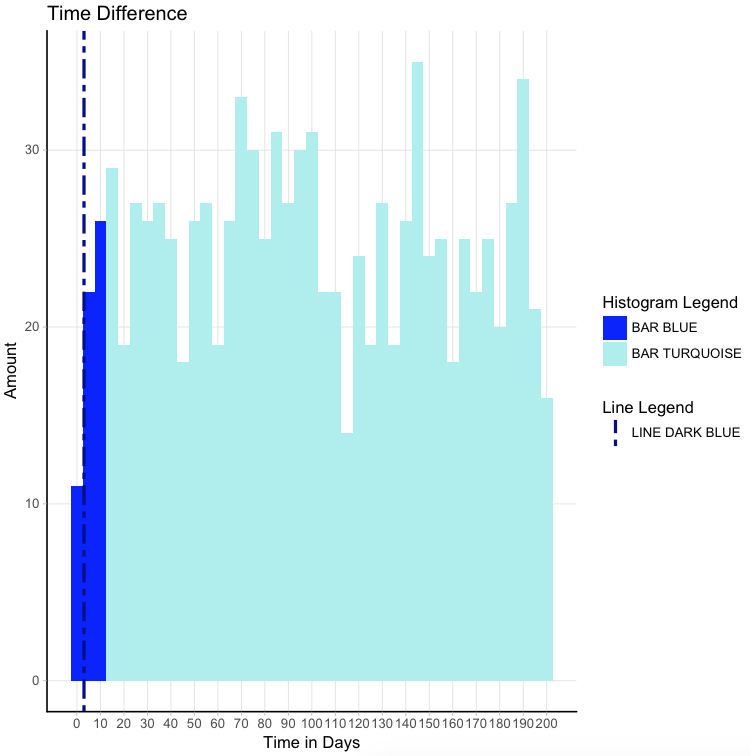
I want to add a legend to one of my plots, but I have different aesthetics and I never created a legend so I find it very difficult to determine how to build it.
One of my aesthetics is a fill code, which I added manually as a vector. The other aesthetic is a vertical line that I added with geom_vline.
From the graph below, there are three characteristics that I want to add to the legend: 1) The bars with color dark blue, 2) The bars with color light blue and 3) The vertical line.
Does anyone have a suggestion for me on how to code this efficiently?
#df
df <- data.frame(Time_Diff <- runif(1000, 0, 200))


# Show median, IQR range and outliers
colors <- c(rep("blue",3), rep("paleturquoise2",38))
bp_overall <- ggplot(data = df, aes(Time_Diff))
bp_overall +
  geom_histogram(binwidth = 5, fill = colors) + #create histogram
  ggtitle("Time Difference")  +
  xlab("Time in Days") +
  ylab("Amount") +
  geom_vline(xintercept = 3, linetype = "twodash", size = 1,      colour= "darkblue") + #show median
  scale_x_continuous(breaks = seq(0, 202, 10)) +
  theme_light() +
  theme(panel.grid.minor = element_blank(),
    panel.border = element_blank(), #remove all border lines
    axis.line.x = element_line(size = 0.5, linetype = "solid", colour = "black"), #add x-axis border line
    axis.line.y = element_line(size = 0.5, linetype = "solid", colour = "black")) + #add y-axis border line
  theme(plot.title = element_text(family = windowsFont("Verdana"),     color="black", size=14, hjust = 0.5)) +
  theme(axis.title = element_text(family = windowsFont("Verdana"), color="black", size=12))
After the suggestion of Djork I arrived to the following script, which works and I am happy with. The only thing I am trying to accomplish now is to get the Legend to be one whole (Histogram Legend and Line Legend are combined into a coherent whole). Anyone has a suggestion?
# reformat data
set.seed(1)
df <- data.frame(runif(1000, 0, 200))
colnames(df) <- "Time_Diff"

bp_overall +
  geom_histogram(data = subset(df, Time_Diff <= 12.5), aes(x = Time_Diff, fill="BAR BLUE"), binwidth = 5) + # subset for blue data, where aes fill is fill group 1 label
  geom_histogram(data = subset(df, Time_Diff > 12.5), aes(x = Time_Diff, fill="BAR TURQUOISE"), binwidth = 5) + # subset for turquoise data, where aes fill is fill group 2 label
  scale_fill_manual("Histogram Legend", values=c("blue", "paleturquoise2")) + # manually assign histogram fill colors
  geom_vline(aes(xintercept = 3, colour="LINE DARK BLUE"), linetype="twodash", size = 1) + # where aes colour is vline label
  scale_colour_manual("Line Legend", values="darkblue") + #removed legend title
  scale_x_continuous(breaks = seq(0, 202, 10)) +
  ggtitle("Time Difference")  +
  xlab("Time in Days") +
  ylab("Amount") +
  theme_light() +
  theme(panel.grid.minor = element_blank(),
        panel.border = element_blank(),
        axis.line.x = element_line(size = 0.5, linetype = "solid", colour = "black"),
        axis.line.y = element_line(size = 0.5, linetype = "solid", colour = "black"),
        legend.position = c(0.95, 0.95),
        legend.justification = c("right", "top"),
        legend.box.just = ("right"))


aes(). Thus, you have to transform your data.frame including the statistics and a column with the colors. See here or here – Apparatus