I have a dataset shared in the following link:
https://drive.google.com/open?id=0B2Iv8dfU4fTUSV8wMmUwVGMyRE0
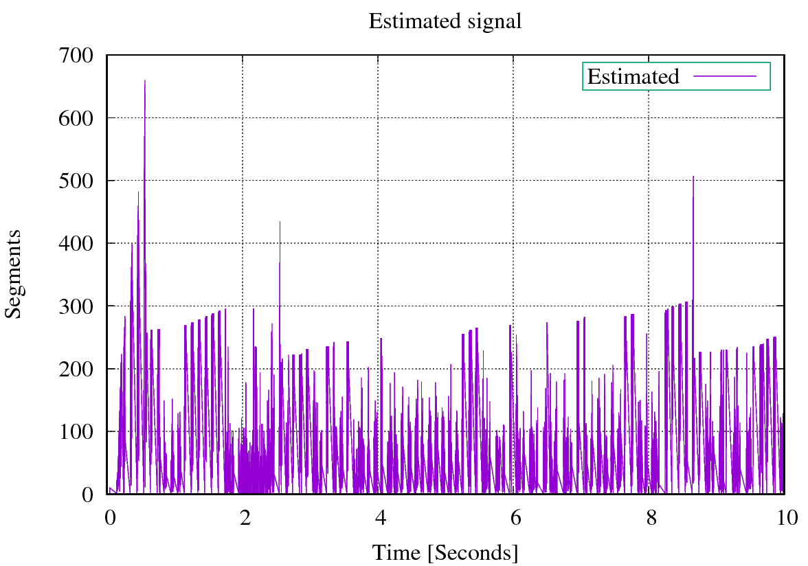
A simple plot of the estimated_data.csv file generates the following plot.
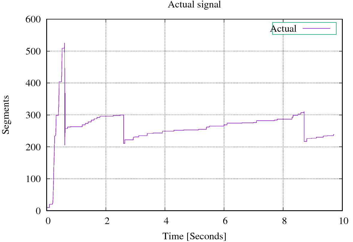
and a simple plot of actual_data.csv (which is my ground truth) generates the following plot
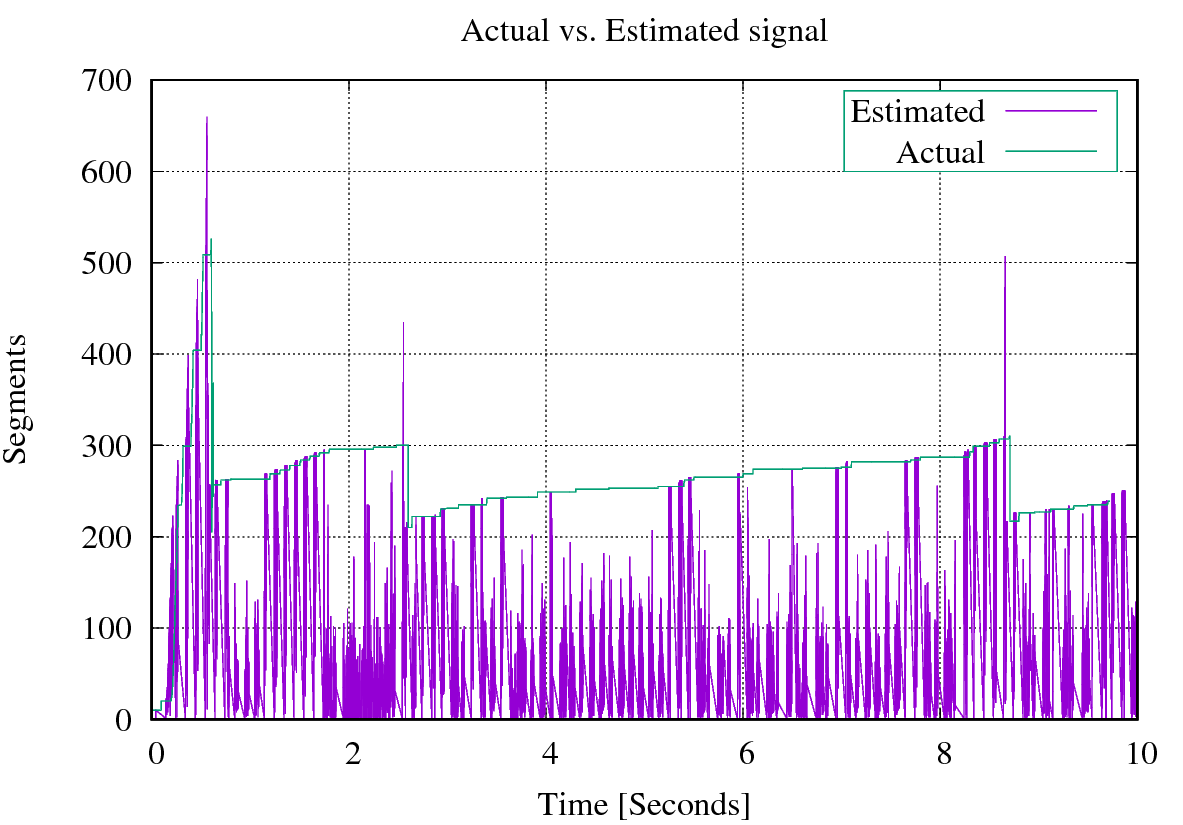
When we plot both the actual and estimated signals together, this is what we got
I wanted to find the closest pattern of the estimated and actual signals. I have tried to find the closest pattern using pandas.rolling_max() by loading the data into a DataFrame and calculate the rolling max and then turn around the whole series and to calculate the windows backwards. Hereunder is my Python script.
import numpy as np
import matplotlib.pyplot as plt
import pandas as pd
plt.ion()

df = pd.read_csv('estimated.csv', names=('x','y'))
df['rolling_max'] = df['y'].rolling(8500).max()
df['rolling_max_backwards'] = df['y'][::-1].rolling(850).max()
df.rolling_max.fillna(df.rolling_max_backwards, inplace=True)
plt.figure()
plt.plot(df['x'], df['rolling_max'], label = 'rolling')

plt.legend()
plt.title('Pattern')
plt.xlim(0,10)
plt.ylim(0,700)
plt.xlabel('Time [Seconds]')
plt.ylabel('Segments')
plt.grid()
plt.show(block=True)
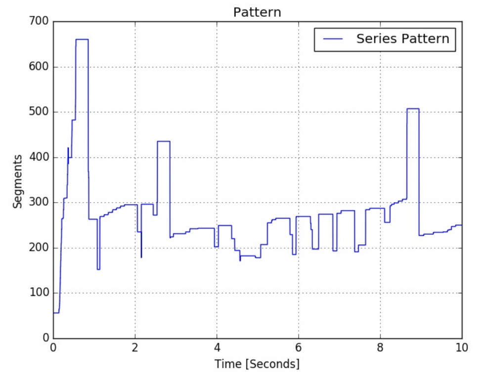
which finally generates the following pattern.
However, I don't feel this pattern is close enough when I compare it with my ground truth (the plot of actual_data.csv). How can we apply filtering models like Kalman Filter to find a pattern of such a signal?


