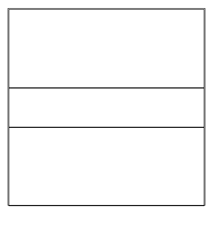
I wrapped a few divs inside a div container, and I can see some weird space between the borders and elements. The problem is occurring on chrome and edge. I tried Mozilla, and it worked fine.
I am using bootstrap, with some custom CSS.
I am sharing the relevant code as well :
.fullScreen {
  height: 100vh;
  width: 100vw;
}

.mainContainer {
  align-items: center;
  justify-content: flex-start;
}

.row {
  margin: 0!important;
}

#box {
  margin: 0 0 0 5vh;
  height: 90vh;
  width: 90vh;
}

.rowEndings {
  height: 36vh;
}

.rowMid {
  height: 18vh;
}

@media (orientation: portrait) {
  .mainContainer {
    align-items: flex-start;
    justify-content: center;
  }
}
<!-- adding bootstrap css -->
<link rel="stylesheet" href="https://stackpath.bootstrapcdn.com/bootstrap/4.5.0/css/bootstrap.min.css" integrity="sha384-9aIt2nRpC12Uk9gS9baDl411NQApFmC26EwAOH8WgZl5MYYxFfc+NcPb1dKGj7Sk" crossorigin="anonymous">
<html lang="en" class="fullScreen">
<body class="fullScreen">
<div class="mainContainer row fullScreen">
<div id="box" class="border border-dark">
<div class="row rowEndings border border-dark"></div>
<div class="row rowMid border border-dark"></div>
<div class="row rowEndings border border-dark"></div>
</div>
</div>
</body>
</html>The alignment is looking perfect in the snippet, but I it's showing some space to me. I am attaching some snips for that :
There's no issue with padding and margin I believe. Any help is appreciated :)
UPDATE : The same is happening on edge as well. And the issue gets solved if I remove the margin of 5vh I have added to #box element.


