visual studio 2022 shows "greater than or equal"-sign (and <=, !=, ==) as one glyph instead of two separate characters
Asked Answered
S

2

6

I noticed in my Visual Studio 2022 with font 'cascadia code' that very recently (I noticed yesterday) that the >= and <= and != are now shown as 1 glyph.

enter image description here

It's both on my windows server 2016 machine as on my windows 2011 machine.

I've seen that in presentations before, and always thought it was very annoying, but now it's on my pc too!

I can't find any setting though to turn it off?

Sheepshead answered 29/6, 2022 at 7:56 Comment(1)
github.com/microsoft/cascadia-codeSighted
T
4

Many of us like the ligature support, as it helps to clearly read the multi-character glyphs used in many programming languages.

However it is not for everyone.

Many ligature fonts are derived from other monospaces fonts without ligature. Eg. Fira Code is derived from Fira Mono, so use the latter.

In the case of Cascadia Code, the releases also include Cascadia Mono, and that removes the ligature. You'll need to go to the repo and manually download & install the ttf files for the mono version. (Note the …PL versions add Powerline Glphs).

Some editors (eg. VS Code) do have options to switch off ligatures and control stylistic sets), but not VS itself.

Ticknor answered 29/6, 2022 at 9:43 Comment(1)
Does anyone know if a ticket has been submitted for this with Microsoft?Feuillant
D
1

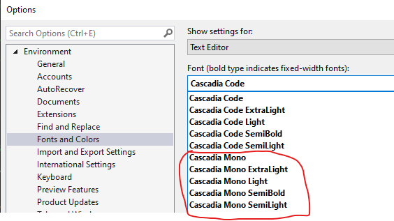
It is driven by the Text Editor font choice. Switching from the Cascadia Code font to any of the Cascadia Mono ones (shipped with the current VS version) removed the ligature glyphs for me:

VS Settings

Dogmatism answered 11/9, 2024 at 22:57 Comment(0)

© 2022 - 2025 — McMap. All rights reserved.