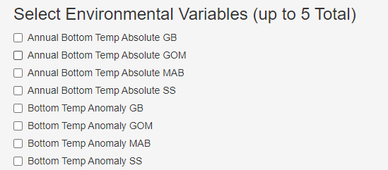
I have a basic RShiny app that has a reactive checkbox which plots timeseries data based on the data (column of df) selected in the checkbox. My current code produces a UI with checkbox inputs like this:
    # Load R packages
library(shiny)
library(shinyBS)

##example df in similar format to the data I'm working with
Both <- data.frame(
  Year  = c("1990", "1991", "1992", "1993"),
  SST_anomaly_GOM = c("-1.1", "0.23", "0.87", "-0.09"),
  SST_anomaly_GB = c("-1.1", "0.23", "0.87", "-0.09"),
  SST_anomaly_MAB = c("-1.1", "0.23", "0.87", "-0.09"),
  BT_anomaly_GOM = c("-2.5", "0.55", "1.20", "-0.19"),
  BT_anomaly_GB = c("-1.1", "0.05", "1.24", "-0.29"),
  BT_anomaly_MAB = c("-1.1", "-1.08", "0.67", "-2.40")
)

# Define UI
ui <- fluidPage(
  # useShinyBS
    "Visualizing Indicators", #app title
    tabPanel("",      # tab title
             sidebarPanel(width=6,

                          checkboxGroupInput("variable", label = "Checkbox", choiceNames  = gsub("_", " ", colnames(Both[2:7])),
                                                choiceValues = colnames(Both[2:7]),
                                                ),
             ), # sidebarPanel
    ), #tabPanel
) # fluidPage

#Define Server:
server<- function (input,output){
   output$rendered <-   renderUI({
    })
}
# Create Shiny object
shinyApp(ui = ui, server = server)
This Produces an interface like this:
This is fine, but a little repetitive, and with more timeseries variables I eventually want to include to this list, this can get cumbersome for the user to sift through and will take up a lot of the space on the UI to list everything in this way.
My question is how can I adjust my code such that it produces an interface with unique variables listed, then checkboxes for each sub-region of interest? (GOM, BG, MAB, etc.) An example of what I have in mind is an interface that looks more like this:
Is this possible? Is this possible with a df in the format as I currently have (such as my example df called "Both").
Thanks!


selectInputwithmultiple = TRUEfor the regions? – Jehol