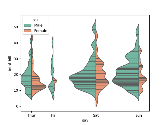
The shape of violin plot is useful for visualizing data distribution of grouped data. The size of each group can also be visualized as the area of the 'violin'.
But when the data is heterogeneous, the width of certain group is too small to show any meaning info (Fri group in Figure 1). There is width option in seaborn.violinplot for enlarging the size of the plot.
However, once group of small size is enlarged into a suitable scale, the large ones will become 'too large'(Sat group in Figure 2) and overlap with each other.
Thus, my question is how to assign different gaping distance for violin plot in seaborn.
The demo
Code for generating the Figure 1:
import seaborn as sns

tips = sns.load_dataset("tips")
ax = sns.violinplot(x="day", y="total_bill", hue="sex",
                    data=tips, palette="Set2", split=True,
                    scale="count", inner="stick",
                    scale_hue=False, bw=.2)
Figure 1

Code for generating the Figure 2:
import seaborn as sns

tips = sns.load_dataset("tips")
ax = sns.violinplot(x="day", y="total_bill", hue="sex",
                    data=tips, palette="Set2", split=True,
                    scale="count", inner="stick", width=2.5
                    scale_hue=False, bw=.2)
Figure 2

What is your solution?
The first attempt is increase figure width, but it looks terrible and leaves too much white space in the figure.
I tried to map category data in x axis into numeric form with different distance between them.
tips["day_n"] = tips["day"].map(dict(zip(tips["day"].unique(), [1, 2, 4, 6])))
But it seems that seaborn does not support numeric data, the distance between group keep just unchanged or mess up, when switching the x, y axis.
Code for generating the Figure 3:
ax = sns.violinplot(y="day_n", x="total_bill", hue="sex",
                    data=tips, palette="Set2", split=True,
                    scale="count", inner="stick", width=2.5,
                    scale_hue=False, bw=.2)
Figure 3

- A similar question in stackoverflow, indicating that there is
positionsoption for matplotlib. But it is not work for seaborn either.

