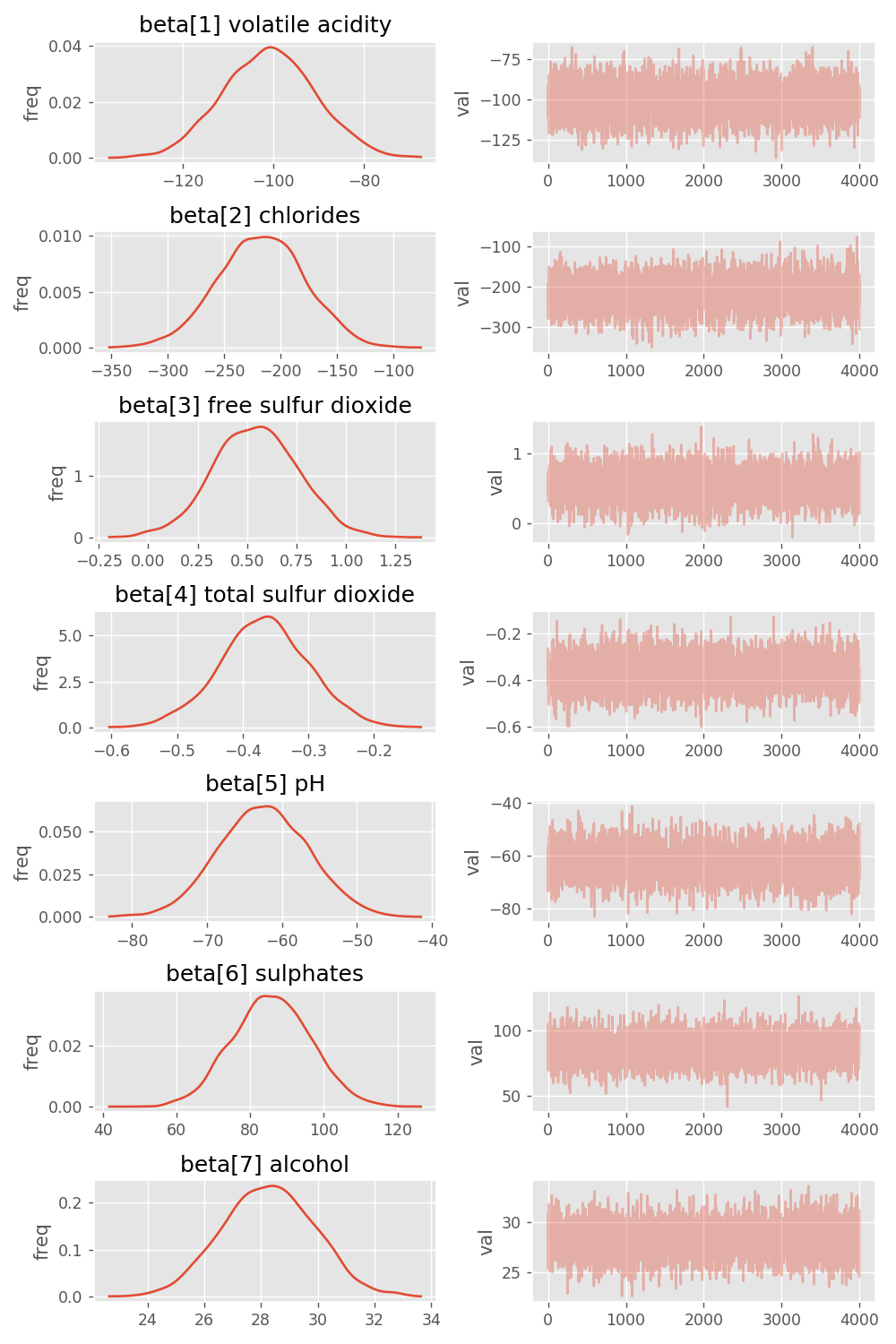
a nice pystan trace plot for a stan vector parameter
Asked Answered
E

2

6

I am doing a multiple regression in Stan.

I want a trace plot of the beta vector parameter for the regressors/design matrix.

When I do the following:

fit = model.sampling(data=data, iter=2000, chains=4)
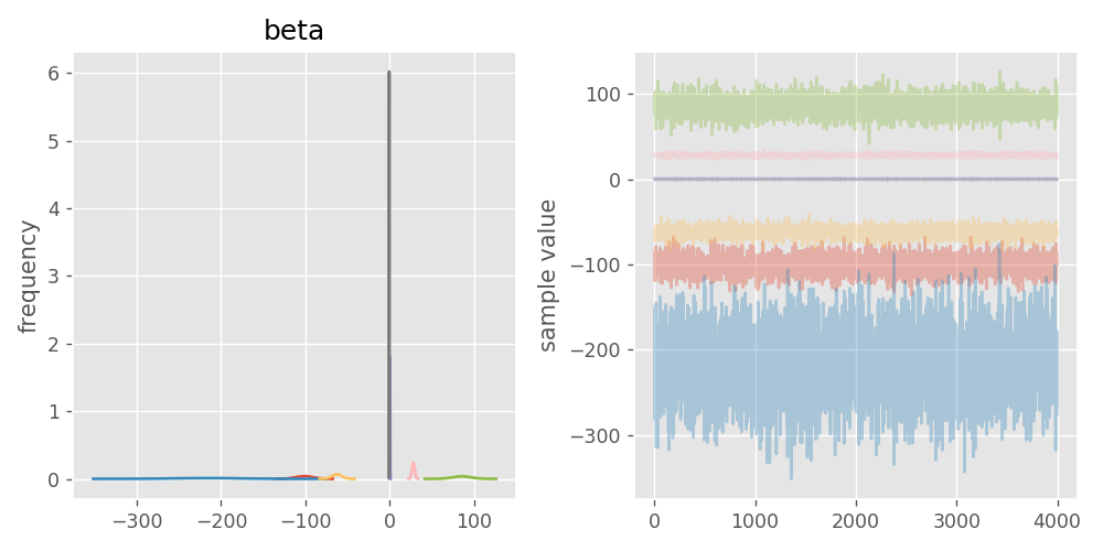
fig = fit.plot('beta')

I get a pretty horrid image:

horrid trace plot for vector parameter

I was after something a little more user friendly. I have managed to hack the following which is closer to what I am after.

Nicer tracer plot for vector parameter

My hack plugs into the back of pystan as follows.

r = fit.extract() # r for results
from pystan.external.pymc import plots
param = 'beta'
beta = r[param] 
name = df.columns.values.tolist()
(rows, cols) = beta.shape
assert(len(df.columns) == cols)
values = {param+'['+str(k+1)+'] '+name[k]: 
    beta[:,k] for k in range(cols)}
fig = plots.traceplot(values, values.keys())
for a in fig.axes:
    # shorten the y-labels
    l = a.get_ylabel()
    if l == 'frequency': 
        a.set_ylabel('freq')
    if l=='sample value': 
        a.set_ylabel('val')
fig.set_size_inches(8, 12)
fig.tight_layout(pad=1)
fig.savefig(g_dir+param+'-trace.png', dpi=125)
plt.close()

My question - surely I have missed something - but is there an easier way to get the kind of output I am after from pystan for a vector parameter?

Epimorphosis answered 15/10, 2018 at 10:2 Comment(0)
E
5

Discovered that the ArviZ module does this pretty well.

ArviZ can be found here: https://arviz-devs.github.io/arviz/

Epimorphosis answered 4/11, 2018 at 9:17 Comment(0)
O
1

I also struggled with this and just found a way to extract the parameters for the traceplot (the betas, I already knew).

When you do your fit, you can save it to a dataframe:

fit_df = fit.to_dataframe()

Now you have a new variable, your dataframe. Yes, it took me a while to find that pystan had a straightforward way to save the fit to a dataframe.

With that at hand you can check your dataframe. You can see it's header by printing the keys:

fit_df.keys()

the output is something like this:

Index([u'chain', u'chain_idx', u'warmup', u'accept_stat__', u'energy__',
       u'n_leapfrog__', u'stepsize__', u'treedepth__', u'divergent__',
       u'beta[1,1]', ...
       u'eta05[892]', u'eta05[893]', u'eta05[894]', u'eta05[895]',
       u'eta05[896]', u'eta05[897]', u'eta05[898]', u'eta05[899]',
       u'eta05[900]', u'lp__'],
      dtype='object', length=9037)

Now, you have everything you need! The betas are in columns as well as the chain ids. That's all you need to plot the betas and traceplot. Therefore, you can manipulate it in anyway you want and customize your figures as you wish. I'll show you an example of how I did it:

chain_idx = fit_df['chain_idx']
beta11 = fit_df['beta[1,1]']
beta12 = fit_df['beta[1,2]']

plt.subplots(figsize=(15,3))
plt.subplot(1,4,1)
sns.kdeplot(beta11)
plt.subplot(1,4,2)
plt.plot(chain_idx, beta11)

plt.subplot(1,4,3)
sns.kdeplot(beta12)
plt.subplot(1,4,4)
plt.plot(chain_idx, beta12)

plt.tight_layout()
plt.show()

The image from the above plot!

I hope it helps (if you still need it) ;)

Osborn answered 2/12, 2018 at 19:49 Comment(0)

© 2022 - 2024 — McMap. All rights reserved.