Implement radio/checkbox logic to custom widgets
Asked Answered
H

4

6

I want to create two widgets. Both displaying a 2 column grid with buttons that can be selected/unselected. One should have radio logic (single selection) where as the other should have checkbox logic (multiple selection).

This is my android implementation I'm trying to recreate in Flutter:

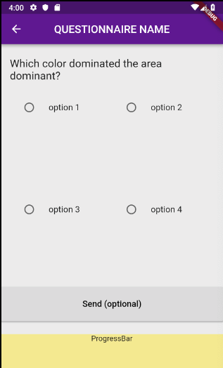
I tried using a GridView with RadioListTiles, thinking I could replace the RadioButton icon with my own widget while retaining the logic. I can't see any way to do this. I also realized GridView in Flutter does not auto wrap it's children, resulting in each radio tile only taking up the first 10% of the entire cell.

This is where I'm at the moment:

class RadioSelect extends StatefulWidget {
    final QuestionData question;

    RadioSelect({this.question});

    @override
    RadioSelectState createState() => RadioSelectState(question);
}

class RadioSelectState extends State<RadioSelect> {
  RadioSelectState(this._question);

  final QuestionData _question;
  final SliverGridDelegate delegate = 
    SliverGridDelegateWithFixedCrossAxisCount(crossAxisCount: 2);
  int _selectedIndex;

  @override
  Widget build(BuildContext context) {
    return GridView.builder(
      gridDelegate: delegate,
      padding: EdgeInsets.all(0),
      itemCount: _question.selectOptions.length,
      itemBuilder: (context, index) {
        return RadioListTile(
          groupValue: _selectedIndex,
          title: Text(_question.selectOptions[index]),
          value: index,
          onChanged: (newIndex) {
           setState(() {
              _selectedIndex = newIndex;
            });
          },
        );
      },
    );
  }
}

Resulting in:

enter image description here

I want to follow the most "Fluttery" way possible. What do you reckon is my best cause of action?

Hadrian answered 12/2, 2019 at 15:18 Comment(0)
I
4

This is what worked for Me.

to mimic radio button behavior I used "ChoiceChip". You can see in the code bellow the parent widget is a "row", but i think "wrap" as a parent widget may serve best this use case.

The proprety shape of the "ChoiceChip" can help to shape it as you need.

 Row(  
                        mainAxisAlignment: MainAxisAlignment.spaceBetween,
                        crossAxisAlignment: CrossAxisAlignment.start,
                        children: [
                          Expanded(
                              child: ChoiceChip(
                                  avatar: image.asset(
                                      "assets/left.png",
                                      matchTextDirection: false,
                                      width: 20.0),
                                  label: Text('LEFT',
                                      textAlign: TextAlign.center,
                                      style: TextStyle(
                                          color: Colors.white, fontSize: 20)),
                                  labelPadding:
                                      EdgeInsets.symmetric(horizontal: 50),
                                  selected: choice== 'left',
                                  onSelected: (bool selected) {
                                    setState(() {
                                      choice= selected ? 'left' : null;
                                    });
                                  },
                                  selectedColor: Color(0xFF0D47A1),
                                  shape: ContinuousRectangleBorder(
                                      borderRadius:
                                          BorderRadius.circular(5.0)))),
                          Expanded(
                              child: ChoiceChip(
                                  avatar: image.asset(
                                      "assets/right.png",
                                      matchTextDirection: false,
                                      width: 20.0),
                                  label: Text('RIGHT',
                                      textAlign: TextAlign.center,
                                      style: TextStyle(
                                          color: Colors.white, fontSize: 20)),
                                  labelPadding:
                                      EdgeInsets.symmetric(horizontal: 50),
                                  selected: choice== 'right',
                                  onSelected: (bool selected) {
                                    setState(() {
                                      choice= selected ? 'right' : null;
                                    });
                                  },
                                  selectedColor: Color(0xFF0D47A1),
                                  shape: ContinuousRectangleBorder(
                                      borderRadius:
                                          BorderRadius.circular(5.0))))
                        ]),

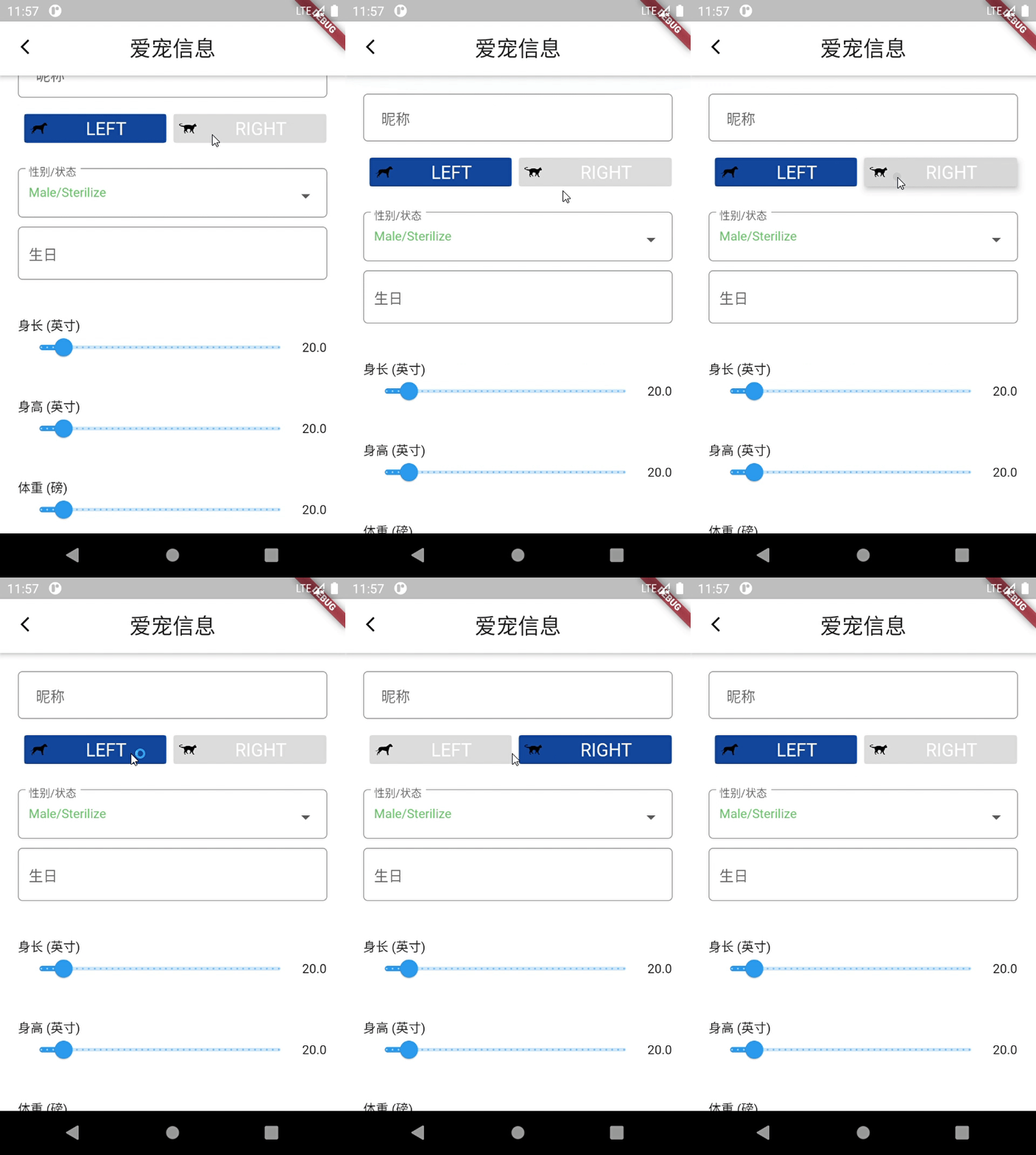
The Result Looks like this

enter image description here

Ingold answered 9/10, 2021 at 15:51 Comment(3)
Looks good. Do you have a screenshoot of the final result? I don't have the assets to copy the code, or the time to run it but if you can provide a screenshot or a gif that satisfy the criteria I will gladly give you the "right answer" mark for this question :) Code wise it looks solig but I haven't used the widget myself so I would like a graphical representation.Outpouring
Thanks ! I edited my answer. Added my emulator screen record.Ingold
Awesome! I'm also working on a pet app at the moment :)Outpouring
C
2

Try using FilterChip and ChoiceChip widgets. The FilterChip will implement checkbox logic (multiple selection), whilst the ChoiceChip behaves like a radio button. Both widgets will let you use custom widgets to fit your ui.

Condor answered 10/3, 2020 at 4:33 Comment(1)
Filterchip is perfect, thank you!Sweetscented
E
0

I also faced the same issue but flutter doesn't seem to provide any widget like this. Try using custom radio, a third-party plugin.

https://pub.dev/packages/custom_radio

Ellinger answered 19/9, 2019 at 15:52 Comment(0)
F
0

I created this package for this purpose. Go and check this out. Group radio button plugin

https://github.com/Dineth95/radio_grouped_buttons

Container(
                padding: EdgeInsets.all(10),
                width: MediaQuery.of(context).size.width,
                height: 160,
                child: CustomRadioButton(
                  buttonLables: buttonList,
                  buttonValues: buttonList,
                  radioButtonValue: (value)=>print(value),
                  horizontal: true,
                  enableShape: true,
                  buttonSpace: 5,
                  buttonColor: Colors.white,
                  selectedColor: Colors.cyan,
                ),
              ),

Using this widget you can do anything you want

Firsthand answered 30/5, 2020 at 16:51 Comment(2)
Looks sweet. Will check it out next time I come across the need for a radio button. Can you select multiple boxes as well?Outpouring
As the first verion I added radio functionality only.I will add that feature in future.Firsthand

© 2022 - 2024 — McMap. All rights reserved.