I have data with two time axes and measurements for each cell. From this I create a heatmap. I also know for each cell whether the measurement is significant.
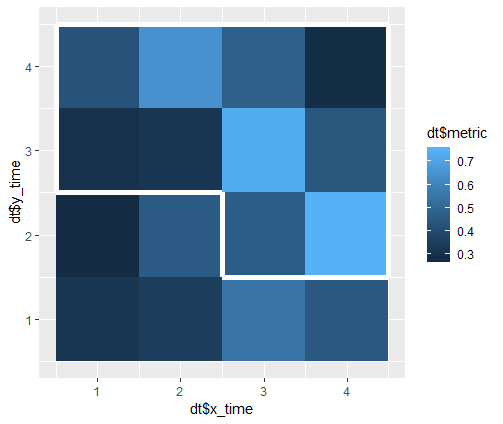
My problem is to draw a contour line around all cells that are significant. If cells form clusters with the same significance value, I need to draw the contour around the cluster and not around each individual cell.
The data are in this format:
   x_time y_time    metric signif
1       1      1 0.3422285  FALSE
2       2      1 0.6114085  FALSE
3       3      1 0.5381621  FALSE
4       4      1 0.5175120  FALSE
5       1      2 0.6997991  FALSE
6       2      2 0.3054885  FALSE
7       3      2 0.8353888   TRUE
8       4      2 0.3991566   TRUE
9       1      3 0.7522728   TRUE
10      2      3 0.5311418   TRUE
11      3      3 0.4972816   TRUE
12      4      3 0.4330033   TRUE
13      1      4 0.5157972   TRUE
14      2      4 0.6324151   TRUE
15      3      4 0.4734126   TRUE
16      4      4 0.4315119   TRUE
The code below generates this data, where the measurements are random (dt$metrics) and the significance is logical (dt$signif).
# data example
dt <- data.frame(x_time=rep(seq(1, 4), 4),
                 y_time=rep(seq(1, 4), each=4),
                 metric=(rnorm(16, 0.5, 0.2)),
                 signif=c(rep(FALSE, 6), rep(TRUE, 10)))
The heatmap alone can be generated using ggplot2's geom_tile
# Generate heatmap using ggplot2's geom_tile
library(ggplot2)
p <- ggplot(data = dt, aes(x = x_time, y = y_time))
p <- p + geom_tile(aes(fill = metric))
Based on this question, I managed to draw contours with different colors around each cell according to the significance value.
# Heatmap with lines around each significant cell
p <- ggplot(data = dt, aes(x = x_time, y = y_time))
p <- p + geom_tile(aes(fill = metric, color = signif), size = 2)
p <- p + scale_color_manual(values = c("black", "white"))

However, this approach does not group adjacent significant cells together by drawing a contour around the entire group (as is also discussed in the question I linked to).
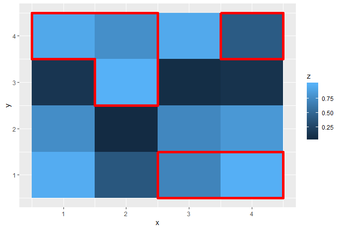
As this question shows, it is possible to draw boxes around specified areas, but I do not think this can be extended to all possible clusters of cells.


raster::clump. See e.g. How to get contour lines around the grids in R-raster? – Anceline