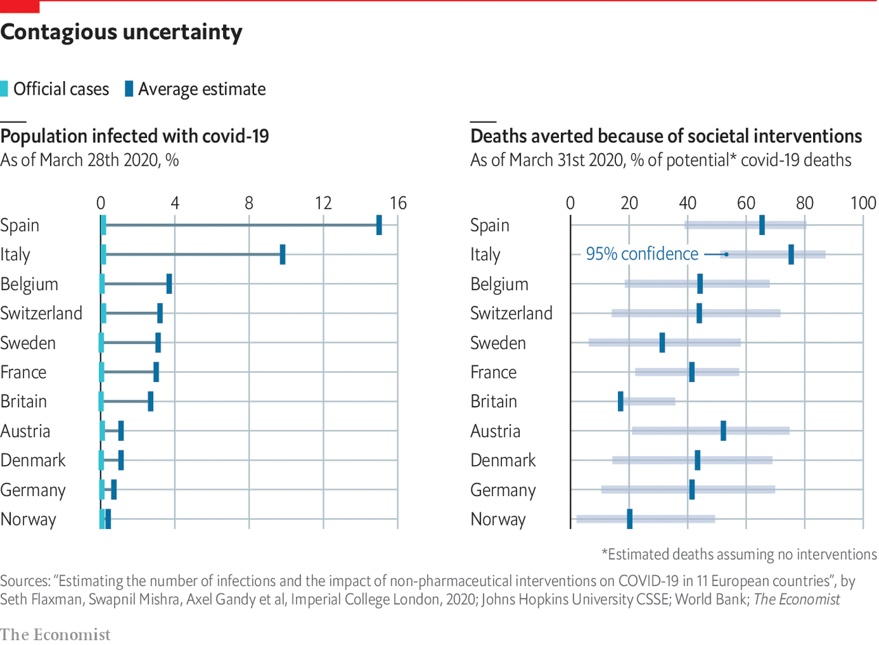
Yes you have it in ggthemes (extension of ggplot2) with theme_economist and theme_economist_white.
For the bar plot, you will need to play with geom_bar and coord_flip (here)
Examples from ggthemes doc (here)
library("ggplot2")
library("ggthemes")

p <- ggplot(mtcars) +
     geom_point(aes(x = wt, y = mpg, colour = factor(gear))) +
     facet_wrap(~am) +
     # Economist puts x-axis labels on the right-hand side
     scale_y_continuous(position = "right")

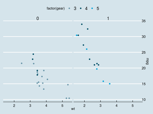
## Standard
p + theme_economist() +
  scale_colour_economist()
![enter image description here]()
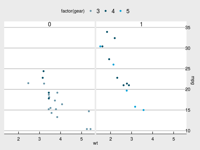
## White
p + theme_economist_white() +
  scale_colour_economist()
![enter image description here]()
How to reproduce the plot given in example
Since I cannot install SciencesPo package in my computer, I propose you a ggplot + ggthemes approach.
A good starting point might be the following approach. I use as an example the diamond dataset.
library(dplyr)
library(ggplot2)
library(ggthemes)

df <- diamonds %>%
  group_by(cut) %>%
  summarise(mean = mean(price), sigma = sd(price),
            n = n())
df <- df %>%
  mutate(int_minus = mean - 1.96*sigma/sqrt(n),
         int_plus = mean + 1.96*sigma/sqrt(n))
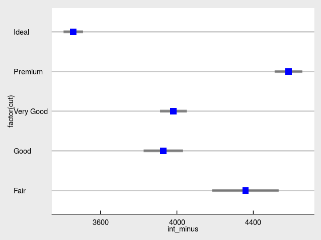
And then the plot
ggplot(df) +
  geom_segment(aes(x = int_minus, xend = int_plus, y = factor(cut), yend = factor(cut)), size = 2L, alpha = 0.4) +
  geom_point(aes(x = mean, y = factor(cut)), shape = 15, color = "blue", size = 4L) +
  theme_economist_white()
![enter image description here]()


geom_segmentis more appropriate thanbar, just figuring it out. – Golightly