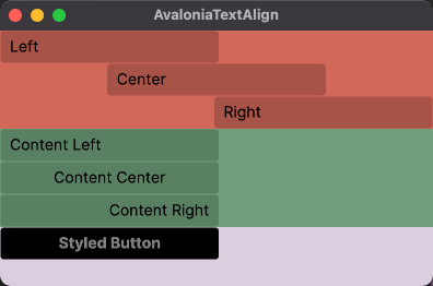
There are two different types of alignments:
- how to align an element with a parent element that is larger than the element
- how to align the content inside an element
To align an element horizontally within a parent element, you can use HorizontalAlignment. To align the content, however, HorizontalContentAlignment must be used.
What is displayed in the Avalonia Dev Tools on the right side in the Layout Visualizer area is the HorizontalAlignment. But when the button is selected, you can see the HorizontalContentAlignment in the center in the Properties area in text form.
These different alignments are best demonstrated with a short XAML example:
- first a stackpanel with alignment of the element in the parent panel
- then a stack panel with applied content alignment
- finally the button with a style where the content alignment is set to centered
<Window.Styles>
    <Style Selector="Button#myBtn">
        <Setter Property="Background" Value="Black" />
        <Setter Property="Foreground" Value="Gray" />
        <Setter Property="FontWeight" Value="Bold" />
        <Setter Property="HorizontalContentAlignment" Value="Center" />
    </Style>
</Window.Styles>

<StackPanel Background="#D9D0DE">
    <!-- different horizontal alignments of element in parent panel -->
    <StackPanel Background="#C46D5E">
        <Button HorizontalAlignment="Left" Content="Left" Width="200" />
        <Button HorizontalAlignment="Center" Content="Center" Width="200" />
        <Button HorizontalAlignment="Right" Content="Right" Width="200" />
    </StackPanel>

    <!-- different horizontal content alignments -->
    <StackPanel Background="#7A9E7E">
        <Button HorizontalContentAlignment="Left" Content="Content Left" Width="200" />
        <Button HorizontalContentAlignment="Center" Content="Content Center" Width="200" />
        <Button HorizontalContentAlignment="Right" Content="Content Right" Width="200" />
    </StackPanel>

    <!-- styled button -->
    <StackPanel>
        <Button x:Name="myBtn" Content="Styled Button" Width="200" />
    </StackPanel>
</StackPanel>
Visually, it looks something like this:
![visual demo]()
As you can see on the bottom button, the style aligns the button content horizontally centered.


TextBlockto theButtonand set the property directly or via the style with selector<Style Selector="Button TextBlock">. More generic approach would be to just setHorizontalContentAlignment, so everything you insert as aContentproperty will be aligned. – Vaginal