Creating overlay in CSS-Grid
Asked Answered
I

3

6

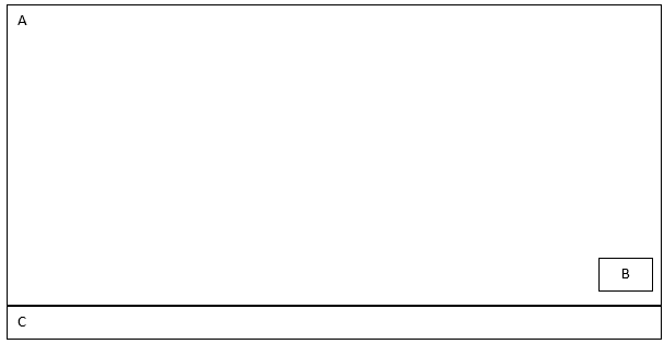
I am trying to create an overlay in CSS3 grid but I can't seem to figure out how I can go about achieving it. I have searched online but haven't found anything of help. I want to achieve something like below:

enter image description here

body {
  margin: 0;
  padding: 0;
}

.wrapper {
		display: grid;
		grid-template-rows: 1f;
    width: 100vw;
    height: 100vh; 
    grid-template-areas:
      "a"
      "b"
      "c";
	}

.box {
  background-color: #444;
  color: #fff;
}

.a {
  grid-area: a;
}

.b {
  grid-area: b;
}

.c {
  grid-area: c;
}
<div class="wrapper">
  <div class="box a">A</div>
  <div class="box b">B</div>
  <div class="box c">C</div>
</div>

Here is a link to codepen: https://codepen.io/anon/pen/PROVeY

Edited:

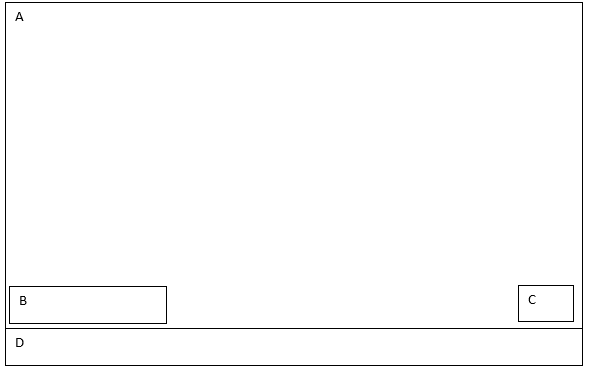
How to place div on left and right side overlay against the larger div behind it in CSS3 grid-layout enter image description here
 body {
      margin: 0;
      padding: 0;
    }

    .wrapper {
            display: grid;
            grid-template-rows: 1f;
        width: 100vw;
        height: 100vh; 
        grid-template-areas:
          "a"
          "b"
          "c";
        }

    .box {
      background-color: #444;
      color: #fff;
    }

    .a {
      grid-area: a;
    }

    .b {
      grid-area: b;
    }

    .c {
      grid-area: c;
    }
    .D {
      grid-area: D;
    }


    <div class="wrapper">
      <div class="box a">A</div>
      <div class="box b">B</div>
      <div class="box c">C</div>
      <div class="box D">C</div>
    </div>
Infante answered 27/3, 2018 at 14:39 Comment(0)
B
6

Like this:

Grid-template areas aren't the most useful things here. Better to define the column / rows independently and then assign the elements to them indvidiually. Then align them as required.

body {
    margin: 0;
    padding: 0;
}

.wrapper {
  margin:auto;
  width:90vw;
    display: grid;
    height: 100vh; 
  grid-template-columns:1fr; /* only one column */
  grid-template-rows:1fr auto; /* 2 rows */
    }
.a,
.b {
  grid-column:1; /* first-column */
  grid-row:1; /* first row */
}


.b {
  width:3em;
  height:3em;
  align-self: end; /* bottom of column */
  justify-self: end; /* right of row */
  margin:1em;
}

.box {
  border:1px solid green;
}
<div class="wrapper">
  <div class="box a">A</div>
  <div class="box b">B</div>
  <div class="box c">C</div>
</div>
Bulldog answered 27/3, 2018 at 15:7 Comment(1)
Hi, sorry to bother you again - I am trying to update my page as shown in the edited section of the post and I would like to place 1 div on left and 1 on right, but I can't seem to get it to that place. Please could you help. Thanks.Infante
B
1

Update Answer for your updated question:

Try the below code snippet:

body {
    margin: 0;
    padding: 0;
}

.wrapper {
  margin:auto;
  width:90vw;
    display: grid;
    height: 100vh; 
  grid-template-columns:1fr; /* only one column */
  grid-template-rows:1fr auto; /* 2 rows */
    }
.a,
.b,.c {
  grid-column:1; /* first-column */
  grid-row:1; /* first row */
}

.c {
  width:3em;
  height:3em;
  align-self: end; /* bottom of column */
  justify-self: end; /* right of row */
  margin:1em;
}

.b {
  width:9em;
  height:3em;
  align-self: end; /* bottom of column */
  justify-self: start; /* left of row */
  margin:0.5em;
 
}

.box {
  border:1px solid green;
}
<div class="wrapper">
  <div class="box a">A</div>
  <div class="box b">B</div>
  <div class="box c">C</div>
  <div class="box d">D</div>
</div>
Bookcraft answered 8/7, 2018 at 17:33 Comment(0)
C
0

I know this is an old question, but I think CSS Grid is your best friend here:

<div class="wrapper">
  <div class="box a">A</div>
  <div class="box b">B</div>
  <div class="box c">C</div>
  <div class="box d">D</div>
</div>

.wrapper {
  display: grid;
  grid-template-columns: 2fr 4fr 1fr; /* 3 columns */
  grid-template-rows: 350px 40px 40px; /* 3 rows */
}

.a {
  background: pink;
  grid-row: 1 / 3;
  grid-column: 1 / 4;
}

.b {
  background: teal;
  grid-row: 2 / 3;
  grid-column: 1 / 2;
}

.c {
  background: yellow;
  grid-row: 2 / 3;
  grid-column: 3 / 4;
}

.d {
  background: orange;
  grid-row: 3 / 4;
  grid-column: 1 / 4;
}
Collodion answered 30/8, 2023 at 20:51 Comment(0)

© 2022 - 2024 — McMap. All rights reserved.