Add horizontal quantile lines to scatter plot ggplot2 R
Asked Answered
L

2

6

I have eg data below

eg_data <- data.frame(
period = c(sample( c("1 + 2"), 1000, replace = TRUE)),
max_sales = c(sample( c(1:10), 1000, replace = TRUE, prob = 
c(.05, .10, .15, .25, .25, .10, .05, .02, .02, .01)))

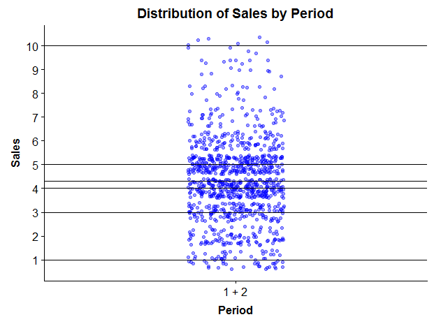
I want to make a scatter (jitter, actually) plot and add horizontal lines at different points along the y-axis. I want to be able to customize the percentiles at which I add the lines, but for now, something like R's summary function would work just fine.

summary(eg_data$max_sales)

I have the code for a jitter plot below. It runs and produces the graph, but I keep getting the error message:

Each group consists of only one observation. Do you need to adjust the group aesthetic?

jitter <-  (
(ggplot(data = eg_data, aes(x=period, y=max_sales, group = 1)) +
geom_jitter(stat = "identity", width = .15, color = "blue", alpha = .4)) +
scale_y_continuous(breaks= seq(0,12, by=1)) +
geom_line(stat = 'summary', fun.y = "quantile", fun.args=list(probs=0.1)) +
ggtitle("Distribution of Sales by Period") + xlab("Period") + ylab("Sales") +
theme(plot.title = element_text(color = "black", size = 14, face = "bold", hjust = 0.5),
      axis.title.x = element_text(color = "black", size = 12, face = "bold"), 
      axis.title.y = element_text(color = "black", size = 12, face = "bold")) +
labs(fill = "Period") )
jitter

I tried looking at this question -

ggplot2 line chart gives "geom_path: Each group consist of only one observation. Do you need to adjust the group aesthetic?"

It suggests making all variables numeric. My period variable is a character, I'd like to keep it that way, but even when I convert it to numeric, it still gives me the error.

Any help would be appreciated. Thank you!

Limitative answered 14/12, 2018 at 17:29 Comment(0)
R
7

Instead of geom_line what you want is geom_hline. In particular, replacing geom_line with

stat_summary(fun.y = "quantile", fun.args = list(probs = c(0.1, 0.2)), 
             geom = "hline", aes(yintercept = ..y..))

gives

enter image description here

where indeed

quantile(eg_data$max_sales, c(0.1, 0.2))
# 10% 20% 
#   2   3 

It also eliminates the warning you were getting.

Ratcliffe answered 14/12, 2018 at 18:12 Comment(0)
D
0

I don't know if this is the most elegant solution, but you can always calculate the summary statistics elsewhere and put it in the plot. This also gives a bit more control over what is happening (for my taste)

hline_coordinates= data.frame(Quantile_Name=names(summary(eg_data$max_sales)),
                          quantile_values=as.numeric(summary(eg_data$max_sales)))

jitter <-  (
  (ggplot(data = eg_data, aes(x=period, y=max_sales)) + #removed group=1
     geom_jitter(stat = "identity", width = .15, color = "blue", alpha = .4)) +
     scale_y_continuous(breaks= seq(0,12, by=1)) +

     geom_hline(data=hline_coordinates,aes(yintercept=quantile_values)) +
     ggtitle("Distribution of Sales by Period") + xlab("Period") + ylab("Sales") +
     theme(plot.title = element_text(color = "black", size = 14, face = "bold", hjust = 0.5),
        axis.title.x = element_text(color = "black", size = 12, face = "bold"), 
        axis.title.y = element_text(color = "black", size = 12, face = "bold")) +
     labs(fill = "Period") )
jitter

enter image description here

Dashpot answered 14/12, 2018 at 18:44 Comment(3)
woops. too slow. ;-)Dashpot
Your answer wasn't first but it is helpful. Thank you!Limitative
Hi TobiO, you can simplify by using: geom_hline(yintercept=as.numeric(summary(eg_data$max_sales))) or geom_hline(yintercept=hline_coordinates$quantile_values)Mccormac

© 2022 - 2024 — McMap. All rights reserved.