My suggestion would be to add an arrow annotation that overlays the indicator chart.
By setting the range of the chart to [-1,1] x [0,1] we are basically creating a new coordinate system that the arrow will be on, we can approximate where the arrow should go to in order to correspond to the value on your indicator chart. This will also ensure that the point (0,0) is at the center of your chart which is convenient since that will be one of the arrow's endpoints.
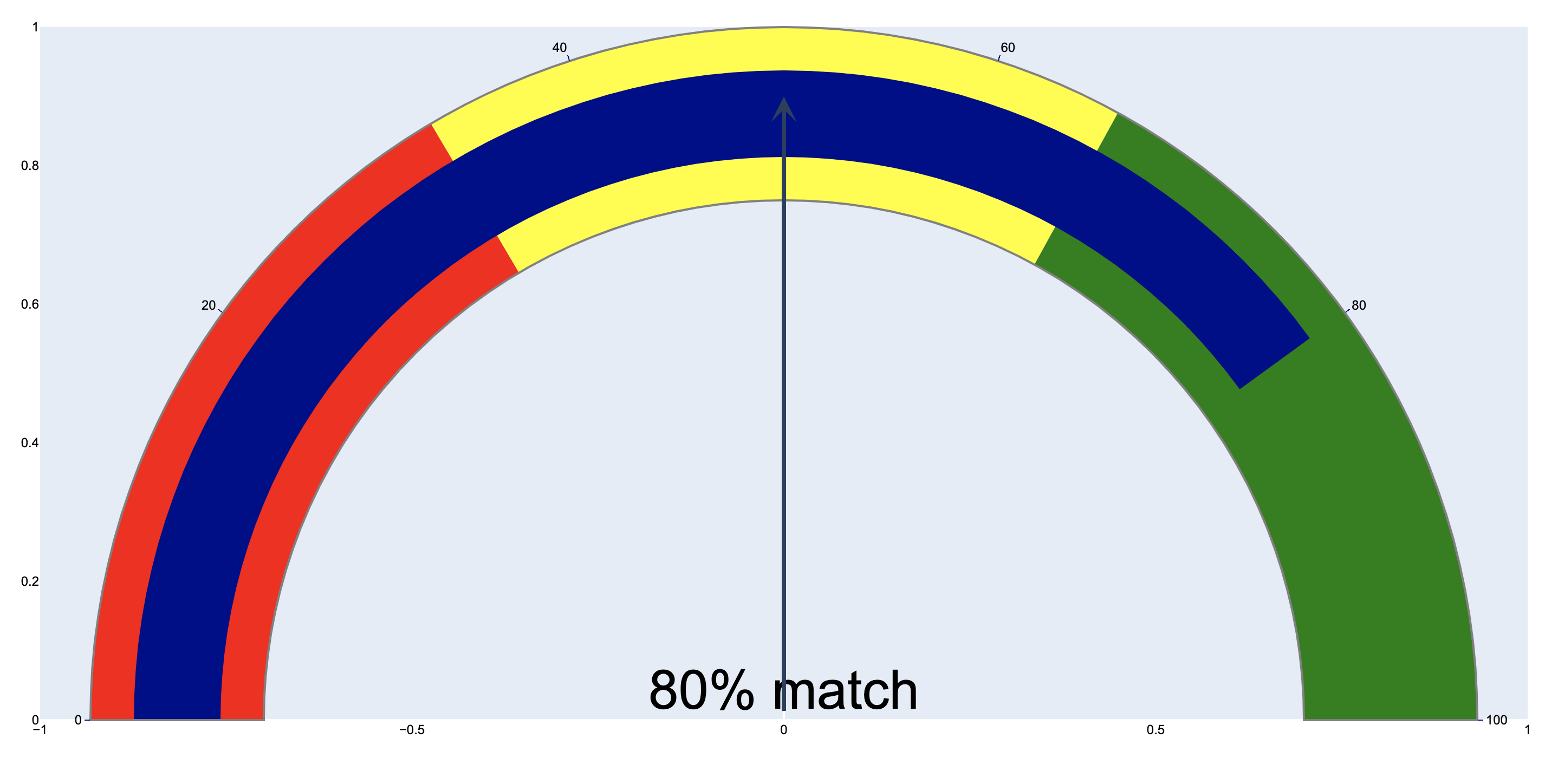
When adding an arrow annotation ax and ay are coordinates for the tail of your arrow, so we want that in the middle of our chart which would be at ax=0 and ay=0. I placed the arrow straight up to show that the radius of the indicator chart with respect to the chart is approximately 0.9 units for my browser window. This may be different for yours.
import plotly.graph_objects as go

fig = go.Figure(go.Indicator(
    mode = "gauge+number",
    number = {'suffix': "% match", 'font': {'size': 50}},
    value = 80,
    domain = {'x': [0,1], 'y': [0,1]},
    gauge = {
        'axis': {'range': [None, 100], 'tickwidth': 1, 'tickcolor': "darkblue"},
        'bar': {'color': "darkblue"},
        'bgcolor': "white",
        'borderwidth': 2,
        'bordercolor': "gray",
        'steps': [
            {'range': [0, 33], 'color': 'red'},
            {'range': [33, 66], 'color': 'yellow'},
            {'range': [66,100], 'color': 'green'}],
        }))

fig.update_layout(
    font={'color': "black", 'family': "Arial"},
    xaxis={'showgrid': False, 'range':[-1,1]},
    yaxis={'showgrid': False, 'range':[0,1]},
    # plot_bgcolor='rgba(0,0,0,0)'
    )

## by setting the range of the layout, we are effectively adding a grid in the background
## and the radius of the gauge diagram is roughly 0.9 when the grid has a range of [-1,1]x[0,1]

fig.add_annotation(
    ax=0,
    ay=0,
    axref='x',
    ayref='y',
    x=0,
    y=0.9,
    xref='x',
    yref='y',
    showarrow=True,
    arrowhead=3,
    arrowsize=1,
    arrowwidth=4
    )

fig.show()
![enter image description here]()
Now while we could use trial and error to find where the arrow should end, that's a truly hacky solution which isn't generalizable at all.
For the next steps, I would recommend you choose an aspect ratio for your browser window size that keeps the indicator chart as close to a circle as possible (e.g. an extreme aspect ratio will make your indicator chart more elliptical, and I am making a simple assumption that the indicator chart is a perfect circle).
So, under the assumption that the indicator chart is roughly a circle with radius ≈ 0.9 (in my case, your radius might be different), we can find the x and y coordinates of your circle using polar coordinates: x = r*cos(θ) and y = r*sin(θ). Note that this formula is only valid for a circle centered at (0,0), which is why we centered your chart at this point.
Since the value on the indicator is 80 on a scale of 0-100, we are 80/100 of the way of an 180 angle of rotation, which comes out to 180 degrees*(80/100) = 144 degrees. So you are rotating 144 degrees clockwise from the lower left corner, or 36 degrees counterclockwise from the lower right corner.
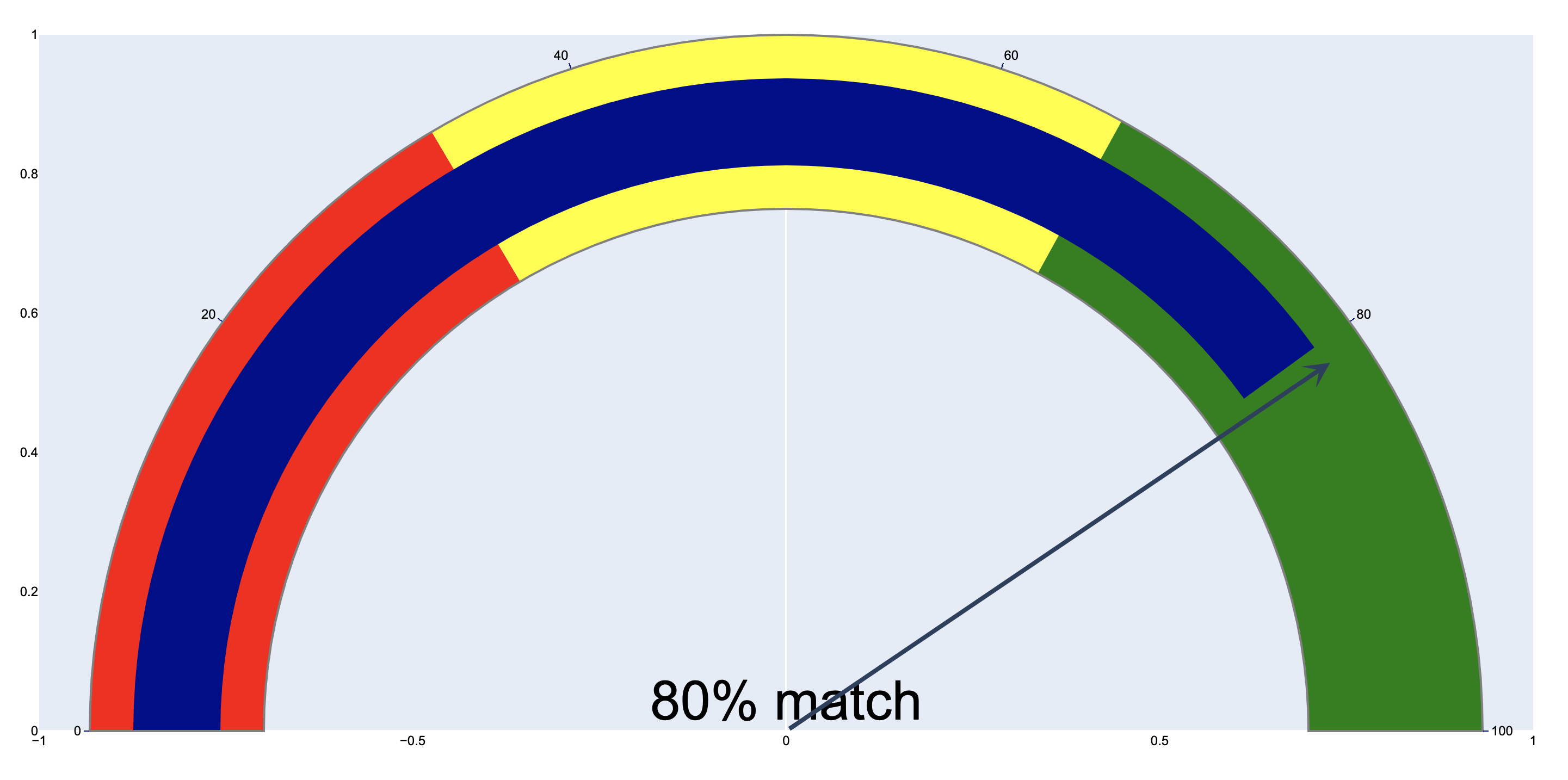
Plugging in, we get x = 0.9*cos(36 degrees) = 0.72811529493, and y = 0.9*sin(36 degrees) = 0.52900672706. Updating the annotation:
fig.add_annotation(
    ax=0,
    ay=0,
    axref='x',
    ayref='y',
    x=0.72811529493,
    y=0.52900672706,
    xref='x',
    yref='y',
    showarrow=True,
    arrowhead=3,
    arrowsize=1,
    arrowwidth=4
    )
We get the following image:
![enter image description here]()
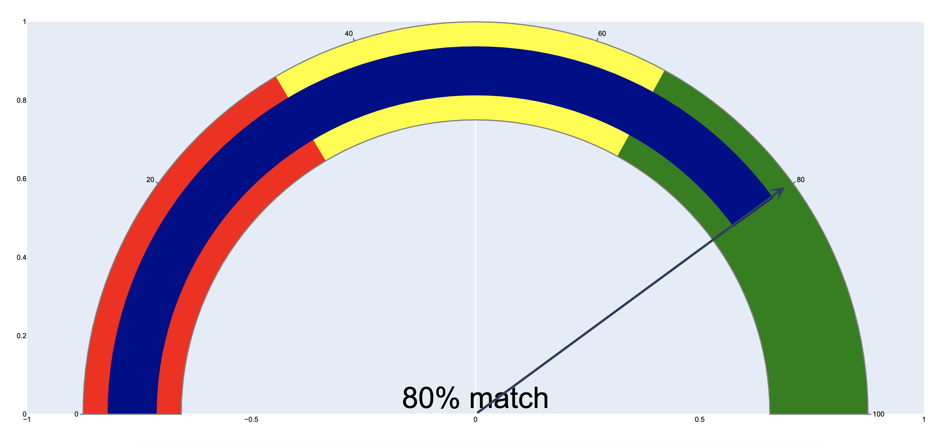
So this is pretty close but not an exact science. For my browser window, let's adjust the angle slightly higher to 40 degrees. Repeating the same process x = 0.9*cos(40 degrees) = 0.6894399988, and y = 0.9*cos(40 degrees) = 0.57850884871, and updating the annotation coordinates, I get the following chart:
![enter image description here]()
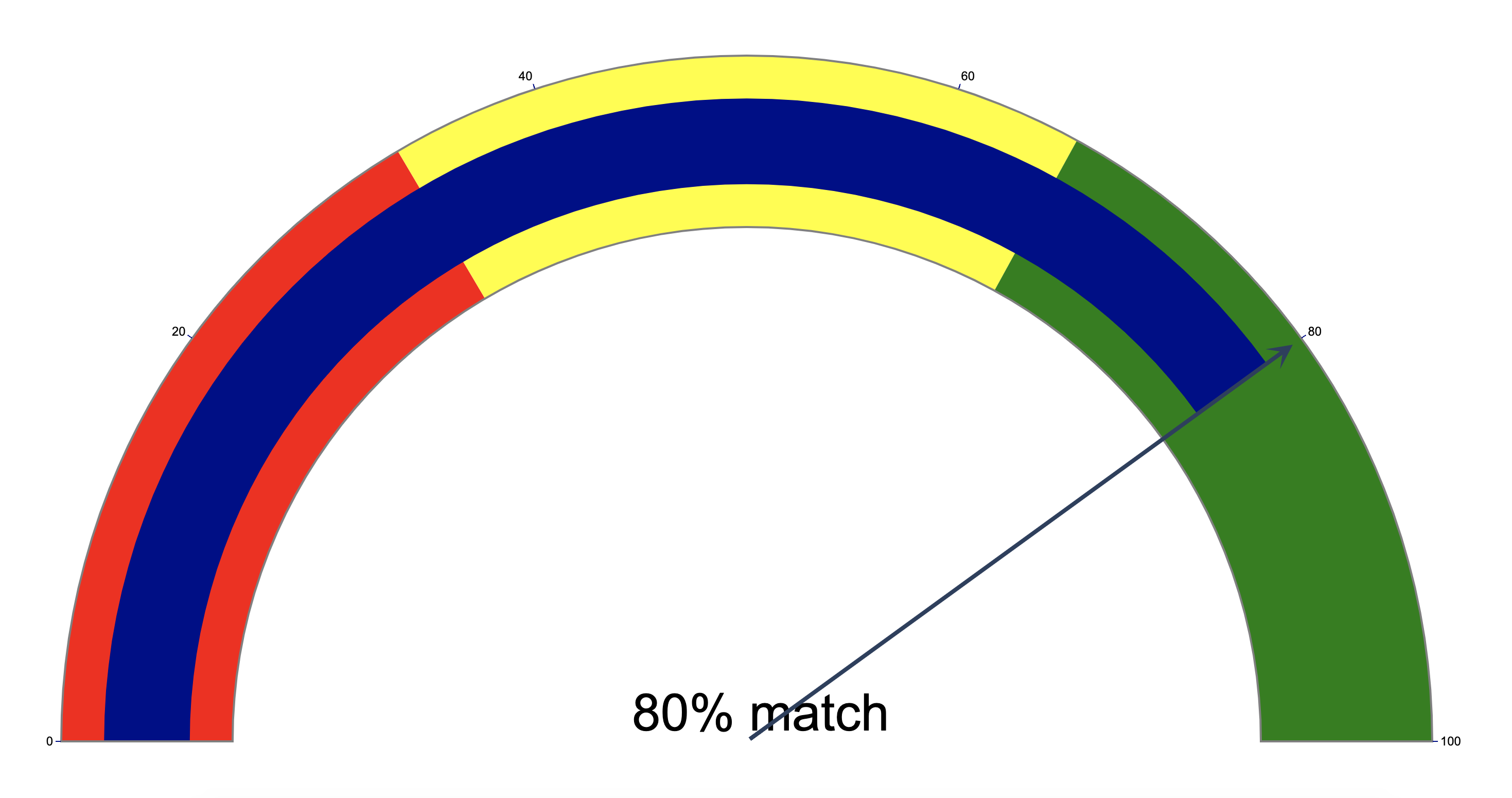
To make the chart prettier, we can now remove tick labels of the chart for the arrow annotation, and also make the background transparent. And to make this method more easy to adjust, I have made theta and r variables.
from numpy import radians, cos, sin
import plotly.graph_objects as go

fig = go.Figure(go.Indicator(
    mode = "gauge+number",
    number = {'suffix': "% match", 'font': {'size': 50}},
    value = 80,
    domain = {'x': [0,1], 'y': [0,1]},
    gauge = {
        'axis': {'range': [None, 100], 'tickwidth': 1, 'tickcolor': "darkblue"},
        'bar': {'color': "darkblue"},
        'bgcolor': "white",
        'borderwidth': 2,
        'bordercolor': "gray",
        'steps': [
            {'range': [0, 33], 'color': 'red'},
            {'range': [33, 66], 'color': 'yellow'},
            {'range': [66,100], 'color': 'green'}],
        }))

fig.update_layout(
    font={'color': "black", 'family': "Arial"},
    xaxis={'showgrid': False, 'showticklabels':False, 'range':[-1,1]},
    yaxis={'showgrid': False, 'showticklabels':False, 'range':[0,1]},
    plot_bgcolor='rgba(0,0,0,0)'
    )

## by setting the range of the layout, we are effectively adding a grid in the background
## and the radius of the gauge diagram is roughly 0.9 when the grid has a range of [-1,1]x[0,1]

theta = 40
r= 0.9
x_head = r * cos(radians(theta))
y_head = r * sin(radians(theta))

fig.add_annotation(
    ax=0,
    ay=0,
    axref='x',
    ayref='y',
    x=x_head,
    y=y_head,
    xref='x',
    yref='y',
    showarrow=True,
    arrowhead=3,
    arrowsize=1,
    arrowwidth=4
    )

fig.show()
![enter image description here]()


