How to create a decision boundary graph for kNN models in the Caret package?
Asked Answered
G

1

6

I'd like to plot a decision boundary for the model created by the Caret package. Ideally, I'd like a general case method for any classifier model from Caret. However, I'm currently working with the kNN method. I've included code below that uses the wine quality dataset from UCI which is what I'm working with right now.

I found this method that works with the generic kNN method in R, but can't figure out how to map it to Caret -> https://stats.stackexchange.com/questions/21572/how-to-plot-decision-boundary-of-a-k-nearest-neighbor-classifier-from-elements-o/21602#21602

    library(caret)

    set.seed(300)

    wine.r <- read.csv('https://archive.ics.uci.edu/ml/machine-learning-databases/wine-quality/winequality-red.csv', sep=';')
    wine.w <- read.csv('https://archive.ics.uci.edu/ml/machine-learning-databases/wine-quality/winequality-white.csv', sep=';')

    wine.r$style <- "red"
    wine.w$style <- "white"

    wine <- rbind(wine.r, wine.w)

    wine$style <- as.factor(wine$style)

    formula <- as.formula(quality ~ .)

    dummies <- dummyVars(formula, data = wine)
    dummied <- data.frame(predict(dummies, newdata = wine))
    dummied$quality <- wine$quality

    wine <- dummied

    numCols <- !colnames(wine) %in% c('quality', 'style.red', 'style.white')

    low <- wine$quality <= 6
    high <- wine$quality > 6
    wine$quality[low] = "low"
    wine$quality[high] = "high"
    wine$quality <- as.factor(wine$quality)

    indxTrain <- createDataPartition(y = wine[, names(wine) == "quality"], p = 0.7, list = F)

    train <- wine[indxTrain,]
    test <- wine[-indxTrain,]

    corrMat <- cor(train[, numCols])
    correlated <- findCorrelation(corrMat, cutoff = 0.6)

    ctrl <- trainControl(
                         method="repeatedcv",
                         repeats=5,
                         number=10,
                         classProbs = T
                         )

    t1 <- train[, -correlated]
    grid <- expand.grid(.k = c(1:20))

    knnModel <- train(formula, 
                      data = t1, 
                      method = 'knn', 
                      trControl = ctrl, 
                      tuneGrid = grid, 
                      preProcess = 'range'
                      )

    t2 <- test[, -correlated]
    knnPred <- predict(knnModel, newdata = t2)

    # How do I render the decision boundary?
Gerstein answered 8/9, 2015 at 4:28 Comment(0)
M
8

The first step is to actually understand what the code you linked is doing! Indeed you can produce such a graph without anything to do with KNN.

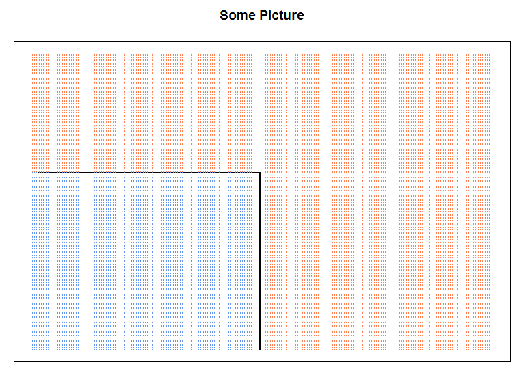
For example, lets just have some sample data, where we just "colour" the lower quadrant of your data.

Step 1

Generate a grid. Basically how the graphing works, is create a point at each coordinate so we know which group it belongs to. in R this is done using expand.grid to go over all possible points.

x1 <- 1:200
x2 <- 50:250

cgrid <- expand.grid(x1=x1, x2=x2)
# our "prediction" colours the bottom left quadrant
cgrid$prob <- 1
cgrid[cgrid$x1 < 100 & cgrid$x2 < 170, c("prob")] <- 0

If this was knn, it would be the prob would be the prediction for that particular point.

Step 2

Now plotting it is relatively straightforward. You need to conform to the contour function, so you firstly create a matrix with the probabilities.

matrix_val <- matrix(cgrid$prob, 
                     length(x1), 
                     length(x2))

Step 3

Then you can proceed as what the link did:

contour(x1, x2, matrix_val, levels=0.5, labels="", xlab="", ylab="", main=
          "Some Picture", lwd=2, axes=FALSE)
gd <- expand.grid(x=x1, y=x2)
points(gd, pch=".", cex=1.2, col=ifelse(prob==1, "coral", "cornflowerblue"))
box()

output:

somepic


So then back to your particular example. I'm going to use iris, because your data wasn't very interesting to look at, but the same principle applies. To create the grid you will need to choose your x-y axis and leave everything else fixed!

knnModel <- train(Species ~., 
                  data = iris, 
                  method = 'knn')

lgrid <- expand.grid(Petal.Length=seq(1, 5, by=0.1), 
                     Petal.Width=seq(0.1, 1.8, by=0.1),
                     Sepal.Length = 5.4,
                     Sepal.Width=3.1)

Next simply use the predict function as you have done above.

knnPredGrid <- predict(knnModel, newdata=lgrid)
knnPredGrid = as.numeric(knnPredGrid) # 1 2 3

And then construct the graph:

pl = seq(1, 5, by=0.1)
pw = seq(0.1, 1.8, by=0.1)

probs <- matrix(knnPredGrid, length(pl), 
                 length(pw))

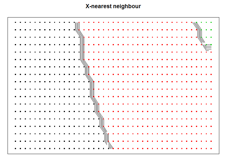
contour(pl, pw, probs, labels="", xlab="", ylab="", main=
          "X-nearest neighbour", axes=FALSE)

gd <- expand.grid(x=pl, y=pw)

points(gd, pch=".", cex=5, col=probs)
box()   

This should yield an output like this:

iris


To add test/train results from your model, you can follow what I've done. The only difference is you need to add the predicted points (this is not the same as the grid which were used to generate the boundary.

library(caret) 
data(iris)

indxTrain <- createDataPartition(y = iris[, names(iris) == "Species"], p = 0.7, list = F)

train <- iris[indxTrain,]
test <- iris[-indxTrain,]

knnModel <- train(Species ~.,
                  data = train,
                  method = 'knn')

pl = seq(min(test$Petal.Length), max(test$Petal.Length), by=0.1)
pw = seq(min(test$Petal.Width), max(test$Petal.Width), by=0.1)

# generates the boundaries for your graph
lgrid <- expand.grid(Petal.Length=pl, 
                     Petal.Width=pw,
                     Sepal.Length = 5.4,
                     Sepal.Width=3.1)

knnPredGrid <- predict(knnModel, newdata=lgrid)
knnPredGrid = as.numeric(knnPredGrid)

# get the points from the test data...
testPred <- predict(knnModel, newdata=test)
testPred <- as.numeric(testPred)
# this gets the points for the testPred...
test$Pred <- testPred

probs <- matrix(knnPredGrid, length(pl), length(pw))

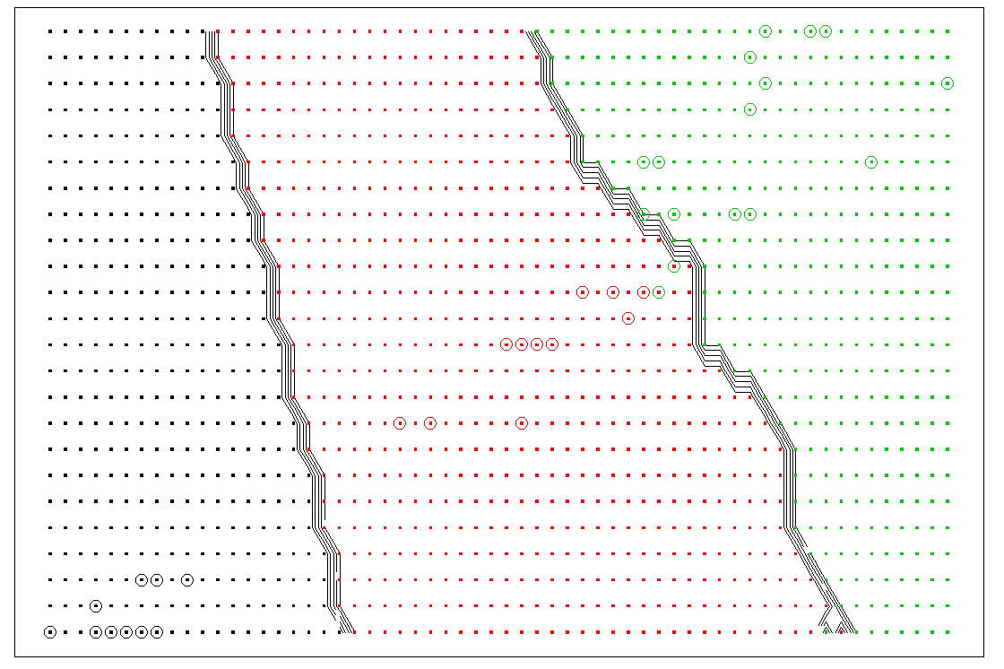
contour(pl, pw, probs, labels="", xlab="", ylab="", main="X-Nearest Neighbor", axes=F)
gd <- expand.grid(x=pl, y=pw)

points(gd, pch=".", cex=5, col=probs)

# add the test points to the graph
points(test$Petal.Length, test$Petal.Width, col=test$Pred, cex=2)
box()

Output:

enter image description here

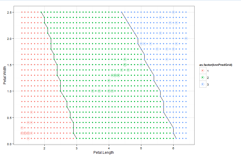
Alternatively you can use ggplot to do the graphing which might be easier:

ggplot(data=lgrid) + stat_contour(aes(x=Petal.Length, y=Petal.Width, z=knnPredGrid),
                            bins=2) +
  geom_point(aes(x=Petal.Length, y=Petal.Width, colour=as.factor(knnPredGrid))) +
  geom_point(data=test, aes(x=test$Petal.Length, y=test$Petal.Width, colour=as.factor(test$Pred)),
             size=5, alpha=0.5, shape=1)+
  theme_bw()

Output:

enter image description here

Mclane answered 8/9, 2015 at 6:30 Comment(6)
This is a very good response and I'm much closer I think. I updated a gist of my code with an attempt to plot the decision boundary: gist.github.com/jameskyle/729945f6fa38a343b8ab. But the graph I get is a monstrous, plaid mess (i.imgur.com/TYCpleT.png). Is this due to an error in implementation or is it the data itself? I chose alcohol + chlorides as my x,y since they were the features of highest importance.Gerstein
I wrote a script based in iris that partitions the iris data instead of generating the test set, I get a similarly fractional graph. I assume that's just how the decision boundaries work out? Script: gist.github.com/jameskyle/ffed976dfef1cbc778d5 Graph: i.imgur.com/UX1xmp9.pngGerstein
In your newdata part, the data needs to be like a grid; I'll update my answer.Mclane
For the wine one, heres my code and output: gist.github.com/chappers/4881b5ae17918309d184, imgur.com/Ei11k7AMclane
So the lgrid is used to span the selected x,y space while holding the other variables static. This is so the model's prediction is based solely on the two variables of interest. Thus, the contour is drawn at the boundary defined by the model's prediction on these two variables. That sound right?Gerstein
Can R do 3-D contours where you span a x, y, & z while holding other variables static to get a decision plane? That would look pretty cool.Gerstein

© 2022 - 2024 — McMap. All rights reserved.