Control colour of geom_text_repel
Asked Answered
H

1

6

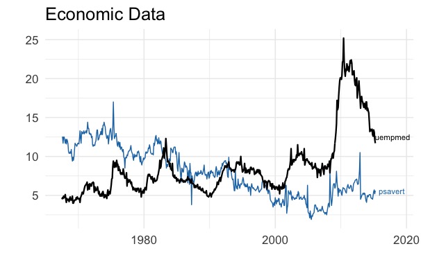
I would like to change the colour of one of my ggrepel labels to black. I have tried to override the inheritance by specifying ...geom_text_repel(...colour='black') but that doesn't seem to work.

uempmed is blue but I need it to match the black line colour

My attempt at a fix to the problem is in the second geom_text_repel function (below).

N.B. If there is a way to control the colour of individual geom_text_repel elements, rather than having to call the function twice, I would prefer that.

library("tidyverse")
library("ggthemes")
library("ggrepel")

df1 <- gather(economics, variable_name, observation, -date) %>% 
  rename(period = date) %>% 
  filter(variable_name == 'psavert')

df2 <- gather(economics, variable_name, observation, -date) %>% 
  rename(period = date) %>% 
  filter(variable_name == 'uempmed')

ggplot(df1, aes(x = period, y = observation, colour = variable_name)) +
  geom_line() +
  geom_line(data = df2, colour = 'black', size = .8) +
  geom_text_repel(
    data = subset(df1, period == max(as.Date(period, "%Y-%m-%d"))),
    aes(label = variable_name),
    size = 3,
    nudge_x = 45,
    segment.color = 'grey80'
  ) +
  geom_text_repel(
    data = subset(df2, period == max(as.Date(period, "%Y-%m-%d"))),
    aes(label = variable_name, colour = 'black'), #How do I set the colour of the label text to black?
    size = 3,
    nudge_x = 45,
    segment.color = 'grey80'
  ) +
  scale_y_continuous(labels = scales::comma) +
  theme_minimal(base_size = 16) +
  scale_color_tableau() + 
  scale_fill_tableau() +
  theme(legend.position = 'none') +
  labs(x="", y="", title = "Economic Data") + 
  scale_x_date(limits = c(min(df1$period), max(df1$period) + 1200))
Hindu answered 3/4, 2018 at 5:27 Comment(0)
A
8

Do the same thing you did in your geom_line() layer. You want to set a color, not a mapping. Make colour = 'black' an argument to geom_text_repel(), not aes().

ggplot(df1, aes(x = period, y = observation, colour = variable_name)) +
  geom_line() +
  geom_line(data = df2, colour = 'black', size = .8) + # just like this layer
  geom_text_repel(
    data = subset(df1, period == max(as.Date(period, "%Y-%m-%d"))),
    aes(label = variable_name),
    size = 3,
    nudge_x = 45,
    segment.color = 'grey80'
  ) +
  geom_text_repel(
    data = subset(df2, period == max(as.Date(period, "%Y-%m-%d"))),
    aes(label = variable_name) # don't assign it here, 
    size = 3,
    nudge_x = 45,
    segment.color = 'grey80',
    colour = "black" # assign it here
  ) +
  scale_y_continuous(labels = scales::comma) +
  theme_minimal(base_size = 16) +
  scale_color_tableau() + 
  scale_fill_tableau() +
  theme(legend.position = 'none') +
  labs(x="", y="", title = "Economic Data") + 
  scale_x_date(limits = c(min(df1$period), max(df1$period) + 1200))
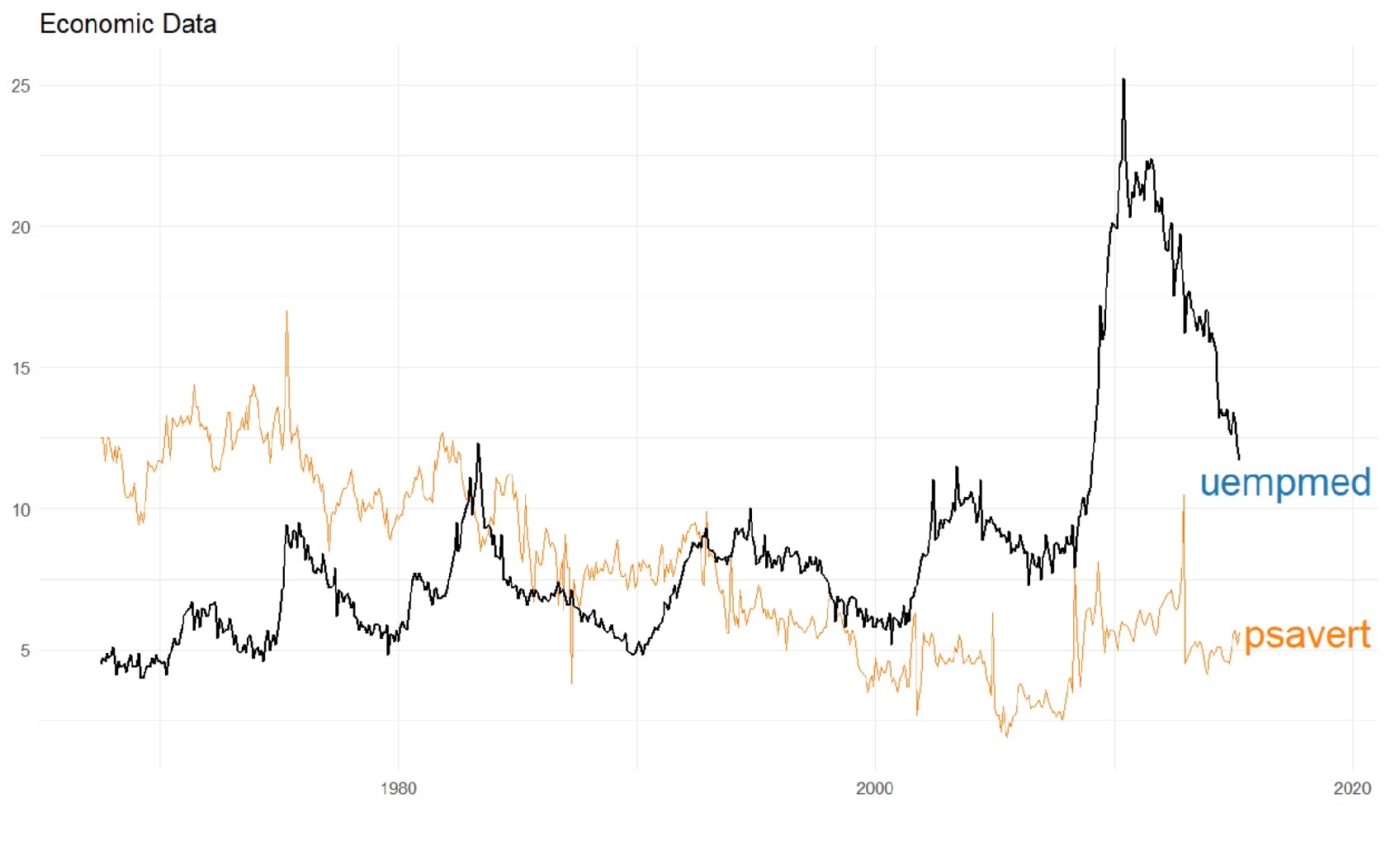
Note that now the first line AND text are now both set manually to "black", so the automatic variable assignment will start over with next line (and text). If you want to set that manually to a different color, you can use the same strategy (set it as an argument to the geom, not as an argument to aes

enter image description here

Ally answered 3/4, 2018 at 5:39 Comment(0)

© 2022 - 2024 — McMap. All rights reserved.