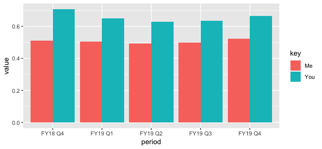
I have some data that captures percentages of two different groups over multiple time periods.
df <- structure(list(period = structure(c(1L, 2L, 3L, 4L, 5L, 1L, 2L,
3L, 4L, 5L), .Label = c("FY18 Q4", "FY19 Q1", "FY19 Q2", "FY19 Q3",
"FY19 Q4"), class = "factor"), key = c("You", "You", "You", "You", "You",
"Me", "Me", "Me", "Me", "Me"), value = c(0.707036316472114,
0.650424585523655, 0.629362214199759, 0.634016393442623, 0.66578947368421,
0.509574110529601, 0.505703612591682, 0.493109917284898, 0.497505296695832,
0.523938932489946)), row.names = c(NA, -10L), class = c("tbl_df",
"tbl", "data.frame"))
I want to plot this data so that the two bars for a period are on top of each other, but the bars are of different widths. I want the bar for "Me" to be width=0.5 and the bar for "You" to be width=0.7. I also want to include a legend that shows what each color represents.
If I wanted to plot the bars side-by-side, I could use position="dodge", like this:
library(ggplot2)
library(dplyr)

ggplot(data=df, aes(x=period, y=value, fill=key)) +
  geom_bar(stat="identity", position="dodge")
I figured out that I can make the bars overlap, and then change the width of each geom_bar() individually, like this:
ggplot(data=df %>% filter(key=="You"), aes(x=period, y=value, color=)) +
  geom_bar(stat="identity", fill="gray50", width=.7) +
  geom_bar(data=df %>% filter(key=="Me"), stat="identity", fill="darkblue", width=0.5)
The second option is what I want, but I no longer have a legend to show what the colors represent. How can I efficiently create a chart like the second example, but maintain the legend?


ggplot(data=df, aes(x=period, y=value, fill=key)) + geom_col(data=df%>%filter(key=="You")) + geom_col(data=df%>%filter(key=="Me"), width=.7)– Scamander