Format labels on bar charts in Altair
Asked Answered
F

1

6

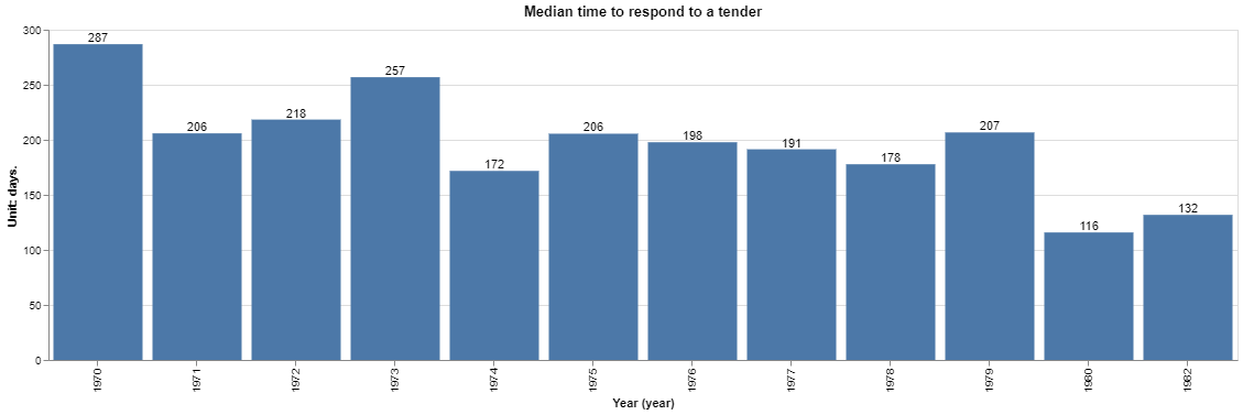
[![chart showing numbers without correct formatting][1]][1]

I need to format the label on these bars, so that they are rounded to nearest whole number. I have the following code:

def chart_tender_response_times(dataframe=None):

        chart = (
            alt.Chart(dataframe, title="Median time to respond to a tender")
                .mark_bar()
                .encode(
                alt.X("year(date):O"
                ),
                alt.Y("mean(median_duration):Q",
                     ## This is our units section, only describe the units of measurement here.
                     axis=alt.Axis(title="Unit: days.")
                ),
                alt.Tooltip(["mean(median_duration):Q"], format=",.2r", title="Days to respond to a tender")
            )
        )

        text = (
            chart.mark_text(align="center", baseline="bottom")
            .encode(text='mean(median_duration):Q')
        )

        return chart+text

I've tried variations of the following...

text = (
            chart.mark_text(align="center", baseline="bottom")
            .encode(text='mean(median_duration):Q', format='.,2r')
        )

but this returns the following schema validation error:

SchemaValidationError: Invalid specification

altair.vegalite.v3.api.Chart, validating 'required'

'data' is a required property

My hunch is that I have to somehow call and format the value, before adding it to the chart, but I can't see how to do this from either the documentation or the examples.

Fourflush answered 20/9, 2019 at 12:29 Comment(0)
A
8

You need to wrap the format in alt.Text, as in encode(text=alt.Text('mean(median_duration):Q', format=',.2r'))

Also, I think format=',.0f' is more robust to round to the nearest integer (e.g. if you have 256.4, it would be rounded to 256, whereas with format=',.2r' you'd get 260)

Below is an example with a function a bit modified to fit another dataset (as you did not provide one):

import altair as alt
from vega_datasets import data

cars = data("cars")

def chart_tender_response_times(dataframe=None):
    chart = (
        alt.Chart(dataframe, title="Median time to respond to a tender")
        .mark_bar()
        .encode(
            alt.X("year(Year):O"),
            alt.Y(
                "mean(Displacement):Q",
                ## This is our units section, only describe the units of measurement here.
                axis=alt.Axis(title="Unit: days."),
            ),
            alt.Tooltip(
                ["mean(Displacement):Q"],
                format=",.0f",
                title="Days to respond to a tender",
            ),
        )
    )

    text = chart.mark_text(align="center", baseline="bottom").encode(
        text=alt.Text("mean(Displacement):Q", format=",.0f")
    )

    return chart + text

chart_tender_response_times(cars)

enter image description here

Adriene answered 20/9, 2019 at 15:49 Comment(0)

© 2022 - 2024 — McMap. All rights reserved.