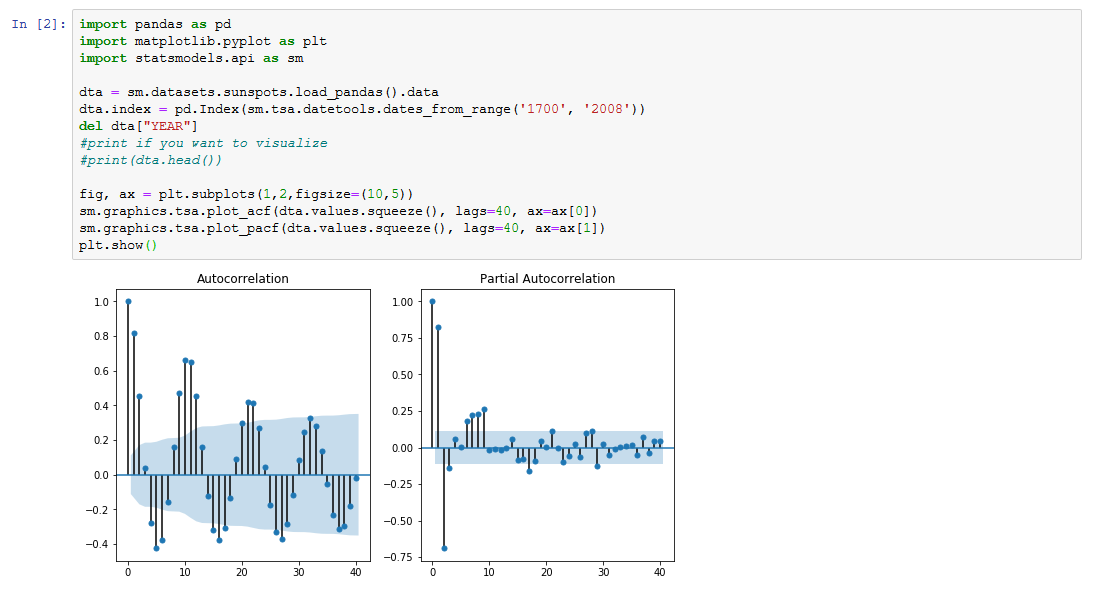
can someone show me how to display plot_acf and plot_pacf side by side? I'm struggling with the show=False arguments and matplotlib crazy object model...
displaying statsmodels plot_acf and plot_pacf side by side in a jupyter notebook
Asked Answered
You can try using plt.subplot. Here is a short example with a data set from statsmodel to guide you. I hope it is helpful.
Code
import pandas as pd
import matplotlib.pyplot as plt
import statsmodels.api as sm

dta = sm.datasets.sunspots.load_pandas().data
dta.index = pd.Index(sm.tsa.datetools.dates_from_range('1700', '2008'))
del dta["YEAR"]
#print if you want to visualize
#print(dta.head())

fig, ax = plt.subplots(1,2,figsize=(10,5))
sm.graphics.tsa.plot_acf(dta.values.squeeze(), lags=40, ax=ax[0])
sm.graphics.tsa.plot_pacf(dta.values.squeeze(), lags=40, ax=ax[1])
plt.show()
is there any way, we can grab the coordinates of those shaded regions? –
Procto
© 2022 - 2024 — McMap. All rights reserved.

