Short answer: You want justify-content not justify-items
.container {
background-color: #aa96da;
display: grid;
justify-content: center; /* -items to -content */
grid-gap: 20px;
grid-template-rows: repeat(3, 1fr);
/*Only if I change this 100px to '1fr' the justify-items will work */
grid-template-columns: repeat(3, 100px);
}
.item {
width: 100px;
height: 100px;
background-color: green;
}
    <div class="container">
        <div class="item"></div>
        <div class="item"></div>
        <div class="item"></div>
        <div class="item"></div>
        <div class="item"></div>
        <div class="item"></div>
        <div class="item"></div>
        <div class="item"></div>
        <div class="item"></div>
    </div>
Long answer:
There's a difference between the grid item and the space it lives in.
When you define a grid, you're only defining rows/columns of the grid called tracks, Not actually defining where each element goes etc.
The DOM elements only follow the flow of the grid and are placed accordingly, which we can alter using properties like grid-column grid-row
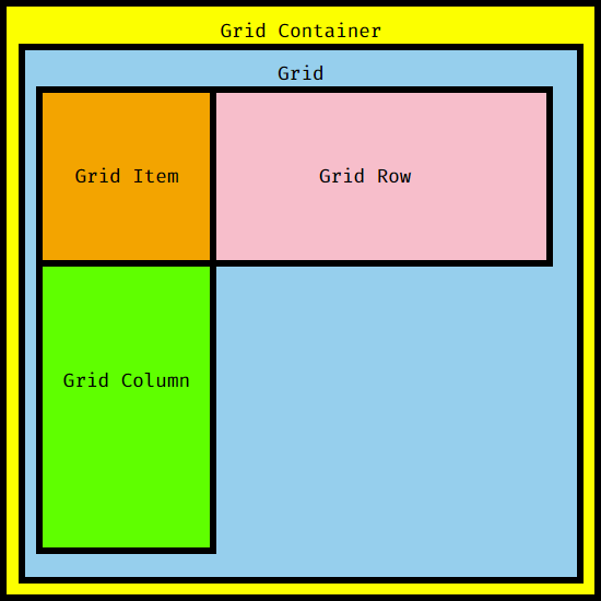
You can look at it like this:
![enter image description here]()
As you can see there's The Grid container, The Grid, The Columns, The Rows and then The Grid items.
The Grid items lives in the intersection between the two called The Grid Area (this what makes css grid better than flexbox in some ways)
And justify-items aligns the grid items within that area.
So grid-template-columns: repeat(3, 1fr); This means 3 columns their width is the width of the grid split evenly between them.
Demo
Don't look at the code just the preview
* {
  padding: 0;
  margin: 0;
  box-sizing: border-box;
}

[grid] {
  height: 300px;
  display: flex;
  border: 2px solid;
  padding: 10px;
  flex-wrap: wrap;
}

[column] {
  flex: 1 0 calc(100% / 3);
  border: 2px solid;
  display: flex;
  flex-direction:column;
  align-items:center;

}

[column]>div {
  width: 100px;
  flex:1;
  background-color: green;
}
<div grid>
  <div column>
    <div>Grid Item</div>
  </div>
  <div column>
    <div>Grid Item</div>
  </div>
  <div column>
    <div>Grid Item</div>
  </div>
  <div column>
    <div>Grid Item</div>
  </div>
  <div column>
    <div>Grid Item</div>
  </div>
  <div column>
    <div>Grid Item</div>
  </div>
  <div column>
    <div>Grid Item</div>
  </div>
  <div column>
    <div>Grid Item</div>
  </div>
  <div column>
    <div>Grid Item</div>
  </div>
</div>
As you can see the grid columns are wider than the grid items 100px which means there space to center stuff, So justify-items: center; will center them inside.
That's why it looks like the grid is centered, But it's actually not reasons why changing to grid-template-columns: repeat(3, 100px); breaks it.
In the case of grid-template-columns: repeat(3, 100px);
Demo
Don't look at the code just the preview
* {
  padding: 0;
  margin: 0;
  box-sizing: border-box;
}

[ctr] {
  border: 2px solid;
  padding: 10px;
}

[grid] {
  height: 300px;
  width: 340px;
  display: flex;
  padding: 10px;
  flex-wrap: wrap;
}

[column] {
  flex: 0 0 100px;
  border: 2px solid;
  display: flex;
  flex-direction: column;
  align-items: center;
}

[column]>div {
  width: 100px;
  flex: 1;
  background-color: green;
}
<div ctr>
  <div grid>
    <div column>
      <div>Grid Item</div>
    </div>
    <div column>
      <div>Grid Item</div>
    </div>
    <div column>
      <div>Grid Item</div>
    </div>
    <div column>
      <div>Grid Item</div>
    </div>
    <div column>
      <div>Grid Item</div>
    </div>
    <div column>
      <div>Grid Item</div>
    </div>
    <div column>
      <div>Grid Item</div>
    </div>
    <div column>
      <div>Grid Item</div>
    </div>
    <div column>
      <div>Grid Item</div>
    </div>
  </div>
</div>
As you can see the columns width equal the grid item's so they all fit snugly within the columns and the grid is still empty.

