Change x-axis labels for ggsurvplot
Asked Answered
N

1

6
library(survival)
library(survminer)

I am using the survminer package to plot unadjusted Kaplan Meier plots. I am calculating mortality comparing different exposures and I have a very specific problem: Is there a way to change the x axis labels of ggsurvplot? In my case I want to replace the timepoint 0 with 30, timepoint 20 with 50, timepoint 40 with 70 and timepoint 60 with 90.

I create my ggsurvplot using the code below:

fit31to90_Mortality <- survfit(msurv31to90DayMortality~Bacteria_Category, data = 

Mortality_31to90_Days_Plot <- 
ggsurvplot(fit31to90_Mortality, xlim = c(0,60), 
break.x.by = 20, xlab = "Day", ylab = c("Survival probability"), 
risk.table = "abs_pct", font.x = c(26, face = "bold"), 
font.y = c(26, face = "bold"), font.tickslab = c(24), 
font.legend = c(24), risk.table.fontsize = 7, risk.table.col = "black", size = 1) 
Mortality_31to90_Days_Plot$plot
Neighborly answered 1/1, 2021 at 17:23 Comment(0)
U
9

You can change the x labels by adding a call to scale_x_continuous for the plot object.

Since you did not provide reproducible data, let's use the example plot from the package documentation:

tdata <- data.frame(time  =c(1,1,1,2,2,2,3,3,3,4,4,4),
                    status=rep(c(1,0,2),4),
                    n=c(12,3,2,6,2,4,2,0,2,3,3,5))
fit  <- survfit(Surv(time, time, status, type='interval') ~1,
                data=tdata, weight=n)
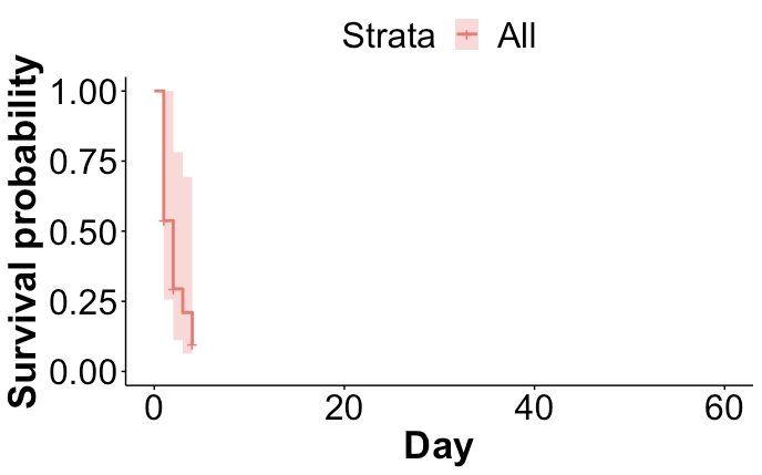
myplot <- ggsurvplot(fit, xlim = c(0,60), 
                     break.x.by = 20, xlab = "Day", ylab = c("Survival probability"), 
                     risk.table = "abs_pct", font.x = c(26, face = "bold"), 
                     font.y = c(26, face = "bold"), font.tickslab = c(24), 
                     font.legend = c(24), risk.table.fontsize = 7, risk.table.col = "black", size = 1) 

enter image description here

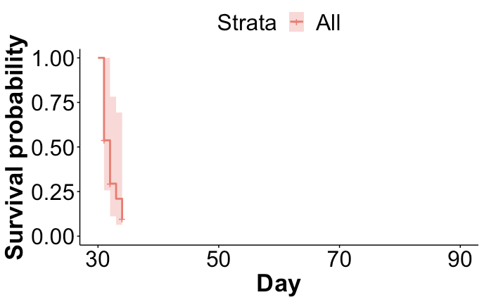
Now you can reassign $plot with a copy that has a new continuous x-axis:

myplot$plot <- myplot$plot + 
                  scale_x_continuous(breaks = c(0,20,40,60),
                                     labels = c(30,50,70,90))
myplot$plot

enter image description here

Unmistakable answered 1/1, 2021 at 17:55 Comment(0)

© 2022 - 2024 — McMap. All rights reserved.