According to documentation and what i've tested, it seems material theme automatically find matching colors for you haven't specified.
I've made a simple reproducer to show you the problem.
First, with only colorPrimary set :
<style name="Base.AppTheme" parent="Theme.Material3.DayNight.NoActionBar">
    <item name="colorPrimary">@color/red1</item>
</style>

<color name="red1">#FB1100</color>
You can see theme set every color for you
![test with only primaryColor]()
In your case, i believe you have to set your own colors in the correct theme field, like the following example.
Solution
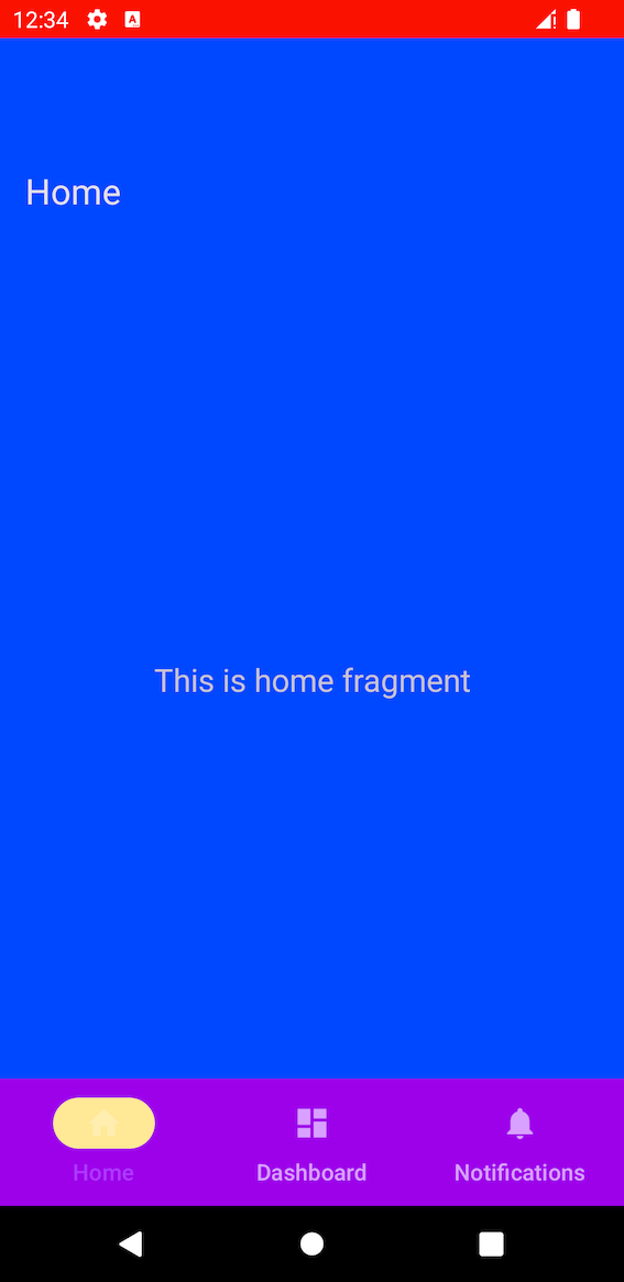
I've made a POC to test behavior (I know colors don't match Material Guidelines, but it's for test purpose only)
Here you can see i've theme colors matching what i've set, and not what Material theme want.
<style name="Base.AppTheme" parent="Theme.Material3.DayNight.NoActionBar">
    <item name="colorPrimary">@color/red1</item>
    <item name="colorOnPrimary">@color/red2</item>
    <item name="colorPrimaryContainer">@color/red3</item>
    <item name="colorOnPrimaryContainer">@color/red4</item>
    <item name="colorPrimaryInverse">@color/red5</item>

    <item name="colorSecondary">@color/yellow1</item>
    <item name="colorOnSecondary">@color/yellow2</item>
    <item name="colorSecondaryContainer">@color/yellow3</item>
    <item name="colorOnSecondaryContainer">@color/yellow4</item>

    <item name="colorTertiary">@color/green1</item>
    <item name="colorOnTertiary">@color/green2</item>
    <item name="colorTertiaryContainer">@color/green3</item>
    <item name="colorOnTertiaryContainer">@color/green4</item>

    <item name="android:colorBackground">@color/blue1</item>
    <item name="colorOnBackground">@color/blue2</item>
    <item name="colorSurface">@color/purple1</item>
    <item name="colorOnSurface">@color/purple2</item>
    <item name="colorSurfaceVariant">@color/purple3</item>
    <item name="colorOnSurfaceVariant">@color/purple4</item>
    <item name="colorSurfaceInverse">@color/purple5</item>
    <item name="colorOnSurfaceInverse">@color/purple6</item>
</style>

<color name="red1">#FB1100</color>
<color name="red2">#FD3A2C</color>
<color name="red3">#FD6459</color>
<color name="red4">#FF9189</color>
<color name="red5">#FFBABA</color>

<color name="yellow1">#FFC800</color>
<color name="yellow2">#FFDC5C</color>
<color name="yellow3">#FFE896</color>
<color name="yellow4">#FFEEAF</color>

<color name="green1">#4FCA00</color>
<color name="green2">#8EFF46</color>
<color name="green3">#ADFF79</color>
<color name="green4">#C8FFA6</color>

<color name="blue1">#0048FF</color>
<color name="blue2">#487CFF</color>

<color name="purple1">#9500FF</color>
<color name="purple2">#AD3AFF</color>
<color name="purple3">#C169FF</color>
<color name="purple4">#D8A1FF</color>
<color name="purple5">#E6C2FF</color>
<color name="purple6">#F3E1FF</color>
Here you can see every color used by my components is sourced from my theme, and not by Material itself. (I know its cringy with theses colors, but I made it on purpose to identify behaviors for each field category (primary, secondary, tertiary, background, surface, etc)
![enter image description here]()
Disclaimer : I don't have your code so i can't tell you exactly which field you have to set, but you could easily use my values to find out which one is used to color your component
Again, here is the documentation where you can find every field and its default value for Material default theme.
Hope this help you fix your problem, and if you need more help, please provide a minimal reproducer so we can try with the exact same config.
Have a nice day !


