Plotting random slopes from glmer model using sjPlot
Asked Answered
R

2

6

In the past, I had used the sjp.glmer from the package sjPlot to visualize the different slopes from a generalized mixed effects model. However, with the new package, I can't figure out how to plot the individual slopes, as in the figure for the probabilities of fixed effects by (random) group level, located here

Here is the code that, I think, should allow for the production of the figure. I just can't seem to get it in the new version of sjPlot.

library(lme4)
library(sjPlot)
data(efc)
# create binary response
efc$hi_qol = 0
efc$hi_qol[efc$quol_5 > mean(efc$quol_5,na.rm=T)] = 1
# prepare group variable
efc$grp = as.factor(efc$e15relat)
# data frame for 2nd fitted model
mydf <- na.omit(data.frame(hi_qol = as.factor(efc$hi_qol),
                           sex = as.factor(efc$c161sex),
                           c12hour = as.numeric(efc$c12hour),
                           neg_c_7 = as.numeric(efc$neg_c_7),
                           grp = efc$grp))
# fit 2nd model
fit2 <- glmer(hi_qol ~ sex + c12hour + neg_c_7 + (1|grp),
              data = mydf,
              family = binomial("logit"))

I have tried to graph the model using the following code.

plot_model(fit2,type="re")
plot_model(fit2,type="prob")
plot_model(fit2,type="eff") 

I think that I may be missing a flag, but after reading through the documentation, I can't find out what that flag may be.

Reiche answered 19/12, 2018 at 16:49 Comment(2)
just to clarify: you're talking about type = "ri.prob" from the linked blog post? And can you specify what you've tried & what's not working?Dagney
I am talking about the plot type = "ri.prob". I will edit my question to show what I have tried.Reiche
D
8

Looks like this might do what you want:

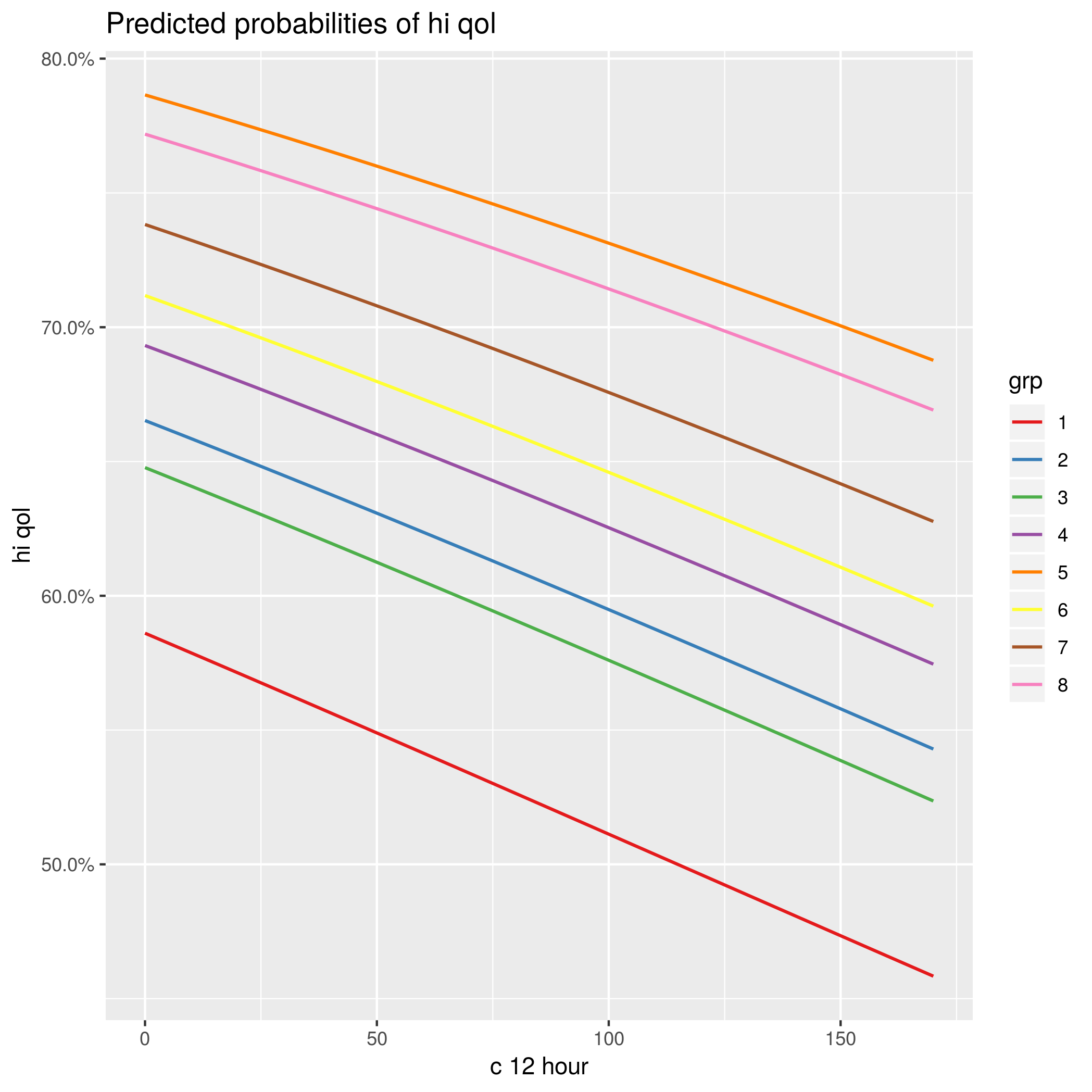
(pp <- plot_model(fit2,type="pred",
       terms=c("c12hour","grp"),pred.type="re"))
  • type="pred": plot predicted values
  • terms=c("c12hour", "grp"): include c12hour (as the x-axis variable) and grp in the predictions
  • pred.type="re": random effects

I haven't been able to get confidence-interval ribbons yet (tried ci.lvl=0.9, but no luck ...)

pp+facet_wrap(~group) comes closer to the plot shown in the linked blog post (each random-effects level gets its own facet ...)

enter image description here

Dagney answered 19/12, 2018 at 17:5 Comment(1)
I'm using your code here: bbolker.github.io/mixedmodels-misc/… to compute conf. int. or pred. int. for mixed models, however, I'm not sure how this might work when plotting specific levels of random effects, to get the CI / PI for the random effects.Chancre
C
3

Ben already posted the correct answer. sjPlot uses the ggeffects-package for marginal effects plot, so an alternative would be using ggeffects directly:

ggpredict(fit2, terms = c("c12hour", "grp"), type="re") %>% plot()

There's a new vignette describing how to get marginal effects for mixed models / random effects. However, confidence intervals are currently not available for this plot-type.

The type = "ri.prob" option in the linked blog-post did not adjust for covariates, that's why I first removed that option and later re-implemented it (correctly) in ggeffects / sjPlot. The confidence intervals shown in the linked blog-post are not correct, either. Once I figure out a way how to obtain CI or prediction intervals, I'll add this option as well.

Chancre answered 22/12, 2018 at 14:44 Comment(2)
Is it possible to exp() the predicted values and the confidence intervals so instead of getting lines, get the curves ? I have been trying to use the transform inside the ggpredict but I keep having non parallel linesDecade
No, it's only possible to plot predictions on the response scale. However, you may try modelbased::estimate_link() to plot predictions on the link-scale.Chancre

© 2022 - 2024 — McMap. All rights reserved.