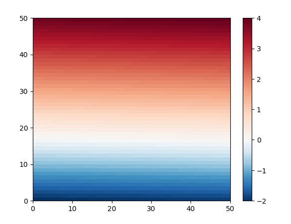
In order to get the desired norm, set the same number of colors on the negative as on the positive side.
Alternatively, you could use the unmodified norm, and create a special colormap. Such a colormap would have 1/3rd of blue-to-white colors and 2/3rd white-to-red colors. A benefit would be that the colorbar looks nicer. Such an approach only works if the balance between negative and positive numbers isn't too extreme.
Here is demo code with generated data. zz is chosen to be a sine rotated around the center, and scaled to go from -2 to 4, so symmetric around 1. At the left the image is shown with the modified colormap. At the right, the norm is changed to force white at zero.
Because of the red coloring of all positive values, the red bands are wider than the blue. In an image without changing norms nor colormaps, the bands would have equal width. The colorbars indicate the zero to be white.
import numpy as np
import matplotlib.colors as colors
from matplotlib import pyplot as plt

x = np.linspace(-20, 20, 500)
y = np.linspace(-20, 20, 500)
xx, yy = np.meshgrid(x, y)
zz = np.sin(np.sqrt(xx * xx + yy * yy)) * 3 + 1

negatives = -2.0
positives = 4.0

bounds_min = np.linspace(negatives, 0, 129)
bounds_max = np.linspace(0, positives, 129)[1:]
    # the zero is only needed once
    # in total there will be 257 bounds, so 256 bins
bounds = np.concatenate((bounds_min, bounds_max), axis=None)
norm = colors.BoundaryNorm(boundaries=bounds, ncolors=256)

num_neg_colors = int(256 / (positives - negatives) * (-negatives))
num_pos_colors = 256 - num_neg_colors
cmap_BuRd = plt.cm.RdBu_r
colors_2neg_4pos = [cmap_BuRd(0.5*c/num_neg_colors) for c in range(num_neg_colors)] +\
                   [cmap_BuRd(1-0.5*c/num_pos_colors) for c in range(num_pos_colors)][::-1]
cmap_2neg_4pos = colors.LinearSegmentedColormap.from_list('cmap_2neg_4pos', colors_2neg_4pos, N=256)

fig, (ax1, ax2) = plt.subplots(1, 2, figsize=(12, 5))

mesh1 = ax1.pcolormesh(xx, yy, zz, cmap=cmap_2neg_4pos)
ax1.set_aspect('equal')
ax1.set_title('using a modified cmap')
fig.colorbar(mesh1, ax=ax1)

mesh2 = ax2.pcolormesh(xx, yy, zz, norm=norm, cmap='RdBu_r')
ax2.set_aspect('equal')
ax2.set_title('using a special norm')
ticks = np.append(np.arange(-2.0, 0, 0.25), np.arange(0, 4.001, 0.5))
fig.colorbar(mesh2, ax=ax2, ticks=ticks)

plt.show()
![example plot]()
Following code plots the norm, which looks like a step function. Only with 257 bounds this step function has the correct shape everywhere (zooming to x at -2, 0 and 4).
nx = np.linspace(-3,5,10000)
plt.plot(nx, norm(nx))
PS: There is an alternative method to create a similar colormap. But trying it out, it is clear that the RdBu colormap is fine-tuned and produces much better looking plots.
norm_2neg_4pos = mcolors.Normalize(negatives, positives)
colors_2neg_4pos = [[0, 'blue'],
                    [norm_2neg_4pos(0.0), "white"],
                    [1, 'red']]
cmap_2neg_4pos = mcolors.LinearSegmentedColormap.from_list("", colors_2neg_4pos)
Still another simple solution is rescaling everything between -4 and 4. However, this would lose the darker blues. An alternative to 'RdBu_r' is 'seismic' with a different way to run from red over white to blue.
ax.pcolormesh(xx, yy, zz, vmin=-positives, vmax=positives, cmap='RdBu_r')


